Links and write-ups about beautiful things from around the web!
-
Lippmann Photography — First Color Spectrum Photos
In the 1890s the French physicist Gabriel Lippmann devised a new method of taking photographs that led to the first photographic recording of color:
Lippmann’s color photography process involved projecting the optical image as usual onto a photographic plate. The projection was done through a glass plate coated with a transparent emulsion of very fine silver halide grains on the other side. There was also a liquid mercury mirror in contact with the emulsion, so the projected light traveled through the emulsion, hit the mirror, and was reflected back into the emulsion.
The resulting plates are pretty cool looking, as seen in the video — very similar to the discovery of holography decades later — and technically they record a wider spectrum of color than our standard modern imaging techniques. He won the Nobel Prize in 1908 for his research, but the method was largely shelved due to the complexity of the process and the inability to make color prints, which also didn’t appear commercially until much later.
In 2021 researchers at the Ecole Polytechnique Fédérale de Lausanne published a paper on their research into Lippmann’s images, including a new method that lets us see the images closer to the original color captured in the photographic scene.
Side trivia: among Lippmann’s doctoral students at the Sarbonne was Maria Sklodowska, later a winner of multiple Nobel prizes herself, under her better-known married name: Marie Curie!
-
Werner Herzog’s Minnesota Declaration
Ostensibly a bulleted list of thoughts about Cinema Verité, there are some interesting nuggets in this “declaration” of “truths” that Werner Herzog shared with Roger Ebert back in 1999:
7. Tourism is sin, and travel on foot virtue.
8. Each year at springtime scores of people on snowmobiles crash through the melting ice on the lakes of Minnesota and drown. Pressure is mounting on the new governor to pass a protective law. He, the former wrestler and bodyguard, has the only sage answer to this: “You can´t legislate stupidity.”
9. The gauntlet is hereby thrown down.
[…]
12. Life in the oceans must be sheer hell. A vast, merciless hell of permanent and immediate danger. So much of a hell that during evolution some species – including man – crawled, fled onto some small continents of solid land, where the Lessons of Darkness continue.
-
Dan Sinker: The Magic of Pee-wee Herman in a Dark Year
We all know grief now. We grieve the people we loved, but also the people we were before this pandemic began. If you’re old enough, you add it to the grief you’ve accrued over the years: for the children we were, the hopes we had, the people we longed to be. But if you’re lucky, the art that you need still finds you. It reminds you of who you are when you’ve forgotten, and gives you the power to imagine a life beyond this one. It lets you believe that what you’ve been robbed of will be found, that your home will come alive.
-
Open to Conversion

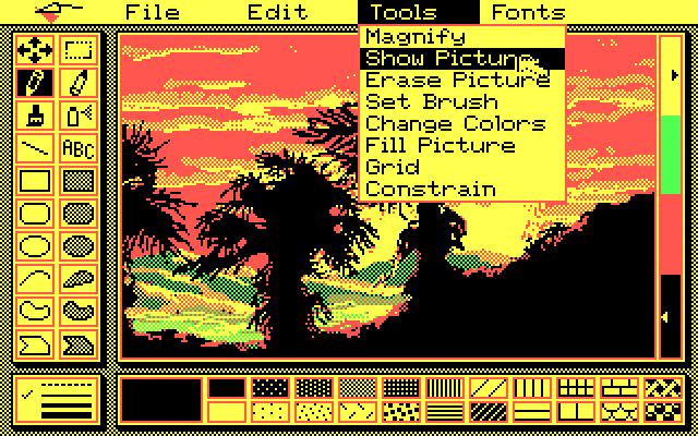
Over on Tedium, a nostalgia bomb roundup of 10 image file formats that time forgot. I wouldn’t say that BMP or even TIFF are exactly forgotten, and VRML seems like the odd one out as a text-based markup language (but definitely in the zeitgeist this month with all of the nouveau metaverse talk), but many of these took me back to the
goodold days. Also I didn’t know that the Truevision TARGA hardware, remarkable for its time in the mid-1980s with millions of colors and alpha channel support, was an internal creation from AT&T (my dad worked for AT&T corporate back then, but all we got at home was the decidedly not-remarkable 2-color Hercules display on our AT&T 6300 PC). JPEG and GIF continue to dominate 30+ years later, but it’s interesting to see what could have been, if only some of these other systems jumped more heavily into file compression… -
Why we’re blind to the color blue
If you’re super nerdy and experienced with using Photoshop’s individual color channels to make enhancements or custom masks, you might have noticed that the blue channel has very little influence on the overall sharpness of an RGB image — it never occurred to me that this is inherently a function of our own human eyesight, which is unable to properly focus on blue light, in comparison to other wavelengths!
I like how the paper from the Journal of Optometry that this article links to straight up dunks on our questionably-designed eyeballs:
In conclusion, the optical system of the eye seems to combine smart design principles with outstanding flaws. […] The corneal ellipsoid shows a superb optical quality on axis, but in addition to astigmatism, it is misaligned, deformed and displaced with respect to the pupil. All these “flaws” do contribute to deteriorate the final optical quality of the cornea. Somehow, there could have been an opportunity (in the evolution) to have much better quality, but this was irreparably lost.
This also made me wonder if this blue-blurriness has anything to do with the theory that cultures around the world and through history tend to develop words for colors in a specific order, with words for “blue” appearing relatively late in a language’s development. Evidently that’s likely so, because hard-to-distinguish colors take longer to identify and classify, even for test subjects who have existing words for them!
-
I Know a Place
On the Pioneer Works art center’s site, Everest Pipkin has a great short essay on the beautiful and transitory (and even community) nature of empty spaces, linking parties on the foundations of a halting suburban neighborhood development with the abandoned sandbox virtual spaces of online platforms like Roblox:
To stand in these places is to stand in a place where desire was met. Where for a moment, something that was yours was carved out of the ugly body of online corporate games culture. Like building a fort in the woods between the highway and the mall.
Back in ancient days when I was role-playing and generating code on the text-based ElendorMUSH, some of my favorite places to visit were the handful of “rooms” that were created as secret spaces by fellow developers and local admins, unlinked from the normal Tolkien-themed spaces above. Mine was a hidden grotto beneath the tunnels of Isengard, and it was a great quiet (virtual) place to escape to for a bit.
See also: people have been spelunking in the abandoned ruins of Second Life for the better part of a decade. The university I work for paid six figures for an island, and I sometimes wonder what state it’s in now.
-
Finger.farm
Modern basic implementation and hosting of the venerable RFC 742 Finger Protocol — share your contact info and plans like it’s the 1970s!
-
Hershey Fonts

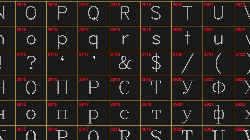
Over on Hackaday, a good history of Hershey fonts, a still-surviving vector font format designed for use in the 1960s for optical cathode ray printers, printing characters onto microfilm at a time when computer displays were still a novelty (now they are useful for CNC milling, laser etching, etc.).
-
Breaking at the Olympics 2024 in Paris
Wild! Breaking has been added as a new official event for the 2024 Olympic Games. Seems like it’s a few decades late, but I actually look forward to seeing this. Hopefully there some good breakbeats to accompany the performing.

