
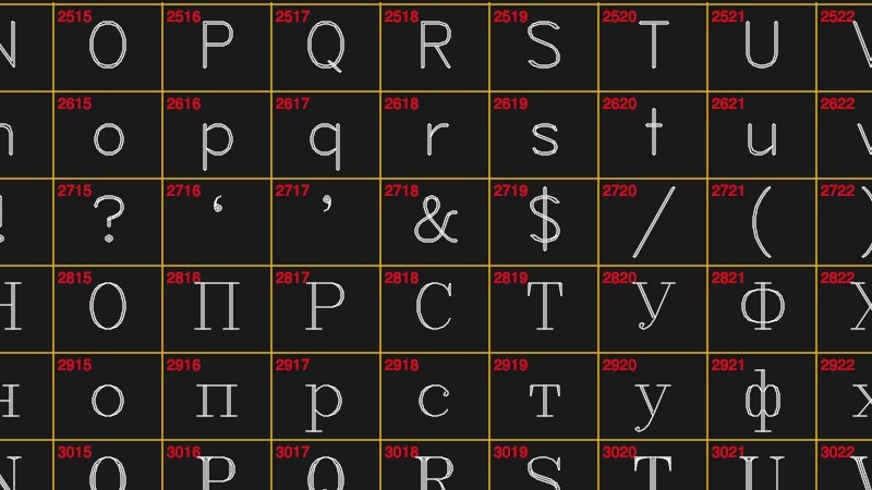
Over on Hackaday, a good history of Hershey fonts, a still-surviving vector font format designed for use in the 1960s for optical cathode ray printers, printing characters onto microfilm at a time when computer displays were still a novelty (now they are useful for CNC milling, laser etching, etc.).
Tag: fonts
-
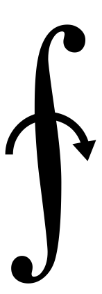
Hershey Fonts
-
8-bit Arcade Fonts
-
Adrian Frutiger Typography and Material
Type-design is not exclusively a matter of aesthetics but, to a large extent, of understanding the technical conditions in which the letter-forms are built up; and a typeface is successful when it is properly at the service of a strict conformity with the material and with progressive techniques. Adrian Frutiger, Type Sign Symbol p. 20
-
Frutiger on Typography Design
Every script contains the spirit of its age.
Adrian Frutiger, Type Sign Symbol (p. 16), on how typography is fundamentally tied to the physical media from which a society creates its writing. -
On Typographic Novelty
The good type designer knows that, for a new font to be successful, it has to be so good that only very few recognize its novelty. Stanley Morison, First Principles of Typography (as quoted in Adrian Frutiger’s Type Sign Symbol, p. 7)
-
opentype.js
This is pretty cool: an OpenType parser written in JavaScript, enabling direct manipulation of a font’s letterforms and other typographical controls right in the browser (or node.js). I don’t think it would be used in production, but with type foundries cranking out OpenType variable fonts, it might be a fun playground / experimentation tool.
-
Decovar: A multistyle decorative variable font by David Berlow
Speaking of newfangled OpenType variable fonts, this Decovar “modular parametric control display font” is a nice example: a typeface that has an absurd set of elements that you can control programmatically, essentially creating a “skeleton” typeface with a large spectrum of embellishments (the terminals, the strokes, the contours are all adjustable, but still looks good by blending together smoothly).
Typography might be undergoing a revolution in the next few years!
-
How I Came to Love the En Space
Not only is every letter an object, but every space between every letter is also an object. Every space between words, every space between lines—every bit of white space is an object. When typesetting, a printer has to think about negative space as something tangible.
A nice essay from The Atlantic on the development of the humble metal (or wood) block known as the en, the invisible assistant of legibility in classic printed text.
-
Dna Sans Nanoscale Typeface
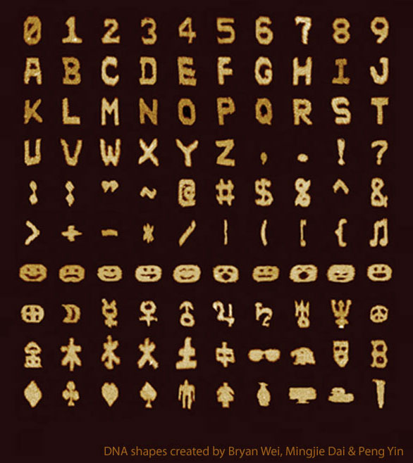
DNA Sans, a typeface / character set of self-assembled DNA strands that have been shaped into pixel-like blocks. I know where I’m stashing my next steganographically-hidden secret message! (Or maybe this could be used as graffiti for the Fantastic Voyage crew?)
(Via Nature – article is here for those with journal access)
-
Fake Unicode Consortium
I’m getting far too many chuckles out of this page for the Fake Unicode Consortium, which pairs up obscure Unicode glyphs with better names. Depicted here:
Unicode character U+2231: ‘NOW FLIP SNAKE TO COOK OTHER SIDE’
http://www.fileformat.info/info/unicode/char/2231/index.htm(Via O’Reilly Radar)