As my office building at the University adds more and more permanent signage with zero consistency in typeface choice or other typographic consideration, this passage from Adrian Frutiger stood out:
The reader encounters typefaces in other forms as well as in printing. His daily environment, in face his entire living space, is filled with typographic characters of all kinds.
Unlike printed matter, with which the reader can bring the written word into his field of vision according to his own desire and choice, lettering on buildings is forced into view without restraint. Depending on its design, such lettering can provide an enrichment of the environment, almost in the sense of ornamentation, or, on the other hand, it can be ugly and therefore experienced as aggressive “pictorial noise”, inimical to the environment.
In this connection, lettering can be regarded as two-dimensional architecture. This realisation makes it possible to appreciate the designing of public signs and notices from a completely new viewpoint, by integrating them into the total concept instead of simply “sticking them on” or “hanging them up”.
I recently finished Jan Tschichold’s Treasury of Alphabets and Lettering (1952), an incredible gallery of historical typographic examples alongside acerbic and insightful commentary by Tschichold, and this passage about storefront signs has popped into my head whenever driving by any given strip mall:
In selecting a letter for a given task, beauty is not the only factor. The letter must also be appropriate to its purpose and surroundings. Most important, a distinction must be made between lettering that is to serve for a long period of time and lettering which is to serve only briefly. Frequently, we see lettering in architecture which, due to its flighty and cursive character, is suitable only for temporary and cheap signs. Many store front inscriptions, often executed in metal or neon lights, belong to the category of imitation brush lettering which is alien to their purpose. These are not only generally hard to read, but also often lack the spontaneous, fresh form which only a master can give them after long practice. They are lame, warped, and miserable. That which one is unprepared to do but insists on doing becomes trashy. And this trash despoils our cities today at every turn. Such pap-like brush lettering on our store fronts is out of place and poorly done. Store front lettering is an architecture, since it is a part of the building. It is destined for a long duration, often for decades, and should, therefore, always be correct, noble and beautiful. It is a waste of money to cast such pseudo brush lettering in expensive metal; it must be replaced in a few years as it becomes obsolete and visually offensive to everybody.
This kind of lettering is either the result of the client’s “design” or conceived by incompetents who should choose another profession.
[…]
Store and building signs are necessary, but they need not result in the evil they have become.
This is pretty cool: an OpenType parser written in JavaScript, enabling direct manipulation of a font’s letterforms and other typographical controls right in the browser (or node.js). I don’t think it would be used in production, but with type foundries cranking out OpenType variable fonts, it might be a fun playground / experimentation tool.
A decent roundup of ways that you can fine-tune your word/character-level typography on the web — I don’t 100% agree with all of his suggested specific fixes, but knowing how one can make these adjustments in the first place is the important part. I might also add mention of the CSS overflow-wrap: break-wordrule which has come up twice as something I needed in the last couple of projects I worked on (okay, that’s not really a spacing technique so much as a fix for overly-long words, but thought it worth mentioning alongside font tweaks)
Not only is every letter an object, but every space between every letter is also an object. Every space between words, every space between lines—every bit of white space is an object. When typesetting, a printer has to think about negative space as something tangible.
A nice essay from The Atlantic on the development of the humble metal (or wood) block known as the en, the invisible assistant of legibility in classic printed text.
A fan-made port of the pixel font built into the adventure game classics The Secret of Monkey Island and Monkey Island 2: LeChuck’s Revenge. As a bonus, a separate version is available that is properly kerned and hinted. (double bonus: opening the .ttf file in Font Book reveals that the demonstration string for the font reads “You fight like a dairy farmer!”)
A post combining Lucasfilm Games and typography? Immediate reblog!
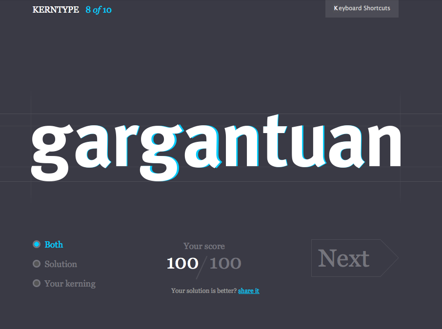
Fun with kerning! I don’t 100% agree with all of their solutions (they do let you share your version in protest, at least!), but it’s a entertaining five-minute distraction if you’re a designer or type-friend, and the interface is slick.
(Via pretty much every design blog and Twitter user this week…)
I’ve wondered where the idea of music albums as discrete packaged works of art came from, and now I know. From the New York Times: Alex Steinweiss, Originator of Artistic Album Covers, Dies at 94
“The way records were sold was ridiculous,” Mr. Steinweiss said in a 1990 interview. “The covers were brown, tan or green paper. They were not attractive, and lacked sales appeal.” Despite concern about the added costs, he was given the approval to come up with original cover designs.
His first cover, for a collection of Rodgers and Hart songs performed by an orchestra, showed a high-contrast photo of a theater marquee with the title in lights. The new packaging concept was a success: Newsweek reported that sales of Bruno Walter’s recording of Beethoven’s “Eroica” symphony increased ninefold when the album cover was illustrated.
Mr. Steinweiss also created a distinctive handwriting script that he used on many of his album covers, which came to be known as the Steinweiss Scrawl (recently resurrected as the font Steinweiss Script by designer Michael Doret).
Mr. Steinweiss said he was destined to be a commercial artist. In high school he marveled at his classmates who “could take a brush, dip it in some paint and make letters,” he recalled. “So I said to myself, if some day I could become a good sign painter, that would be terrific!“
More good information about his career and innovations (including diagrams of his LP packaging) are available on this page about his work for the Remington record label.
Oh my, yes. The Firefox team has an experimental specification for making use of the advanced features of OpenType and AAT, possibly through the CSS @font-variant property. This could get hairy rather quickly and I have to imagine it’d be tricky to write out the full description by hand, but the typographical goodness would be hard to pass up. Be sure to check out the hack.mozilla.org page about this to see some nice preview images.
Steam is gathering behind the open font / redistributable typeface movement, which will hopefully usher in some better typography options on the web. Arguments abound as to whether letting designers use whatever font they want on the web is a good thing, and the situation’s been moving at a snails pace for years due to the reluctance of both the font foundries and the browser makers, so it’s good to see actual, workable options on the horizon. Here are a handful of recent projects, all of which seek to ameliorate the licensing issues inherent in the use of embedded fonts: