Color nerdery ahead: I’ve been a fan of the CIELAB color space ever since I discovered Lab mode in Photoshop 20-ish years ago — it’s so awesome and useful to be able to manipulate color channels separate from luminosity! — and so I’m thrilled that web design is heading that direction as well with the new OKLCH color space in CSS Color 4.
This article from Evil Martians about why they’ve made the switch to OKLCH is a great read on the ins and outs of the new color space and why you should consider using it over the more familiar ancient standards. The TL;DR: unlike hexadecimal or RGBa values, Lab/LCH is much easier to read and adjust directly in CSS as well: want to make a color more saturated? Just adjust the middle value, chroma! Oh, and contrast is preserved between different colors so long as the Luminosity remains the same, which makes conforming to the WCAG-compliant color contrast accessibility guidelines that much easier.
I also learned from this in-depth article that Adobe Photoshop has adopted the OKLab space as a “perceptual” option when generating color gradients. Look at how ugly that “classic” gradient is in their screenshot! Gradients in Photoshop have always been messed up, so this is a pretty huge change that they’ve made.
From Andrew Somers, a great primer on how color vision works and how illuminated display technology maps perception to luminance contrast, color gamut, etc. Especially useful is his writeup of not only WCAG 2’s limitations for determining proper contrast for meeting accessibility needs but also the upcoming standards like APAC (Accessible Perceptual Contrast Algorithm) that will pave the way for more useful and relevant a11y standards.
My favorite part of these kind of demos is when the audience goes wild (well, relatively) for the breakdancing elephant animation, even more than for the psuedo-3D graphics and psychedelic color scanline gimmicks.
This is a compelling use of AI for photographic manipulation (in my mind more practical than many of the other AI image generation examples that are flooding the art websites these days): basically the software can analyze a photograph, use AI to generate a pretty accurate depth map of the subject of the photo, and then use that for dynamic relighting (allowing you to add different artificial lights, color gels, etc.). You can try the web-based demo on your own photos! Neat.
Over on Tedium, a nostalgia bomb roundup of 10 image file formats that time forgot. I wouldn’t say that BMP or even TIFF are exactly forgotten, and VRML seems like the odd one out as a text-based markup language (but definitely in the zeitgeist this month with all of the nouveau metaverse talk), but many of these took me back to the good old days. Also I didn’t know that the Truevision TARGA hardware, remarkable for its time in the mid-1980s with millions of colors and alpha channel support, was an internal creation from AT&T (my dad worked for AT&T corporate back then, but all we got at home was the decidedly not-remarkable 2-color Hercules display on our AT&T 6300 PC). JPEG and GIF continue to dominate 30+ years later, but it’s interesting to see what could have been, if only some of these other systems jumped more heavily into file compression…
A recent computer vision paper titled Learning to Cartoonize Using White-box Cartoon Representations trains machine learning software to automatically “cartoonize” photographs — a normally human-done process known as rotoscoping (at least when applied to moving images). The results are strikingly similar to the work produced for the (excellent) Amazon show Undone or the earlier animated Richard Linklater / Bob Sabiston classic Waking Life.
It’s interesting that their training data was “collected from Shinkai Makoto, Miyazaki Hayao and Hosoda Mamoru films.” These demo images definitely look akin to the American productions mentioned above, more than I’d expect from the background art of a Studio Ghibli film, say.
The good news for now for human animators: I presume these images each take significant processing power to generate, and would have trouble with consistency between frames even if it could be animated (?).
In 1985, computer graphics were exotic enough that using them for a TV commercial was the kind of thing you might save for a Super Bowl ad slot, as seen in this short documentary. I would not have guessed that the first significant use of CGI on TV was for an ad illustrating the sexy (?) futuristic appear of _aluminum cans_.
(They fail to mention this in this mini-doc, but the ad studio was clearly lifting the chrome-plated sexy robots imagery of Japanese illustrator Hajime Sorayama)
Good news, owners of Gameboy Cameras! New technology will now up-res and almost accurately colorize those grainy low-res spinach photos.
Jokes aside, there are some pretty amazing things being done these days in the world of neural net-trained image enhancements. See also this crazy research on using Google Brain to reasonably “zoom! enhance!” photos as small as 8×8 pixels (we used to laugh at crime drama TV shows and their unbelievable photo techniques…but now it’s getting pretty close…)
Hmm, @harthvader has written some impressive neural network, machine learning, and image detection stuff, shared on her GitHub — wait, she’s combined these things into a JavaScript cat-detecting routine?! Okay, that wins.
var cats = kittydar.detectCats(canvas); console.log(“there are”, cats.length, “cats in this photo”); console.log(cats[0]); // { x: 30, y: 200, width: 140, height: 140 }
What happens if you write software that generates random polygons and the software then feeds the results through facial recognition software, looping thousands of times until the generated image more and more resembles a face? Phil McCarthy’s Pareidoloop. Above, my results from running it for a few hours. Spooky.
(More about his project on GitHub, and more about pareidolia in case the name doesn’t ring a bell)
[8/5 Update: Hi folks coming in from BoingBoing and MetaFilter! Just want to reiterate that I didn’t write this software, the author is Phil McCarthy @phl !]
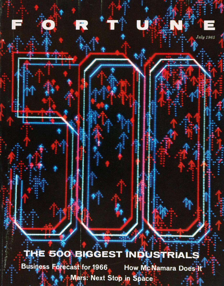
Now that I have a retina display, I want a screensaver that looks as good as this 1963 AT&T microfilm video:
This film was a specific project to define how a particular type of satellite would move through space. Edward E. Zajac made, and narrated, the film, which is considered to be possibly the very first computer graphics film ever. Zajac programmed the calculations in FORTRAN, then used a program written by Zajac’s colleague, Frank Sinden, called ORBIT. The original computations were fed into the computer via punch cards, then the output was printed onto microfilm using the General Dynamics Electronics Stromberg-Carlson 4020 microfilm recorder. All computer processing was done on an IBM 7090 or 7094 series computer.
The Internet has become self-aware, but thankfully it just wants to spend some time scrolling Tumblr for cat videos. From the NY Times, How Many Computers to Identify a Cat? 16,000:
[At the Google X lab] scientists created one of the largest neural networks for machine learning by connecting 16,000 computer processors, which they turned loose on the Internet to learn on its own.
Presented with 10 million digital images found in YouTube videos, what did Google’s brain do? What millions of humans do with YouTube: looked for cats. The neural network taught itself to recognize cats, which is actually no frivolous activity.
As the Make post says, this 3D-printable model of Captain Picard’s teacup would be a good benchmark for the nascent fabrication technology (the image on the right is a photo of the original Star Trek prop, which was just an off-the-shelf Bodum teacup). That it could be seen as a sly progression from the famous Utah teapot I think makes it an especially worthy benchmark!
The Language Log on how science fiction often misses the mark with predictions of technology (the why is up for debate, of course):
Less than 50 years ago, this is what the future of data visualization looked like — H. Beam Piper, “Naudsonce”, Analog 1962:
She had been using a visibilizing analyzer; in it, a sound was broken by a set of filters into frequency-groups, translated into light from dull red to violet paling into pure white. It photographed the light-pattern on high-speed film, automatically developed it, and then made a print-copy and projected the film in slow motion on a screen. When she pressed a button, a recorded voice said, “Fwoonk.” An instant later, a pattern of vertical lines in various colors and lengths was projected on the screen.
This is in a future world with anti-gravity and faster-than-light travel.
The comments that follow are a great mix of discussion about science fiction writing (why do the galactic scientists in Asimov’s Foundation rely on slide rules?) and 1960s display technology limitations (vector vs. raster, who will win?). I like this site.
GelSight, a high-resolution, portable 3D imaging system from researchers at MIT, basically what looks like a small piece of translucent rubber injected with metal flakes. Watch the video to see some of the microscopic scans they’re able to get using this. I love non-showy SIGGRAPH tech demos like this one.
From a post titled The Art of Nomography on Dead Reckonings (a blog dedicated to forgotten-but-beautiful mathematical systems! I’d better subscribe to this one…) :
Nomography, truly a forgotten art, is the graphical representation of mathematical relationships or laws (the Greek word for law is nomos). These graphs are variously called nomograms (the term used here), nomographs, alignment charts, and abacs. This area of practical and theoretical mathematics was invented in 1880 by Philbert Maurice d’Ocagne (1862-1938) and used extensively for many years to provide engineers with fast graphical calculations of complicated formulas to a practical precision.
Along with the mathematics involved, a great deal of ingenuity went into the design of these nomograms to increase their utility as well as their precision. Many books were written on nomography and then driven out of print with the spread of computers and calculators, and it can be difficult to find these books today even in libraries. Every once in a while a nomogram appears in a modern setting, and it seems odd and strangely old-fashioned—the multi-faceted Smith Chart for transmission line calculations is still sometimes observed in the wild. The theory of nomograms “draws on every aspect of analytic, descriptive, and projective geometries, the several fields of algebra, and other mathematical fields” [Douglass].
Via New Scientist, research into an image processing technique designed to mask the actual physical position of the photographer, by creating an interpolated photograph from an artificial vantage point:
The technology was conceived in September 2007, when the Burmese junta began arresting people who had taken photos of the violence meted out by police against pro-democracy protestors, many of whom were monks. “Burmese government agents video-recorded the protests and analysed the footage to identify people with cameras,” says security engineer Shishir Nagaraja of the Indraprastha Institute of Information Technology in Delhi, India. By checking the perspective of pictures subsequently published on the internet, the agents worked out who was responsible for them. …
The images can come from more than one source: what’s important is that they are taken at around the same time of a reasonably static scene from different viewing angles. Software then examines the pictures and generates a 3D “depth map” of the scene. Next, the user chooses an arbitrary viewing angle for a photo they want to post online.
Interesting stuff, but lots to contemplate here. Does an artificially-constructed photograph like this carry the same weight as a “straight” digital image? How often is an individual able to round up a multitude of photos taken of the same scene at the same time, without too much action occurring between each shot? What happens if this technique implicates a bystander who happened to be standing in the “new” camera’s position?
The heat-mapping method works by first breaking an object into a mesh of triangles, the simplest shape that can characterize surfaces, and then calculating the flow of heat over the meshed object. The method does not involve actually tracking heat; it simulates the flow of heat using well-established mathematical principles, Ramani said. …
The method accurately simulates how heat flows on the object while revealing its structure and distinguishing unique points needed for segmentation by computing the “heat mean signature.” Knowing the heat mean signature allows a computer to determine the center of each segment, assign a “weight” to specific segments and then define the overall shape of the object. …
“A histogram is a two-dimensional mapping of a three-dimensional shape,” Ramani said. “So, no matter how a dog bends or twists, it gives you the same signature.”
In other words, recognizing discrete parts (like fingers or facial features) of an object in front of the camera should be much more accurate with this approach than with older techniques like simple edge detection. Uses for real-time recognition are apparent (more accurate Dance Central!), but it seems like this would also be a boon for character animation rigging?
The IBM 2250 graphics display, introduced in 1964. 1024×1024 squares of vector-based line art beamed at you at 40Hz, with a handy light pen cursor. Much more handy than those older displays that just exposed a sheet of photographic film for later processing!
They didn’t think it was relevant. In their minds, we were working on computer-generated images—and for them, what was a computer-generated image? What was an image they saw on a CRT? It was television.
The man who created the first scanned digital photograph in 1957, Russel Kirsch, pioneer of the pixel, apologizes in the May/July issue of Journal of Research of the National Institute of Standards and Technology. Now 81 years old, he offers up a replacement (sorta) for the square pixel he first devised: tessellated 6×6 pixel masks that offer much smoother images with lower overall resolution. The resulting file sizes are slightly larger but the improved visual quality is pretty stunning, as seen in the closeup above. His research was inspired by the ancient 6th Century tile mosaics in Ravenna, Italy.
There are a lot of comments out there complaining that square pixels are more efficient, image and wavelet compression is old news, etc., and that’s true, but if you actually read the article you’ll find that the point isn’t so much the shape, the efficiency, or even the capture/display technology needed, but rather that this could be a good method for reducing the resolution of images somewhat while still retaining visual clarity, important in medical applications and in situations where low-resolution images are still tossed around.
Computational image processing researchers at Northwestern University teamed up with art historians from the Art Institute of Chicago to investigate the colors originally laid down by Matisse while he was working on Bathers by a River:
Researchers at Northwestern University used information about Matisse’s prior works, as well as color information from test samples of the work itself, to help colorize a 1913 black-and-white photo of the work in progress. Matisse began work on Bathers in 1909 and unveiled the painting in 1917.
In this way, they learned what the work looked like midway through its completion. “Matisse tamped down earlier layers of pinks, greens, and blues into a somber palette of mottled grays punctuated with some pinks and greens,” says Sotirios A. Tsaftaris, a professor of electrical engineering and computer science at Northwestern. That insight helps support research that Matisse began the work as an upbeat pastoral piece but changed it to reflect the graver national mood brought on by World War I.
The Art Institute has up a nice mini-site about Bathers and the accompanying research, including some great overlays on top of the old photos to show the various states the painting went through during the years of its creation.
I can vouch that this works, and it’s pretty straightforward once you manage to grab and build the two or three additional Quartz Composer plugins successfully. I had to fold in a newer version of the ARToolkit libs, and I swapped out the pattern bitmap used to recognize the AR target to match one I already had on hand – the default sample1 and sample2 patterns weren’t working for me for some reason. Apart from that, Quartz Composer’s a lot of fun to use, almost like building eyecandy demos with patch cables and effects pedals, and it’s already on your system if you have Xcode.
L’Artisan Electronique, an openFrameworks-powered “virtual pottery wheel”. Users can deform the cylinder geometry by waving their hand between the lasers and then print a physical copy of their piece using an attached RepRap machine.
Real-time 3D capture at 60fps using a cheap webcam and simple projected pattern of light points. The structured-light code is open source, looks like a pretty cool project.
Phil Plait of Bad Astronomy lucidly explains display resolution, clearing up arguments about the iPhone 4’s retinal display technology:
Imagine you see a vehicle coming toward you on the highway from miles away. Is it a motorcycle with one headlight, or a car with two? As the vehicle approaches, the light splits into two, and you see it’s the headlights from a car. But when it was miles away, your eye couldn’t tell if it was one light or two. That’s because at that distance your eye couldn’t resolve the two headlights into two distinct sources of light.
The ability to see two sources very close together is called resolution.
DPI issues aside, the name “retinal display” is awfully confusing given that there’s similar terminology already in use for virtual retinal displays…
Tangible Interaction’s Tangible Graffiti Wall. Rear projection drawing screens with IR “spraycan” interface. The cherry on top is the ability to use virtual stencils while painting – clever.
Excellent use of AR for marketing: an in-store display that’s actually fun to play with, and it makes you pick up the box in order to see it come alive. Nice.
If you’re the sort of lab that’s engineering a method of printing ceramic materials using rapid prototyping machines, I suppose it’d make sense that you’d already have made some real-life polygonal Utah teapots! I never thought about it before, but for the 3D graphics humor value I really, really want one of these now. You can read about the Utanalog project and see finished photos (and a video explaining the whole thing) over on the Unfold blog.
Kottke linked to this time-stitch-stretch video, which is kind of fun to watch. Reminds me of the 1990’s video morphing work done using Elastic Reality, especially Michel Gondry’s video for Björk’s “Joga” (which I think was done with ER…anyone know?)
The drawings in this collection were made by various users in a discussion forum on the website www.foreverdoomed.com. Using MS Paint, and other rudimentary computer drawing programs, users attempted to recreate their favorite album covers and let others on the forum guess the band and title from the artwork. […] Some gave themselves a limit of five minutes to recreate the most recognizable essentials.
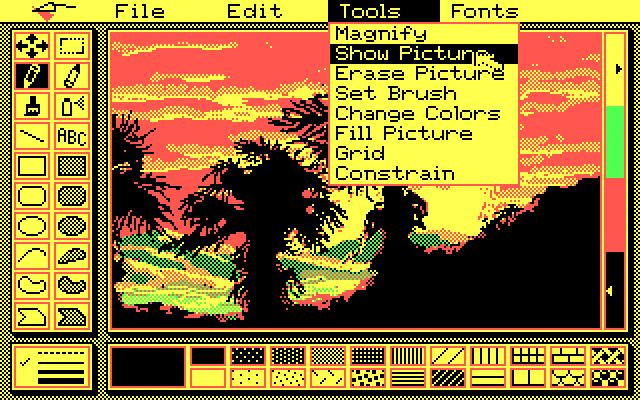
I sort of like these. I’d forgotten the subtle charm of MSPaint’s spraycan, though I’d always envied MacPaint’s patterns.
John Balestrieri is tinkering with generative painting algorithms, trying to produce a better automated “photo -> painting” approach. You can see his works in progress on his tinrocket Flickr stream. (Yes, there are existing Photoshop / Painter filters that do similar things, but this one aims to be closer to making human-like decisions, and no, this isn’t in any way suggestive that machine-generated renderings will replace human artists – didn’t we already get over that in the age of photography?)
Whatever the utility, trying to understand the human hand in art through code is a good way to learn a lot about color theory, construction, and visual perception.
Pretend to be Radiohead with this Instructable guide to 3D light scanning using a projector, camera, and a bit of Processing! This is designed to create the visualization seen in the video above, but you could also use the point data for output on a 3D printer, animation package, etc. Neat.
My camera switches over to portrait-mode whenever it sees a painting or a drawing with a face in it. It stays in AUTO mode otherwise.
According to Popular Mechanics: “a chip inside the camera constantly scans the image in its viewfinder for two eyes, a nose, ears and a chin, making out up to 10 faces at a time before you’ve hit the shutter.”
I decided to test my camera—it’s a Canon Powershot SX120—to see what it decides to regard as a face.
Artist James Gurney tests out his point-and-shoot’s facial recognition chip against works of art and illustration. A mixed bag, but a good reminder that this technology is getting better and cheaper (and subtle) all the time.
The FAT LAB crew put the markup back in markup language, with their week dedicated to creating new applications and standardizing their existing work around a Graffiti Markup Language, an XML archive format describing tagging and gestural drawing. Rad.
FluidPaint: An Interactive Digital Painting System using Real Wet Brushes. An experimental project by Tom Van Laerhoven of the Hasselt University Expertise Centre for Digital Media in Belgium. Unlike previous digital painting applications, this one uses actual water (detected by a surface-level IR emitter) to record strokes on the surface and more correctly models the tip of the brush being used, whether rounded or fanned, and it can even simulate a sponge. Looks like it makes some convincing watercolor-like images.
Magician Marco Tempest demonstrates a portable “magic” augmented reality screen. The system uses a laptop, small projector, a PlayStation Eye camera (presumably with the IR filter popped out?), some IR markers to make the canvas frame corner detection possible, Arduino (?), and openFrameworks-based software developed by Zachary Lieberman. I really love this kind of demo – people on the street (especially kids) intuitively understand what’s going on. This work reminds me a lot of Zack Simpson’s Mine-Control projects, especially with the use of cheap commodity hardware for creating a fun spectacle.
Pinwall, by Germany’s art/marketing group URBANSCREEN. Fabulous concept, but wow that’s garish! Would be fun to see some other urban architecture re-envisioned by actual pinball playfield designers. Tilt the Reichstag?
The American Society of Media Photographers has a new resource up for people working with digital images: dpBestflow rounds up the best practices and workflows for digital photography, in neat, easy-to-digest pieces, with tips on subjects ranging from camera file formats to desktop hardware to room lighting. If you look at their handy Quick Reference overview, be sure to note that each bullet point links to a more in-depth piece if you’re interesting in drilling down for more info…
To help further the field of computational photography, a team at Stanford is working on a homebrewed, open source digital camera that they can sell at-cost to other academics in the field. Right now it’s pretty big and clunky-looking, but a camera that can be extended with the latest image processing techniques coming out of the labs would be very sexy indeed. There’s a recent press release that’s worth reading about the team, along with a video and an animation or two to explain the project.
Those that want to tinker with their existing store-bought cameras might want to check out the firmware hacks that are floating around out there, like the excellent CHDK software (GPL’ed, I think) that runs on most modern Canon digital point-and-shoot and dSLR cameras. With a little bit of elbow grease and some free tools you can add a lot of professional(ish) features and scripting support to your low-end camera.
Typophile user Miha is doing some awesome sub-pixel typography experimentation for making tiny text sharper (at least on LCD screens with RGB ordering – sorry CRT holdouts!). It’s this kind of hand-rendering and tailoring that makes this work craft, in the best sense of the word. Drawing out a legible, full alphabet with an x-height of 3 pixels? Impressive.
The Xerox Star 8010 OS, an early GUI from 1981. I wish my desktop looked a bit more like this today. More interface awesomeness from this system on the DigiBarn Computer Museum site.
“Touchable Holography”, a hardware demo by researchers from the University of Tokyo at this year’s SIGGRAPH conference. This mostly builds on the work they presented last year involving their “Airborne Ultrasound Tactile Display” (PDF), a device that shoots out directional ultrasound to simulate haptic pressure, like the impact rain has when it hits your skin. I don’t think this current display counts as holography exactly (the image is made with a refracting mirror, just like Sega’s 1991 arcade game Time Traveler!), but being able to reinforce the illusion with the sensation of touch is a cool idea. Hopefully they can expand it to use more than one of their ultrasound boards so they can simulate a feeling that’s more than one-dimensional. Also good to see that researchers are using the inexpensive, off-the-shelf Wiimotes for projects like this.
Rhonda. It’s a nifty 3D drawing/sketching app that’s been making the rounds for a few years, and now the video of its creator sketching with it has finally been posted on the web. Even better: it’s been ported to openFrameworks and is being actively maintained on a number of platforms.
Blit, an early Unix-based multitasking windowing system demo from Bell Labs, a precursor to the X Window System. X11 didn’t look much different ten years later, and true multitasking and multi-user systems have only recently filtered into the Mac and Microsoft Windows worlds. Not bad for 1982.
Another paper from the upcoming SIGGRAPH 2009 conference: Dark Flash Photography. The researchers have developed a camera flash that uses a combination of infra-red and and ultra-violet light to illuminate a scene before capture, and an algorithm to denoise and color-correct the otherwise dimly-lit normal digital photo, producing a low-light image that is both noise-free and sharp (no need for long exposure, so no worry about camera shake or the subject moving). Seems like a killer idea, and immensely useful.
The image above is the creepy-looking multi-spectral version – be sure to click through to their site to see the final photo compared with the noisy ambient light version.
(Via New Scientist. Photo: Dilip Krishnan, Rob Fergus)
Hmm, a Google employee is using some of his 20% time to add 3D viewing options to YouTube. Not in a fully working state at this point, but it’s a cool idea. The more people out there wearing anaglyph glasses the better, if you ask me.
Videos from the recent ART && CODE Symposium, featuring presentations by the folks behind Scratch, Processing, Max/MSP/Jitter, and other fun + education-leaning graphics tools.
Rad, there’s an online ANSI art generator! Relive the glory days of BBSes and dodgy w4r3z nfo files right in your browser. I remember wasting a lot of time back in junior high making colorful DOS menus using ansi.sys and batch files. Better than launching Windows 3.1!
Check it out, make some art: ansi.drastic.net (The drawing program seems to be broken for me under Firefox 3.5.1, but your mileage may vary)