Links and write-ups about beautiful things from around the web!
-
Prince of Persia Level Editor
This would be a fun thing to dink around with: a level editor for the Apple II version of Prince of Persia, one of the most innovative platforming games of all time.
If you have any interest in game design and development, be sure to also read Jordan Mechner’s journals / diaries from his time making Karateka and Prince of Persia — a time capsule into the mind of a successful ~18-year-old game dev auteur.
-
The Making of Rock and Rule
The Making of Rock & Rule
Hey, it’s Lou Reed, Iggy Pop, Debbie Harry, and Maurice White talking about their roles in the odd, uneven 1983 toon film Rock & Rule. The movie itself is kind of lousy, except that it somehow was starring these folks (and their music), and despite Nelvana turning it into a very off Disney / Goofy-esque rotoscoped nightmare.
Possibly of interest for the above-mentioned musician interviews alone, the documentary also has scenes of how feature animation was made in the early 1980s (traditional hand-drawn cels with multiplane camera photography), and some talk about the synthesizer work of Patricia Cullen (who IMBD tells me recorded synth scores for a number of other 1980s cartoons and TV shows).
(via The Making of Rock and Rule : Nelvana : Free Download & Streaming : Internet Archive)
-
Seven rules for perfect Japanese typography
From the files of things I don’t know much about: best practices for Japanese web typography, a nice short primer. Web fonts are problematic enough in the West, and we don’t even have the character set troubles introduced by having multiple alphabets, the huge glyph set and calligraphic history of kanji, the need to be interspersed with Latin characters and ruby characters…
-
Ibm Punched Card Typography

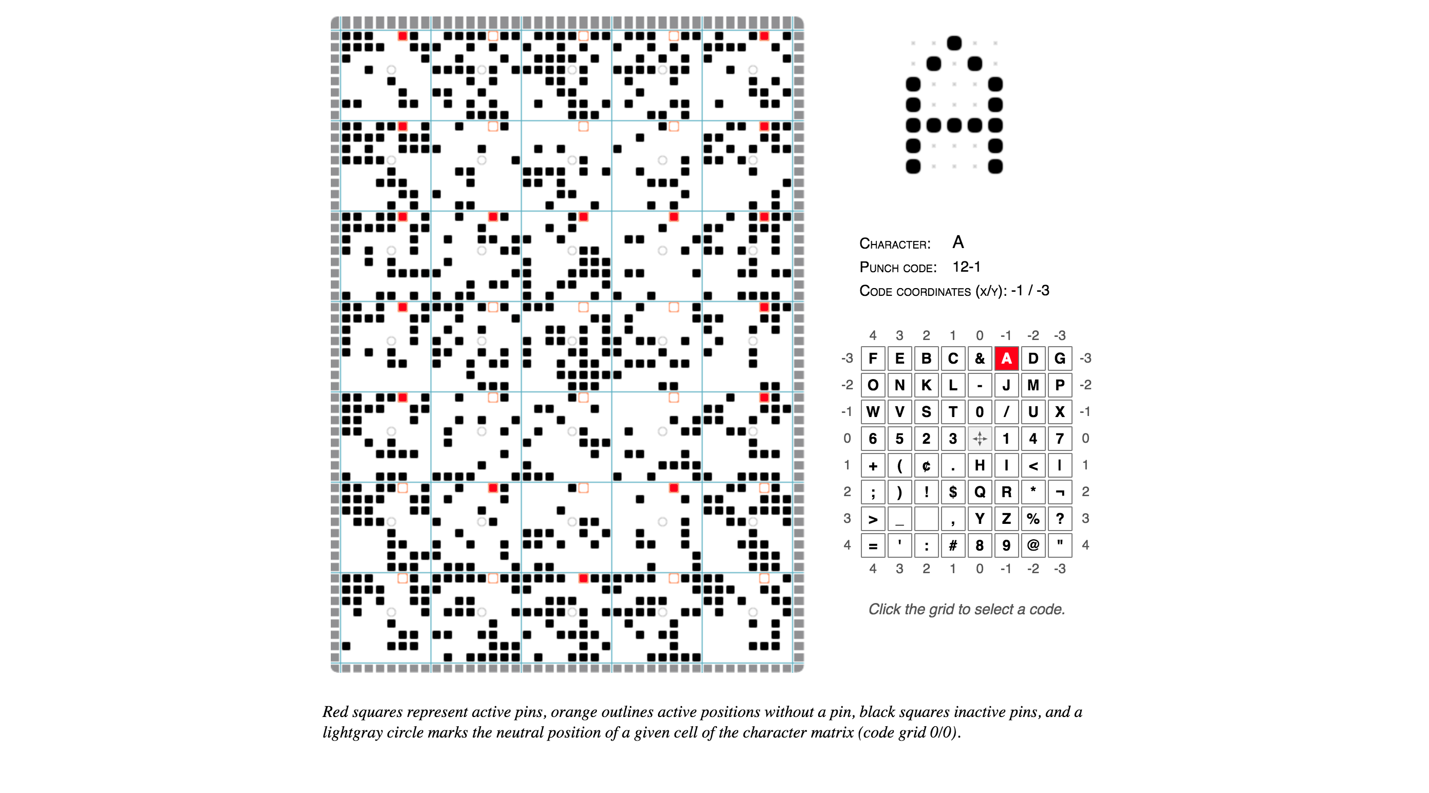
Norbert Landsteiner wrote up a post about something that’s retro-technology-typography-nerdy beyond even my usual limits and understanding: a thorough explication and an interactive demo of how the late-1940s IBM 026 key punch (the typewriter keyboard/workstation machine that operators would use to poke the holes in the computer program punchcards of that era) was able to also print tiny human-readable letters and words at the top of the cards for easy reference.
Basically IBM encoded the alphabet and other special characters onto a clever postage stamp-sized print head that would run along the top of the punchcard, with wires to each “dot” enabling the printing of each encoded character in turn, effectively an early dot-matrix printer. (it’s not easy to see, but if you squint at the image you’ll see that the red dots form the “A” character, upside-down — you’ll see it more easily if you play with the demo and choose other characters)
-
We will see Landscapes
’We will see… landscapes,’ they announced, ‘in which the trees bow to the whims of the wind, the leaves ripple and glitter in the rays of the sun.’ Along with the familiar photographic leitmotif of the leaves, such kindred subjects as undulating waves, moving clouds, and changing facial expressions ranked high in early prophesies. All of them conveyed the longing for an instrument which would capture the slightest incidents of the world about us.
Film theorist Siegfried Kracauer writing about the dreams of photography pioneers Henry Cook and Gaetano Bonnelli, who in the 1860s invented a device called a photobioscope that combined stereoscope + zoetrope effects to show primitive short “3D” “movie” loops. It’s interesting to think about the decades in which photography was new and exploding in use, but it couldn’t capture the essence of normal day-to-day movement due to the long exposure times.
We’re still chasing those dreams, 150 years later.
(Via this excellent Bright Wall / Dark Room essay on Totoro)
-
Towards a True Children’s Cinema: on ‘My Neighbor Totoro’
This is an excellent essay on Miyazaki’s / Studio Ghibli’s place in the canon of art cinema, the nature of “boredom” in the life of children, and how cinematic experiences can be so much more for children than our U.S. blockbusters lead us to believe.
When Roger Ebert asked Miyazaki about the “gratuitous motion” in his films—the bits of realist texture, like sighs and gestures—Miyazaki told Ebert that he was invoking the Japanese concept of “ma.” Miyazaki clapped three times, and then said, “The time in between my clapping is ma.” This calls to mind the concept of temps morts, or dead time, in the European art cinema of the 1960s. Temps morts is a pause, a beat, a breath, a moment that doesn’t advance the plot. But far from being dead, Miyazaki’s moments of “ma” are full of life—there is a simple joy in watching his worlds move. In “animating”—breathing life into—a world that looks like our own, Miyazaki carries forward a spirit from the very beginning of film history.
This is one of the greatest descriptions of the power of animation that I’ve read in a long time, and something that you can see in all of the small moments of Miyazaki’s films.
On children and boredom:
But I think some of the common thinking about children’s boredom and attention is inaccurate. Children are bored standing in line at the bank or the post office, certainly—they have no banking of their own to do, no mail of their own to send. But if you were to put a child and an adult in an empty room full of scattered objects, I suspect the adult would grow bored much faster. […] A child can never exhaust the possibilities of a park or a neighborhood or a forest. Totoro is travel and transit and exploration, set against lush, evocative landscapes that seem to extend far beyond the frame.
Bonus: this essay is from an full Studio Ghibli issue of Bright Wall / Dark Room! I need to start reading this magazine.
-
Decovar: A multistyle decorative variable font by David Berlow

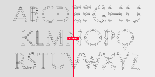
Speaking of newfangled OpenType variable fonts, this Decovar “modular parametric control display font” is a nice example: a typeface that has an absurd set of elements that you can control programmatically, essentially creating a “skeleton” typeface with a large spectrum of embellishments (the terminals, the strokes, the contours are all adjustable, but still looks good by blending together smoothly).
Typography might be undergoing a revolution in the next few years!
-
opentype.js

This is pretty cool: an OpenType parser written in JavaScript, enabling direct manipulation of a font’s letterforms and other typographical controls right in the browser (or node.js). I don’t think it would be used in production, but with type foundries cranking out OpenType variable fonts, it might be a fun playground / experimentation tool.
-
Creating photorealistic images with neural networks and a Gameboy Camera
Good news, owners of Gameboy Cameras! New technology will now up-res and almost accurately colorize those grainy low-res spinach photos.
Jokes aside, there are some pretty amazing things being done these days in the world of neural net-trained image enhancements. See also this crazy research on using Google Brain to reasonably “zoom! enhance!” photos as small as 8×8 pixels (we used to laugh at crime drama TV shows and their unbelievable photo techniques…but now it’s getting pretty close…)
