We all know grief now. We grieve the people we loved, but also the people we were before this pandemic began. If you’re old enough, you add it to the grief you’ve accrued over the years: for the children we were, the hopes we had, the people we longed to be. But if you’re lucky, the art that you need still finds you. It reminds you of who you are when you’ve forgotten, and gives you the power to imagine a life beyond this one. It lets you believe that what you’ve been robbed of will be found, that your home will come alive.
The New York Times has posted a lovely analysis of my favorite woodblock print by Hokusai, “Ejiri in Suruga Province” (circa 1830, from his “Thirty-Six Views of Mt. Fuji” series), in which a sudden blast of wind is the invisible subject of the piece. Nature and landscape and social class and quotidian humor, all meeting together in a pivotal moment of art history where Dutch imports influenced the Edo-era artists whose own innovative works quickly influenced the French.
If it ever gets too bleak, just remember that Al Jaffee is still making the world a better place through his incredible (and bitingly funny) illustrations for Mad at age 96 (!!!).
I was making fun of the fold-outs you’d see in Playboy or National Geographic or Life Magazine. They had these big, fancy, full-color fold-outs. Well, at Mad we didn’t have that kind of budget. So I thought, wouldn’t it be funny to do the exact opposite? We’d do a cheap black-and-white fold in.
I love that the Fold-In started as another subversive bit of meta-humor about how “cheap” Mad magazine is.
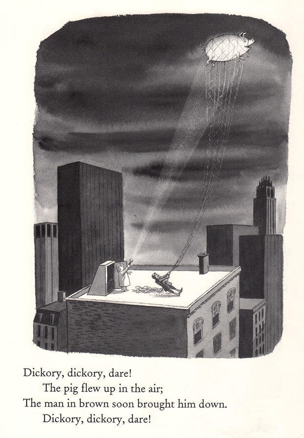
Maria Popova posts a wonderful selection of cartoons from Charles Addam’s lesser-known book of Mother Goose rhymes from 1967. Such good stuff, and fun to imagine the crossovers between the classic grim nursery rhymes and his own macabre sense of humor, juxtaposed with his mid-century New York City skylines and deadpan-faced characters.
“In A Descriptive Handbook of Modern Water Colours, by J. Scott Taylor…. London: Winsor and Newton, 1887, neutral tint is described as ‘A compound shadow colour of a cool neutral character. It is not very permanent, as the gray is apt to become grey by exposure’. Has anyone besides this author ever made a distinction of meaning between gray and grey? I do not know how the distinction is to be converted in speaking unless the words are differently pronounced” (1897).
Glad to know that the gray / grey split in English has been confusing people for well over 115 years. What’s going on in pigment company Winsor & Newton’s world where gray turns into grey eventually? An interesting read about the etymology of the mysterious color and it’s uncertain linguistic origins.
I kept creating them, hoping I’d hit pay dirt. But I never showed them to anybody, so it was an exercise in stupidity. At least they’ll look good at Columbia.
I’ve learned you have to be careful when you get lost in an idea. As an artist, you have to get a little lost. Otherwise you won’t discover anything interesting. But you have to avoid getting so lost that you’re unable to walk away and keep exploring.
As an art person I’ve enjoyed a good amount of time around lithography and other drawing media, and now I’m engaged to a children’s book illustrator who largely works in watercolor, so I’ve spent a fair amount of time at art supply shops buying paper. One thing has bugged me for years about our fine rag paper purchases, though: what’s up with the “BFK” in “Rives Arches BFK”? I’ve asked professors, professional printers, other artists, and even the Internet, with no great leads, but I finally coaxed the answer out of Google today. From The Albumen & Salted Paper Book: The history and practice of photographic printing, 1840-1895:
It is no wonder that only two paper mills in the world managed to consistently produce a paper of the necessary quality, and these two mills were able to maintain their monopoly from the 1860’s until approximately World War I. They were the above-mentioned Blanchet Frères et Klébler Co. in Rives, France (hence their product was known as the “Rives” paper) and Steinbach and Company, located in Malmedy, Belgium (at that time part of Germany). Steinbach paper was known outside Germany as “Saxe” paper.
The product that established their paper monopoly (duopoly?) — the exploding new field of photography! More to the point, 3D stereography, the Victorian postcard origin of a Tumblr meme:
In the late 1850’s and especially after 1860, two new factors in photographic technology and practice generated a great demand for albumen paper. The first of these was the stereograph; its ability to transport the viewer to distant scenes with the illusion of three-dimensional reality depended largely on the smooth surface and fine detail of albumen paper. Stereo views were extremely popular, and created a corresponding demand for albumen paper. Nearly all stereo views before 1890 were made on albumen paper.
Every man needs aesthetic ghosts in order to live. I have pursued them, sought them, hunted them down. I have experienced many forms of anxiety, many forms of hell. I have known fear and terrible solitude, the false friendship of tranquilizers and drugs, the prison of depression and mental homes. I emerged from all that one day, dazzled but sober. … I did not choose this fatal lineage, yet it is what allowed me to rise up in the heaven of artistic creation, frequent what Rimbaud called “the makers of fire,” find myself, and understand that the most important encounter in life is the encounter with one’s self.
Gold, an acrylic + light sculpture by Evan Roth of the Graffiti Research Lab, capturing the marker movement of Jean-Michel Basquiat’s handwriting. The way the projected light spirals through the acrylic is beautiful!
The lives of artists are more fragile than their creations. The poet Ovid was exiled by Augustus to a little hell-hole on the Black Sea called Tomis, but his poetry has outlasted the Roman Empire. Osip Mandelstam died in a Stalinist work camp, but his poetry has outlived the Soviet Union. Federico García Lorca was killed by the thugs of Spain’s Generalissimo Francisco Franco, but his poetry has survived that tyrannical regime.
We can perhaps bet on art to win over tyrants. It is the world’s artists, particularly those courageous enough to stand up against authoritarianism, for whom we need to be concerned, and for whose safety we must fight.
Arthouse, the 100-year-old Austin-based organization I’ve been proud to support since the days when it was still called the Texas Fine Arts Association, is beginning to show signs of fracture, despite their beautiful new façade. You can get the bigger story over at Austin360 if you’ve missed it in the news, but to summarize: exhibited art has been mishandled and censored, their admired and successful curator was fired abruptly (possibly after having written a letter of concern to the director about the above-mentioned mishandling), and some of their prominent board members and staff members have resigned in protest. There’s also a growing collective voice of concern by the artists who were to be contributing work to the upcoming 5×7 fundraising show (myself included). So far, apart from short responses directly to inquiring reporters, I don’t believe that Arthouse has issued a statement on the matter, which isn’t especially good PR in my humble opinion.
Eric Zimmerman has a nice summary of the concerns on his cablegram blog:
No one would argue against a new building, or at very least a renovation. But when you dump truckloads of cash into a designer building and neglect to budget for a curator, the person who puts the actual art in the Arthouse, there seems to be some serious priority issues. I said it before, a building is nice and all, but what you show in that building is where the rubber meets the road. I’d love to see art organizations forgo the starchitect buldings and put money into paying artists, curators, and their staff instead.
For the curatorial angle (or perhaps, the “lack of curator”), you might be interested in Wendy Vogel’s take over on …might be good.
Here’s to hoping that Arthouse can steer itself back on track as the leading space for contemporary art in Austin.
The principal factor in my success has been an absolute desire to draw constantly. I never decided to be an artist. Simply, I could not stop myself from drawing. I drew for my own pleasure. I never wanted to know whether or not someone liked my drawings. I drew on walls, the school blackboard, old bits of paper, the walls of barns. Today I’m still as fond of drawing as when I was a kid — and that’s a long time ago…
How this unprepossessing peak got its name is the subject of Teresa Hubbard and Alexander Birchler’s beautifully made two-screen, high-definition video “Méliès.” To the sound of melancholy piano music, the 24-minute film interweaves panoramic landscapes and interviews with local people who vaguely recall that someone shot a silent movie, a western, on or near Movie Mountain early in the 20th century. No one is quite sure who made that early film, but two of the interviewees say they had relatives who were employed as extras. The artists conclude that Gaston Méliès, brother of the cinema pioneer Georges Méliès, made that lost movie around 1910 or 1911 during a stopover in Sierra Blanca while relocating to California from San Antonio. […] The meandering, understated emergence of cinematic fact and fiction is captivating to watch.
“Tarantella” is a five-minute color, avant-garde short film created by Mary Ellen Bute, a pioneer of visual music and electronic art in experimental cinema. With piano accompaniment by Edwin Gershefsky, “Tarantella” features rich reds and blues that Bute uses to signify a lighter mood, while her syncopated spirals, shards, lines and squiggles dance exuberantly to Gershefsky’s modern beat. Bute produced more than a dozen short films between the 1930s and the 1950s and once described herself as a “designer of kinetic abstractions” who sought to “bring to the eyes a combination of visual forms unfolding with the … rhythmic cadences of music.” Bute’s work influenced many other filmmakers working with abstract animation during the ‘30s and ‘40s, and with experimental electronic imagery in the ‘50s.
Bute’s final piece was an interpretation of Finnegans Wake, one of the very few attempts ever made at staging Joyce’s novel of troubled dreams.
One time my son had a friend over. I heard the friend say in a stage whisper, “Does your dad have a job?” No, my son replied. “He just stays home and draws dinosaurs all day.”
A copious plate of pasta arrived, with no sauce. Teller suddenly stabbed his palms with a fork and rummaged through the strands of linguine. When a bright red river surged from beneath the plain pasta, Teller stood up, dripping red palms outstretched. Voila! The thrillingly gruesome “Linguine a la Stigmata.” Waiters smiled, diners at nearby tables didn’t notice a thing, and the linguine was served to one and all. …
“Violence is what gives you real excitement,” [Penn] continued. “It’s what gives us the rage to live. Without violence, you don’t really have art. You have to have your Shakespeare, your Greek tragedies. Teller and I are both very pro-violence in the arts, but only in the arts. No one wants to go on a roller coaster that’s slow and flat.”
But does that include sticking a fork into your eye? Absolutely. “Nothing is more life affirming than doing this stuff and not being hurt,” Teller said. “It’s cool to be startled. You laugh, and that’s a social activity. There are repartees, and there is ramming a fork into your eye.”
They didn’t think it was relevant. In their minds, we were working on computer-generated images—and for them, what was a computer-generated image? What was an image they saw on a CRT? It was television.
Megana-ya (Seller of Eyeglasses), by Hokusai, circa 1811-1814, part of a incredibly great collection of health-related Japanese woodblock prints housed at the University of California, San Francisco. Having recently bought a new pair of glasses, I can relate.
An art world / comics story I hadn’t heard before: in November of 1978, a Peanuts strip ran in which Snoopy expresses his love for Christo and Jeanne-Claude’s ephemeral environmental installations. 25 years later the artists responded by presenting the Charles Schulz Museum with an actual reconstruction of Wrapped Snoopy House.
(Image above from Landfall Press, where you can buy a litho of the artists’ working collage for this piece)
UPDATE: there’s a nearly identical post over at Dinosaurs and Robots, dated almost exactly 24 hours before this post. I’d honestly not seen that when I posted this, so there must be something freaky going on in the collective unconscious…
Akira Kurosawa’s Dreams (夢,Yume): a mostly quiet, artful film with eight short vignettes (five dreams and three nightmares) reflecting the remembered dreams of the director throughout his lifetime. Despite the segments being separate, discontinuous stories, I enjoyed their shared abstract sense of looking for something, a great dream motif. Unfortunately the quality of the pieces vary, but the ones that are good border on the sublime. In some ways they remind me of animated versions of Jeff Wall’s artifically-constructed photographs (but maybe I’m just conflating this film’s first nightmare with Wall’s Dead Troops Talk).
Like many of his other later movies, Kurosawa had difficulty getting this film financed by the Japanese studios, but a script sent to Steven Spielberg helped secure money from Warner Bros. Interestingly, the visual effects in the movie (including a walking-through-an-oil-painting sequence later echoed in What Dreams May Come) were supervised by Ken Ralston of Industrial Light and Magic (of Star Wars and Back to the Future fame), and there’s a cameo by Martin Scorsese as Vincent van Gogh, so despite the traditional Japanese cultural elements, there’s definitely a Western tinge to this one.
From David Cyranoski’s review of the Sensing Nature exhibition at the Tokyo Mori Art Museum:
The merging of nature and human activity harks back to earlier Japanese tradition, according to art historian Toshio Watanabe of the University of the Arts in London, who is lecturing at the gallery. The famed woodblock landscapes of Japan usually depict human endeavour coexisting with nature — unlike Western art, in which nature is an awesome, sublime force that often excludes or overpowers humans. Even in Hokusai’s famous 1832 painting The Great Wave off Kanagawa, Watanabe explains, the people don’t look panicked and no boats are overturned: “The picture is as much about the energy of the boatmen as the waves.”
Above video from the show: Snow, an interactive installation of feathers created by Yoshioka Tokujin.
Computational image processing researchers at Northwestern University teamed up with art historians from the Art Institute of Chicago to investigate the colors originally laid down by Matisse while he was working on Bathers by a River:
Researchers at Northwestern University used information about Matisse’s prior works, as well as color information from test samples of the work itself, to help colorize a 1913 black-and-white photo of the work in progress. Matisse began work on Bathers in 1909 and unveiled the painting in 1917.
In this way, they learned what the work looked like midway through its completion. “Matisse tamped down earlier layers of pinks, greens, and blues into a somber palette of mottled grays punctuated with some pinks and greens,” says Sotirios A. Tsaftaris, a professor of electrical engineering and computer science at Northwestern. That insight helps support research that Matisse began the work as an upbeat pastoral piece but changed it to reflect the graver national mood brought on by World War I.
The Art Institute has up a nice mini-site about Bathers and the accompanying research, including some great overlays on top of the old photos to show the various states the painting went through during the years of its creation.
Ancient pigment history is fascinating. From dried beetles (carmine) to sea snails (Tyrian purple) to ground up human and feline mummies (the rather uncreatively-named Mummy brown), colors come from some weird places. I’d heard of Maya Blue before, but didn’t realize that it’s more of a process rather than a specific mineral pigment. The color was made by intercalating indigo (añil) into fine clay over continuous heat. The slow fusing with clay made the paint exceptionally resistant to weather and acidic conditions (and even modern solvents), and the process wasn’t fully understood / rediscovered until a few years ago. Cooking it up may have been ritualistic, as the incense copal was often burned in the same bowls. The color was important in sacrifice rituals as well: when the Sacred Cenote of Chichen Itza was dredged back in 1904, a a layer of blue silt 14-feet-thick was found at the bottom (sensationalism aside, the silt was likely more from all of the blue-painted pots tossed in than the blue-painted people…I hope).
The researchers knew that the Mayans made their blue by heating the pigment with palygorskite (a type of clay); their analysis showed that this heating allowed the pigment to enter tiny channels in the clay which are sealed after the mixture cools, protecting and keeping the pigment true blue for centuries.
L’Artisan Electronique, an openFrameworks-powered “virtual pottery wheel”. Users can deform the cylinder geometry by waving their hand between the lasers and then print a physical copy of their piece using an attached RepRap machine.
Over the past years, I’ve watched bakeries, luncheonettes, cobbler shops and much more come tumbling down at an alarming rate, making space for condos and office towers. Now the discovery that the “Nighthawks” diner never existed, except as a collage inside Hopper’s imagination, feels like yet another terrible demolition, though no bricks have fallen.
It seems the longer you live in New York, the more you love a city that has vanished. For those of us well versed in the art of loving what is lost, it’s an easy leap to missing something that was never really there.
To me, it’s quite the opposite: Hopper was delivering to us an entire city’s electric nightlife collapsed into one tidy, incredibly lonely painting, and that is far more interesting than any image of a specific, real diner. Why mourn the non-existence of a restaurant when the sadness and predation that Hopper reflects in us still exists in every large city, at no risk of demolition?
In the winter of 1511, Michelangelo entered the final stages of the Sistine Chapel project and painted 4 frescoes along the longitudinal apex of the vault, which completed a series of 9 central panels depicting scenes from the Book of Genesis. It is reported that Michelangelo concealed an image of the brain in the first of these last 4 panels, namely, the Creation of Adam. Here we present evidence that he concealed another neuronanatomic structure in the final panel of this series, the Separation of Light From Darkness, specifically a ventral view of the brainstem.
Could be pareidolia, but given Michelangelo’s breakthroughs in anatomical rendering and that God is depicted here with a rather non-standard bearded neck, who knows?
Tangible Interaction’s Tangible Graffiti Wall. Rear projection drawing screens with IR “spraycan” interface. The cherry on top is the ability to use virtual stencils while painting – clever.
And as she lost consciousness of outer things, and her name and her personality and her appearance, and whether Mr. Carmichael was there or not, her mind kept throwing up from its depths, scenes, and names, and sayings, and memories and ideas, like a fountain spurting over that glaring, hideously difficult white space, while she modelled it with greens and blues.
Whenever humans design and make a useful thing they invariably expend a good deal of unnecessary and easily avoidable work on it which contributes nothing to its usefulness. Look, for instance, at the ceiling. It is flat. It would have been easier not to have made it flat. Its being flat does not make you any warmer or the room about you any quieter, nor yet does it make the house any cheaper; far from it. Since there is a snobbism in these things flattening a ceiling is called workmanship, or mere craftsmanship; while painting gods on it or putting knobs on it is called art or design. But all these activities: ‘workmanship,’ ‘design for appearance,’ ‘decoration,’ ‘ornament,’ ‘applied art,’ ‘embellishment,’ or what you will are part of the same pattern of behavior which all men at all times and places have followed: doing useless work on useful things. If we did not behave after this pattern our life would indeed by poor, nasty and brutish.
Animator Patrick Smith offers advice over on Scribble Junkies about drawing hands, an area of life drawing I still struggle with. He rails against both Preston Blair and Burne Hogarth’s popular treatises, and I’d have to agree with him there (I think the Hogarth “dynamic” books stunted my artistic abilities and understanding of anatomy by a few years, personally…).
One of the responses in the comments section rings true: “The drawings of hands you admire were probably drawn by people who looked at hands, not drawings of drawings of hands.”
If you’re the sort of lab that’s engineering a method of printing ceramic materials using rapid prototyping machines, I suppose it’d make sense that you’d already have made some real-life polygonal Utah teapots! I never thought about it before, but for the 3D graphics humor value I really, really want one of these now. You can read about the Utanalog project and see finished photos (and a video explaining the whole thing) over on the Unfold blog.
The New York Times has up a nice review of the new Charles Addams exhibit at the Museum of the City of New York:
The city street is dark and deserted. The buildings are empty. There are no witnesses. A lone man carrying a briefcase, after a long day at the office perhaps, approaches a subway staircase. Out of the subterranean gloom, a giant human hand protrudes, its index finger beckoning the office worker, inviting him into the depths. His eyes are wide with astonishment, his face showing the hint of a grin, as if the bizarre, illicit invitation were not entirely unwelcome. […]
Above is my personal favorite Addams cartoon, perhaps one of my favorite cartoons of all time. His drawings are often cited as finding their humor and inspiration in the macabre — I think their lasting appeal comes more from his ability to find joy in laughing at and rejecting the bleakness of modern life.
I’ve seen artists on the Internet question the necessity for this, saying that you can’t really learn anything about drawing by carrying a sketchbook, and that the drawings you do in a sketchbook are always dashed off, careless and sloppy. […]
The real reason I carry a sketchbook is so that I can record and remember details that I observe. Drawing from real life is the best way to teach yourself how people look, act and move in a naturalistic way (and help you remember it later). Life drawing and studying the work of other artists and animators are great learning experiences, but those things aren’t the same as studying real life. A great life drawing is an amazing feat and you can learn a lot about drawing and anatomy by going to life drawing. But very few life drawings give you a lot of information about the model’s personality and what kind of human being they are. You’re never going to create an original story or character based on a life drawing model you saw.
From a good piece in this month’s Vanity Fair, “Coloring the Kingdom”, about the often-unsung Ink and Paint “girls” that cranked out most of the hand painting for Disney’s early feature days:
The end of the assembly line usually inherits all the problems. Preparing the animators’ vision for camera required the inking and painting of thousands of fragile, combustible cels with perfect refinement. During Snow White, it was not at all unusual to see the “girls”—as Walt paternalistically referred to them—thin and exhausted, collapsed on the lawn, in the ladies’ lounge, or even under their desks. “I’ll be so thankful when Snow White is finished and I can live like a human once again,” Rae wrote after she recorded 85 hours in a week. “We would work like little slaves and everybody would go to sleep wherever they were,” said inker Jeanne Lee Keil, one of two left-handers in the department who had to learn everything backward. “I saw the moon rise, sun rise, moon rise, sun rise.” Painter Grace Godino, who would go on to become Rita Hayworth’s studio double, also remembered the long days merging into nights: “When I’d take my clothes off, I’d be in the closet, and I couldn’t figure it out: am I going to sleep or am I getting up?”
Visions of the Amen, a voice-responsive kinetic sculpture by artist Mitchell Chan (demonstrated in this video by soprano Ashleigh Semkiw). The software is written in Processing, the hardware is controlled by the ArtBus interface being developed at the School of the Art Institute of Chicago. Kind of like a real-world oscilloscope.
John Balestrieri is tinkering with generative painting algorithms, trying to produce a better automated “photo -> painting” approach. You can see his works in progress on his tinrocket Flickr stream. (Yes, there are existing Photoshop / Painter filters that do similar things, but this one aims to be closer to making human-like decisions, and no, this isn’t in any way suggestive that machine-generated renderings will replace human artists – didn’t we already get over that in the age of photography?)
Whatever the utility, trying to understand the human hand in art through code is a good way to learn a lot about color theory, construction, and visual perception.
Michael Vorfeld’s Glühlampenmusik, creating music through the sound of incandescent filaments popping on and off. The percussion of light and electric resistance.
This presents an interesting problem. Caricature has never been taken as seriously as realism. The history of Western art, with the exception of the dark ages and the 20th century, has always been derived from realism, and the art of the dark ages probably had more to do with the loss of knowledge and craft than with a conscious artistic choice. Caricature might be seen as clever, but except for artists, nobody values caricature as more than a lightweight diversion. Disney moved more towards illustration when he went into features. The all-cgi features have pushed their visuals towards greater complexity (which sometimes clashes with their character designs). Video games have also gravitated towards realism. I believe that this has been motivated by a desire to be taken more seriously by getting closer to what Western eyes value in art.
My camera switches over to portrait-mode whenever it sees a painting or a drawing with a face in it. It stays in AUTO mode otherwise.
According to Popular Mechanics: “a chip inside the camera constantly scans the image in its viewfinder for two eyes, a nose, ears and a chin, making out up to 10 faces at a time before you’ve hit the shutter.”
I decided to test my camera—it’s a Canon Powershot SX120—to see what it decides to regard as a face.
Artist James Gurney tests out his point-and-shoot’s facial recognition chip against works of art and illustration. A mixed bag, but a good reminder that this technology is getting better and cheaper (and subtle) all the time.
A Parallel Image, an installation by Gebhard Sengmüller in collaboration with Franz Büchinger, consisting of an array of sensors, 2500 wires, and small light bulbs to make an “electronic camera obscura” for lo-fi video transmission.
One of the artist’s desires is to give an account of reality and at the same time to protect it against oblivion and death, and this effort is bound to fail; failure is there from the beginning. For example, Giacometti knows that he cannot grasp life: he will do his brother’s bust and his wife’s portrait again and again without ever achieving his aim, but this explicit failure is part of the beauty of his work.
FluidPaint: An Interactive Digital Painting System using Real Wet Brushes. An experimental project by Tom Van Laerhoven of the Hasselt University Expertise Centre for Digital Media in Belgium. Unlike previous digital painting applications, this one uses actual water (detected by a surface-level IR emitter) to record strokes on the surface and more correctly models the tip of the brush being used, whether rounded or fanned, and it can even simulate a sponge. Looks like it makes some convincing watercolor-like images.
The Rotating Kitchen, an installation by Zeger Reyers that was put into motion at the Kunsthalle Düsseldorf late last month, where it will keep rotating for the next three months. Hypnotic, like an inside-out katamari.
The poor image is a copy in motion. Its quality is bad, its resolution substandard. As it accelerates, it deteriorates. It is a ghost of an image, a preview, a thumbnail, an errant idea, an itinerant image distributed for free, squeezed through slow digital connections, compressed, reproduced, ripped, remixed, as well as copied and pasted into other channels of distribution.
[…]
At present, there are at least twenty torrents of Chris Marker’s film essays available online. If you want a retrospective, you can have it. But the economy of poor images is about more than just downloads: you can keep the files, watch them again, even reedit or improve them if you think it necessary. And the results circulate. Blurred AVI files of half-forgotten masterpieces are exchanged on semi-secret P2P platforms. Clandestine cell-phone videos smuggled out of museums are broadcast on YouTube. DVDs of artists’ viewing copies are bartered.3 Many works of avant-garde, essayistic, and non-commercial cinema have been resurrected as poor images. Whether they like it or not.
A ‘conversational’ collection of academic theory and discourse on arts, aesthetics, architecture (along with other non-alliterative disicipines), a user-contributed journal. Who needs grad school?
Dreaming the Industrial Body. I’m not sure that I’m following the info that they’re trying to convey about the sun’s effects on our bodies, but it’s definitely an eye-catching image as far as medical literature goes. From Der mensch gesund und krank [The Healthy and Sick Human], menschenkunde 1940 … . Vol. 2, displayed as part of the National Library of Medicine’s Dream Anatomy exhibit. Speaking of which, check out their cool children’s art page!
A dog, a cyclops, and others kill some time with the help of wormholes and hobbyist self-modification. Made in 2008.
Pellet Gunn by Tim Beckhardt. Not 100% sure that I get the full story, but it’s great in a non sequitur, underground comix sort of way. His line work and hand-filled blacks are nicely composed, and the animation is fun. Extra points for the Philip Guston painting in the background.
Interactive Audio Visual installation for
Mekanism’s “After School Special” art show
location: gray area foundation for the arts http://www.gaffta.org/
How did reclusive monks living in the year 700 or 800 AD draw the intricate lines of the Book of Kells, rendered by hand at sub-millimeter resolution (about the same level of detail as the engraving work found on modern money), hundreds of years before optical instruments became available, hundreds of years before the pioneering visual research of Alhazen? According to Cornell paleontologist John Cisne’s theory, their trick was in the detail and pattern: by keeping their eyes unfocused on the picture plane, the monks could superimpose their linework and judge the accuracy against the template using a form of temporary binocular diplopia (sort of like willing yourself to view a stereograph or one of those Magic Eye posters).
“You see how the smoke trembles up in the roof holes? As if whimpering and afraid? Yet it’s only going out into the open air, where it has the whole sky to tumble about in. But it doesn’t know that. So it cowers and trembles under the sooty ridge of the roof. People are the same way. They worry and tremble like leaves in a storm because of what they know, and what they don’t know.” — from Ingmar Bergman’s The Virgin Spring
Death has long been a savvy financial move in the visual arts: it guarantees that the supply of new works has come to an end, conferring scarcity value upon the existing oeuvre. For an artist it is better to die old, however. Death can reduce the value of young artists by taking them from the market before immortality is assured.
Rad, there’s an online ANSI art generator! Relive the glory days of BBSes and dodgy w4r3z nfo files right in your browser. I remember wasting a lot of time back in junior high making colorful DOS menus using ansi.sys and batch files. Better than launching Windows 3.1!
Check it out, make some art: ansi.drastic.net (The drawing program seems to be broken for me under Firefox 3.5.1, but your mileage may vary)
I’d been wondering what those thinly-etched or embossed porcelain “hidden images” found on antique plates and teacups were called: lithophanes. Artists would carve molds for them using warm wax over a glass plate, with a mirror to reflect light from a window underneath so they could get a preview of their work. A translucent bas relief, with the subtle grisaille quality of a lithograph.
A short clip from Double Take, a film by media artist Johan Grimonprez (there are a handful of other clips on YouTube). “They say that if you meet your double, you should kill him.” Hitchcock versus Hitchcock versus the Cold War, with cinematic history folding in on itself. There’s a worthwhile interview with Grimonprez over on the Cinema Scope website with more info.
The science journal Nature reviews the new book Inventing Futurism: The Art and Politics of Artificial Optimism by Christine Poggi. The review itself is a decent synopsis of the Futurist movement in art and literature and the role that modern technology played in shaping European political thought in the early 20th Century. (Note: the Italian Futurist utopian dream devolved rapidly into the very frightening march of fascism, and would eventually become our model for Blade Runner-style sci-fi dystopia…not something to idealize, but worth learning a lesson from)
The Futurists imagined a world governed by electricity. Their electrical fantasies, writes Poggi, take a Utopian turn in their vision and evolve into an orgy of violence. They saw Italy as being “fertilized” by electricity, banishing hunger, poverty, disease and work. Air temperature and ventilation would be controlled automatically, telephones would be wireless, and crops and forests would spring up at speed. But in this world of ease and plenty, fierce competition would arise over superabundant industrial production. War would break out, fought by “small mechanics” whose flesh resembled steel. Deploying “steel elephants” and battery-powered trains from afar, they would wage a thrilling interplanetary war.
William Hogarth’s final engraving, a self-satirical illustration of the end of time, parodizing the bathetic imagery in his contemporaries’ works. I admire a guy who can go out on a bit of pessimist humor. (see also this explication of the print)
Looking at the stars always makes me dream, as simply as I dream over the black dots representing towns and villages on a map. Why? I ask myself, shouldn’t the shining dots of the sky be as accessible as the black dots on the map of France? Just as we take a train to get to Tarascon or Rouen, we take death to reach a star. We cannot get to a star while we are alive any more than we can take the train when we are dead. So to me it seems possible that cholera, tuberculosis and cancer are the celestial means of locomotion. Just as steamboats, buses and railways are the terrestrial means. To die quietly of old age, would be to go there on foot.
Revolver, a brilliant series of short looping animations by Jonas Odell (codirected with Stig Bergkvist, Marti Ekstrand & Lars Olsson). I loved these when they ran serialized in the early days of Hotwired.com’s Renaissance 2.0 / Kino section, circa 1995, and hastily squirreled away all of the QuickTime .mov’s from the site for archiving. Benefit of having the .mov’s? You could have all of them open and playing simultaneously!
I love Edo-era art and cartooning. Hard to imagine doing this with a woodblock! Image found on the always-great BibliOdyssey, also available on Flickr.
DB: We used to say “pirating.” I mean, the term pirating was used for my early work.
CA: Was it really?
DB: Yeah. For example, when I started, there were no home-recording units. There was no TiVo. There was nothing like that.
CA: I must have been very difficult for you to get that footage.
DB: It was. There was no way to get the footage I needed directly. I had to find people inside the industry who believed in my artwork and were willing to get images out to me. So they called me a “pirateer” of imagery. That had a very romantic sound to it: “Oh, she’s the one who pirated imagery from television.”
Maybe this is the real difference between our generations. In pirating, originally, there was no way to talk back to the media. That’s why I did it. The stuff was coming one way at you, and there was no way to arrest it, stop the action, divert it, alter the vocabulary, or change the syntax.
Certainly, knowledge comes from traditional sources, such as school and books, but it also comes from non-traditional sources like experiences and conversations. Personally, I’m fond of the immersion technique when it comes to learning.
[…]
I think one of the most important things that my career path has taught me is that it is it very important to respect all kinds of art, whether I like it or not. It is not the difference between good or bad art, it is that art comes in different forms and qualities. I like to think of art as a document or reflection of our time. The more able an artist is to make a clear statement, the more lasting it will become. Artists often project ideas on a piece of work, but I think a work’s impact is stronger when a artist can project a broader conceptual belief.
[…]
It takes a second act to understand the first. My interest in art, architecture and music are all constantly informing my work. It is about submerging yourself in something you believe in. I guess the main function of a first act is to flush out ideas – to experiment and refine wheat I think my work should be. A second act allows for self-imposed rules and regulations. It gives me the ability to say no to ideas that are not genuine and complete. I often think of the legendary story of Johnny Cash walking into Sun Studio to record gospel songs. Sam Phillips told him to “go out and sin a little and then come back.” He came back “experienced” and became a legend.
Pioneer of medical instruments, photography, and cinema. Took some very interesting early photographs in his research of animal locomotion and physionomy, which led to his successor Muybridge’s famous collections of plates.
IN COLLEGE, I focused on printmaking. A lot of my work is actually a kind of reaction to printmakers. They’re territorial and they don’t understand art the same way I do. They look at it pictorially and miss the essence of what they do, which lies in the technical process – using specific chemicals and materials and pressing them together. You can control that in certain ways; you can do things graphically and physically that are worth doing as an artist. Printmaking is an easy way to get going. It’s procedural. It’s like the process of a singer warming up, preparing, thinking; that’s how Keith Richards writes songs, in the process of tuning his guitar. I’ll sit here and paint any number of silk screens. They change as I print. The ink falls out and some more comes through and so on, as I use it again.
[Slot machines] are indeed a software chimera, the tail of a serpent attached to the head of a lion. It combines business graphics with the Internet, cinematic memory, remote-control systems – and banking, franchise capitalism at your fingertips.
Museums would map the transition toward this new Baroque, like the new Guggenheims in Las Vegas, as part of a franchise that has stopped growing in the U.S. Museums were also under the gun. Very likely, shows will look more like Baroque wunderkammers than they used to. They will overlap and sprawl more, like browsers and search engines. The pressures to make shows monumentalize the new power relations will be intense, an often under shrinking curatorial budges, with signature buildings outside, like the Electronic Baroque: gaudy outside, conservative at its core.
[…] Gothic revivals polish decay, until it turns into special effects. Ultimately, they retrofit the haunted house until it looks as if no one has moved in yet.
Suspicious as a generator of disquiet may be found in certain contemporary paintings when a simple house, seen in an ambiguous light, and isolated against the landscape, becomes haunted and takes on a threatening and malign air […] The Kafka of The Trial was a master of suspicioun, but sometimes (as in Metamorphosis) what is uncanny is not so much the horror that is shown and described 9a man wakes up to find he has been transformed into a disgusting insect), but the fact that his family take the event as embarrassing yet entirely natural, and we suspect that the story is really talking about our acquiescence in the face of the evil that surrounds us.
‘Can you explain to me why, when we defecate, we often examine our excrement?’ Aesop explained: 'In olden days there was a king’s son who, because of his life of luxury, spent most of his time sitting and shitting. Once he remained seated thus so long that, having forgotten what he was doing, he shat his own common sense. From that day forward, men shit hunched over, being careful not to crap away their own common sense. But don’t you worry: you can’t shit something you don’t possess!’
And to Thee nothing is whatsoever evil: yea, not only to Thee, but also to Thy creation as a whole, because there is nothing without, which may break in, and corrupt that order which Thou hast appointed it. But in the parts thereof some things, because unharmonising with other some, are accounted evil: whereas those ver things harmonise with others, and are good; and in themselves are good. And all these things which harmonise not together, do yet with the inferior part, which we call Earth, having its own cloudy and windy sky harmonising with it. Far be it then that I should say, ‘These things should not be’: for indeed long for the better; but still must even for these alone praise Thee; for that Thou are to be praised , do show from the earth, dragons, and all deeps, fire, hail, snow, ice, and stormy wind, which fulfil Thy word […]
The poets have utilized what are called solecisms and barbarisms; they have preferred, by changing the names, to call them figures and transformations, rather than avoid them as evident errors. Well, take them out of poetry, and we would miss the most melodious sweetness. Gather many together in a single composition, and it will vex me because all will be mawkish, pedantic, affected […] The order that governs and moderates such things would not tolerate their being too many, nor too few. A humble and almost disregarded discourse highlights elevated expressions and elegant movements, alternating between one and the other.
I was looking at Robert Frank’s photograph Sick of Goodby’s in his book The Lines of My Hand. Moments before I had been listening to a Johnny Cash song called I Wish I Was Crazy Again. Then I thought of the goodbyes in the book to old friends caught once and for all and never again to be seen in life, and I was struck by the intensity of the sadness of life and its redeeming qualities as reflected in these moving photos. With Johnny Cash as well, the desire to see it all again, to go out one more time into the wild flame only to be burned up forever and never be seen again except in these farewell photos, is moving beyond description. The photos speak of an acceptance of things as they are. the inevitable death of us all and the last photo – that last unposed shot to remind us of our friends, of our loss of the times we had in a past captured only on film in black and white. Frank has been there, and seen that, and recorded it with such subtlety that we only look in awe, our own hearts beating with the memories of lost partners and songs.
To wish for the crazy times one last time and freeze it in the memory of a camera is the least a great artist can do. Robert Frank is a great democrat. We’re all in these photos. Paint dripping from a mirror like blood. I’m sick of goodbyes. And aren’t we all, but it’s nice to see it said.
Every urban population believes in having it owns collective psychology. One can ridicule this belief, but it has produced a lot of poetry, music and cinema that we are accustomed to valuing. The volume of poems about Parisian air or St. Petersburg’s weather is a sufficient justification for their architecture. However, if we don’t speak about art that is stimulated by a city but about art in the public space, then one should be very careful. The chance that any really good artwork can go through all possible channels that evaluate it is minimal. And, in general, art that is exhibited outside of arts institutions has to additionally identify itself as art. That makes art shown in the public space even more conservative than art shown within the framework of institutions.
It is not important at all to me that you or anyone else should have this or that knowledge of anything written or recorded about my pictures of anyone else’s. It’s about experiencing the pictures, not understanding them. People now tend to think their experience of art is based in understanding the art, whereas in the past people in general understood the art and were maybe more freely able to absorb it intuitively. They understood it because it hadn’t yet separated itself off from the mainstream of culture the way modern art had to do. So I guess it is not surprising that, since that separation has occurred, people try to bridge it through understanding the oddness of the various new art forms. Cinema seems more of less still in the mainstream, as if it never had a ‘secession’ of modern or modernist artists against that mainstream. So people don’t trend to be so emphatic about understanding films, they tend to enjoy them and evaluate them: great, good, not so good, two thumbs up, etc. Although that can be perfunctory and dull, it may be a better form of response. Experience and evaluation – judgment – are richer responses than gestures of understanding or interpretations.
The street, in the extended sense of the word, is not only the arena of fleeting impressions and chance encounters but a place where the flow of life is bound to assert itself. Again, one will have to think mainly of the city street with its ever-moving crowds. The kaleidoscopic sights mingle with unidentified shapes and fragmentary visual complexes and cancel each other out, thereby preventing the onlooker from following up any of the innumerable suggestions they offer. What appeals to him are not so much sharp-contoured individuals engaged in this or that definable pursuit as loose throngs of sketch, completely indeterminate figures. Each has a story, yet the story is not given. Instead an incessant flow casts its spell over the flâneur, or even creates him. The flâneur is intoxicated with life in the street – life eternally dissolving the patterns which it is about to form. […]
Even though the fogged photograph is not in itself pure absence, but rather the eclipsing of an image, we know that what we are seeing is a representation that has been spoilt, a calamity that no technology can ever repair. The image is there, but hidden, ‘fogged’, conceled for ever by a curtain of shadow, which no one is capable of raising.