
Links and write-ups about beautiful things from around the web!
-
Monastic vs Scholastic Reading Habits
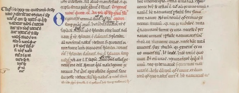
PETRUS LOMBARDUS, Sententiarum libri IV (no copyright) It’s interesting to know that the introduction of scholarly reading — needing to reference many different texts quickly for relevant snippets to quote from — led to changes in how text was laid out, with new features like section headings and passage markers (and those nifty typographic manicules) being added initially by readers as quick reference aides:
Amongst the medieval literate elite, there were two major methods of reading: monastic and scholastic, each divided into three ‘levels’. Monastic reading consisted of lectio / meditatio / contemplatio – that is: reading / meditation / contemplation. This method was primarily concerned with memorisation and enlightenment through repetition and deep reading (contemplation). To read this way was to know by memory and intimately understand a very few books in their entirety. […] Scholastic reading appears in the 13th century and proliferates in universities, growing in popularity throughout the late Middle Ages. It comprised of legere / disputare / praedicare, or: reading / discussing / presenting. The emphasis here was on a person’s capacity to read widely and to be able to pull choice quotes from important works to use in intellectual debates (disputatio) or lectures.
-
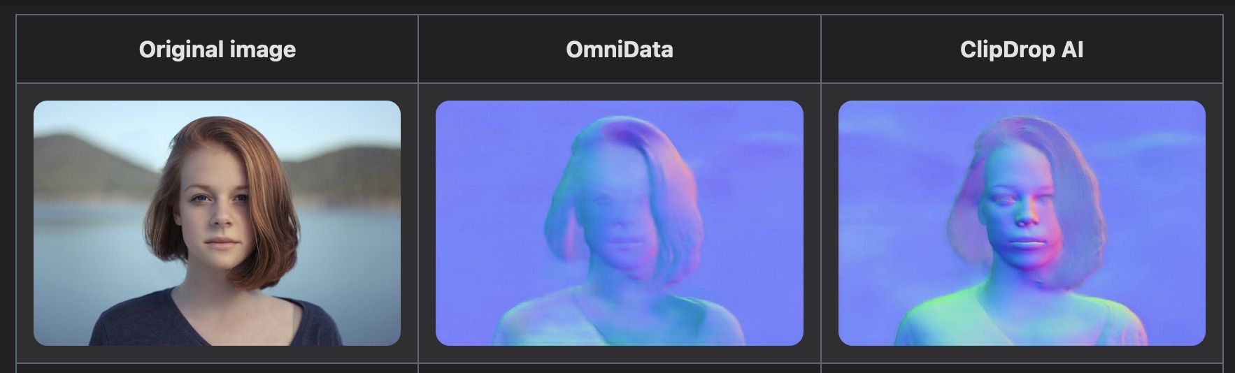
ClipDrop: AI for Image Relighting
This is a compelling use of AI for photographic manipulation (in my mind more practical than many of the other AI image generation examples that are flooding the art websites these days): basically the software can analyze a photograph, use AI to generate a pretty accurate depth map of the subject of the photo, and then use that for dynamic relighting (allowing you to add different artificial lights, color gels, etc.). You can try the web-based demo on your own photos! Neat.

-
All Communication is Lossy
A nice piece on how the significant problem with communication between individuals isn’t so much that the conversation is lossy, it’s the lack of acknowledging and correcting for that “signal loss”.
Adopting the mindset that lossiness is a fact of life has another benefit: that of beginning to see communication not as simply a transference but as a generative space. That is, we often think of communication as simply moving understanding from one place to another, the way we might move electrons from a substation to a home. This assumption is behind a lot of otherwise well-intentioned efforts to reduce or even eliminate synchronous communication, as it can seem wholly inefficient compared with other methods. But the best communication makes way for something new to emerge in the exchange. It’s not passive but generative, not mere delivery but a creative transformation.
-
Paul Ford gifts us a new modern lexicon for time
“Eileen, pace yourself. It’s only Scrumspan. We’ve got three lightmodes to go before good-binge.”
-
Anil Dash on A New Web Renaissance
Lots that I agree with in this post, including this short paragraph that speaks to both the web3 of 2022, but definitely reminds me of what excited me in the early days of learning about the WWW:
People should have ownership and control of their data online. Users should be able to connect to services and then move between them freely without having to ask permission from any big tech companies. Creators should be fairly compensated for their work. Communities and movements should easily be able to form groups and collaborate together to achieve their goals.
-
RIP to the OG Alamo Drafthouse

Another iconic Austin location bites the dust to make way for a new downtown tower: this time it’s the warehouse between 4th and 5th Streets on Colorado, which in the late 1990s became the upstairs home of the very first Alamo Drafthouse with its tiny single screen. Elijah Wood perfectly described it like being “somewhere between a movie theater, an attic, and a living room.”
If you’re nostalgic, now’s a good time to go read the Austin Monthly Oral History of the Alamo Drafthouse which has some great anecdotes about that space:
Elle Klein: Tim had lined the walls of the theater with hay bales. They were covered with black curtains … There was the wall, then hay bales, then a black curtain. There would constantly be hay coming out on the floor. We would sweep up hay at the end of the night.
Yup. Who needs special acoustic panels for soundproofing when you can just stuff the walls with hay??
There have been serious problems caused by the Drafthouse leadership over the past decade, even as they continue to open dozens of locations around the U.S., but I do miss the spirit of that first little theater and the amazing movies and community experiences that I would never have seen otherwise.
-
Max Planck Society: Glyph
Getting burned out on playing Wordle? Want something that’s more about the letters individually? Want to play around with taxonomies of multicultural letterforms for the sake of science? (who wouldn’t??)
Glyph is a newly-launched game that will help researchers better understand how crowdsourced individuals around the word perceive the shapes, texture, and patterns of letters from 45 different written languages. The video below explains how it works:
-
Why Are Letters Shaped the Way They Are?
Over on Vice, an interesting write-up on a growing movement in the field of linguistics: that the sounds of words or letterforms themselves can have direct relationships to their referent:
The Color Game did more than show how languages form over time, it violated a long-standing rule in linguistics: the rule of arbitrariness. In the subject of semiotics, or the use of signs and symbols to convey meaning, most students are taught about the theories of linguist Ferdinand de Saussure. He wrote that the letters and words in many writing and language systems have no relationship to what they refer to. The word “cat” doesn’t have anything particularly cat-like about it. The reason that “cat” means cat is because English speakers have decided so—it’s a social convention, not anything ingrained in the letters c-a-t. […] But the idea that words, or other signs, do actually relate to what they’re describing has been gaining ground. This is called iconicity: when a spoken or written word, or a gestured sign, is iconic in some way to what it’s referring to.
Aside from familiar English onomatopoeia like bang, chirp, etc., see the takete/maluma effect or bouba/kiki effect, as examples of words that “sound” like something. From the Vice article:
This effect extends beyond made up words. In 2021, researchers wrote about how words in English like ball, globe, balloon and hoop have more round vowels and sounds, compared to angular or spiky objects, such as spike, fork, cactus and shrapnel.
Now I’m also thinking of:
-
Austin Film Tourism Guide
I’m a sucker for figuring out where very specific things were filmed in Austin, and my neighborhood has been swarmed recently with TV shoots, so this handy new mini-site and interactive map from the Austin Visitor Center is right up my alley.
-
Colors: Where did they go?
A nice write-up on color grading in films, especially after the 1990s advent of digital intermediates and LUTs — or to say it more clearly, Why do movies all look like that these days??