Tag: graphics

  • Simulated Heat Mapping for Computer Vision

    A new approach to computer vision object recognition: simulated heat-mapping:

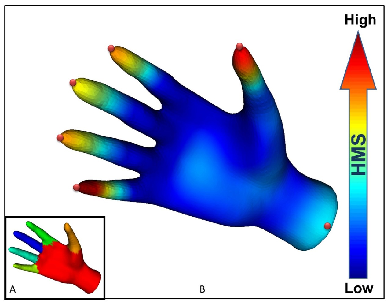
    The heat-mapping method works by first breaking an object into a mesh of triangles, the simplest shape that can characterize surfaces, and then calculating the flow of heat over the meshed object. The method does not involve actually tracking heat; it simulates the flow of heat using well-established mathematical principles, Ramani said. …

    The method accurately simulates how heat flows on the object while revealing its structure and distinguishing unique points needed for segmentation by computing the “heat mean signature.” Knowing the heat mean signature allows a computer to determine the center of each segment, assign a “weight” to specific segments and then define the overall shape of the object. …

    “A histogram is a two-dimensional mapping of a three-dimensional shape,” Ramani said. “So, no matter how a dog bends or twists, it gives you the same signature.”

    In other words, recognizing discrete parts (like fingers or facial features) of an object in front of the camera should be much more accurate with this approach than with older techniques like simple edge detection. Uses for real-time recognition are apparent (more accurate Dance Central!), but it seems like this would also be a boon for character animation rigging?

    (Via ACM TechNews)

  • IBM 2250 Graphics Display

    The IBM 2250 graphics display, introduced in 1964. 1024×1024 squares of vector-based line art beamed at you at 40Hz, with a handy light pen cursor. Much more handy than those older displays that just exposed a sheet of photographic film for later processing!

    (Via Columbia University, via Ars Technica’s recent quick primer on computer display history)

  • Catmull Interview

    They didn’t think it was relevant. In their minds, we were working on computer-generated images—and for them, what was a computer-generated image? What was an image they saw on a CRT? It was television.

    Ed Catmull, co-founder of Pixar and pioneer of computer graphics, on the time he and his nascent team were brought in to ILM during the filming of the second Star Wars movie.

    From an ACM Queue interview between Catmull and Pat Hanrahan. There are also some good quotes about incubator projects like ARPA providing protection for new ideas, arts education, and the role of artist-scientists in the graphics field.

  • Non Square Pixels

    The man who created the first scanned digital photograph in 1957, Russel Kirsch, pioneer of the pixel, apologizes in the May/July issue of Journal of Research of the National Institute of Standards and Technology. Now 81 years old, he offers up a replacement (sorta) for the square pixel he first devised: tessellated 6×6 pixel masks that offer much smoother images with lower overall resolution. The resulting file sizes are slightly larger but the improved visual quality is pretty stunning, as seen in the closeup above. His research was inspired by the ancient 6th Century tile mosaics in Ravenna, Italy.

    There are a lot of comments out there complaining that square pixels are more efficient, image and wavelet compression is old news, etc., and that’s true, but if you actually read the article you’ll find that the point isn’t so much the shape, the efficiency, or even the capture/display technology needed, but rather that this could be a good method for reducing the resolution of images somewhat while still retaining visual clarity, important in medical applications and in situations where low-resolution images are still tossed around.

    Bonus: the man in the demo photo above is his son, the subject of the first-ever digital photograph!

    (Via ScienceNews)

  • Matisse Photos

    Art and Science Collide in Revealing Matisse Exhibit from Northwestern News on Vimeo.

    Computational image processing researchers at Northwestern University teamed up with art historians from the Art Institute of Chicago to investigate the colors originally laid down by Matisse while he was working on Bathers by a River:

    Researchers at Northwestern University used information about Matisse’s prior works, as well as color information from test samples of the work itself, to help colorize a 1913 black-and-white photo of the work in progress. Matisse began work on Bathers in 1909 and unveiled the painting in 1917.

    In this way, they learned what the work looked like midway through its completion. “Matisse tamped down earlier layers of pinks, greens, and blues into a somber palette of mottled grays punctuated with some pinks and greens,” says Sotirios A. Tsaftaris, a professor of electrical engineering and computer science at Northwestern. That insight helps support research that Matisse began the work as an upbeat pastoral piece but changed it to reflect the graver national mood brought on by World War I.

    The Art Institute has up a nice mini-site about Bathers and the accompanying research, including some great overlays on top of the old photos to show the various states the painting went through during the years of its creation.

    (Via ACM TechNews)

  • Artoolkit in Quartz Composer

    Augmented Reality without programming in 5 minutes

    I can vouch that this works, and it’s pretty straightforward once you manage to grab and build the two or three additional Quartz Composer plugins successfully. I had to fold in a newer version of the ARToolkit libs, and I swapped out the pattern bitmap used to recognize the AR target to match one I already had on hand – the default sample1 and sample2 patterns weren’t working for me for some reason. Apart from that, Quartz Composer’s a lot of fun to use, almost like building eyecandy demos with patch cables and effects pedals, and it’s already on your system if you have Xcode.

    (Via Make)

  • Matchmoved Mario

    Super Mario Bros. from Andreas Heikaus on Vimeo.

    Super Mario Bros. speedrun matchmoved onto a real-life wall. Fun to think about.

    (Via Waxy)

  • Virtual Pottery Wheel

    L’Artisan Electronique, an openFrameworks-powered “virtual pottery wheel”. Users can deform the cylinder geometry by waving their hand between the lasers and then print a physical copy of their piece using an attached RepRap machine.

    (Via Make)

  • Structured Light

    Real-time 3D capture at 60fps using a cheap webcam and simple projected pattern of light points. The structured-light code is open source, looks like a pretty cool project.

    (Via Make)

  • Iphone Resolution

    Phil Plait of Bad Astronomy lucidly explains display resolution, clearing up arguments about the iPhone 4’s retinal display technology:

    Imagine you see a vehicle coming toward you on the highway from miles away. Is it a motorcycle with one headlight, or a car with two? As the vehicle approaches, the light splits into two, and you see it’s the headlights from a car. But when it was miles away, your eye couldn’t tell if it was one light or two. That’s because at that distance your eye couldn’t resolve the two headlights into two distinct sources of light.

    The ability to see two sources very close together is called resolution.

    DPI issues aside, the name “retinal display” is awfully confusing given that there’s similar terminology already in use for virtual retinal displays