
Links and write-ups about beautiful things from around the web!
-
Cloudflare: “A steam locomotive from 1993 broke my yarn test”
I failed to link to this anecdote when it was making the rounds earlier in the year, but this is a legitimately bonkers story about a fun/maddening debugging session (you know it’s a good sign when you’re breaking out
straceto diagnose a yarn script). 🚋 -
Consumer Aesthetics Research Institute (CARI)
Trying to describe and qualify contemporary aesthetic trends isn’t new, even in our hyper-online era (I first heard about product designers’ obsession with blobjects in the pages of Artbyte circa 1999, RIP to both that magazine and to me 💀), but like the two hard problems of computer science, naming things is often the difficult work.
Enter the Consumer Aesthetics Research Institute, a group of online researchers cataloguing and sifting through the design trends (especially imagery) since the 1970s that bubbled up out of subcultures far enough to be picked up by the corporate world and out into shopping malls and ads in popular magazines of the day. They provide a handy filterable and sortable interface to these design trends.
I love having names for these trends — sure, lots of design-y folks can probably identify Memphis style by name, but how about Rad Dog or Whimsicraft!
From It’s Nice That’s write-up on CARI’s work:
From coquette to dark academia, girl-dinner to white boy summer, micro-trends dominate the internet. Interests, fashion and fandoms have become so granular, with everyone out to try to create their own aesthetic, that the average person is often left feeling dizzy from the esoteric jargon of the online design world. We live in a wonderfully varied, but confusing, fragmented polyculture, sometimes so difficult to navigate that people wonder if subcultures no longer exist. But the worlds of obscure aesthetics within the larger design universe offer a drastically different perspective. Subcultures are in fact thriving – they’re alive, they’re actively shaping our world and anything, no matter how niche, can belong to somebody.
-
Presence is Fleeting: mothers, Frankenstein, and Guillermo del Toro
I finally carved out the time this weekend to watch Guillermo del Toro’s new adaptation of Frankenstein. It’s good! His version reworks the story and adds some new characters here and there, but it hews closer to the Mary Shelley novel (the original original one she wrote as a teenager, before her later rewrites) than other film adaptations tend to do, while retaining the galvanic spectacle of the 1931 James Whale movie that captured del Toro’s attention as a devout Catholic child in Mexico.
The trope of the absent or dead mother in fairy tales, Disney movies, and other pop culture (including Mary Shelley’s work) has been widely written about, and the horrors of miscarriage and childbirth are a through-line of del Toro’s films. There’s plenty to unpack about his Frankenstein‘s added focus on fathers — cycles of cruelty and disregard for their creations — so the insights about del Toro’s own family experiences from this recent New York Times writeup jumped out to me:
Curiously, there are no mothers in “Frankenstein.” The creature is born out of a man’s scientific ambition, not a woman’s body. The family the creature spies on is missing a mother as well; so is Victor’s betrothed. I have never understood this dogged slaughter of mothers in Shelley’s fiction (motherless characters are common in her subsequent books as well), until del Toro told me of his own mother’s story, how she was blotted out by her mother’s ghost. Absence is more powerful than presence, he explained to me. “Presence is fleeting. Absence is eternal.”
-
Computer-Generated Fortune 500 cover (1965!)
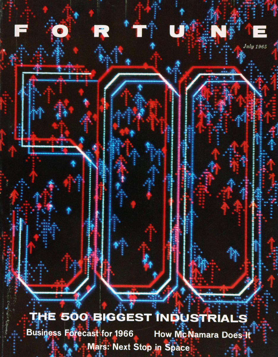
In the current era of concerns about generative AI / LLMs substituting for creative work, this anecdote about the first magazine cover to be generated by a computer (a DEC PDP-1 in this case, which apart from other hacker lore is also remembered as the hardware for the first known video game, Spacewar!) way back in 1965 reminds me that it’s still a pretty old concern that designers will transition to become prompt engineers:
“In the course of events, Fortune’s art director, Walter Allner, might have frowned on filling the column at left with an array of abbreviations and figures, for Allner is no man to waste space on uninspired graphics. But these figures are his special brain children. They are the instructions that told a PDP-1 computer how to generate the design on this month’s cover. This program was ‘written’ to Allner’s specifications and punched into an eight-channel paper tape by Sanford Libman and John Price, whose interest in art and electronics developed at M.I.T.
Generating the design on an oscilloscope and photographing required about three hours of computer time and occupied Price, Allner, and Libman until four one morning. Multiple exposure through two filters added color to the electron tube’s glow. […]
Allner confesses to certain misgivings about teaching the PDP-1 computer too much about Fortune cover design, but adds, philosophically: ‘If the computer puts art directors out of work, I’ll at least have had some on-the-job training as a design-machine programer [sic].’
It’s not mentioned in this article, and it doesn’t look like the choices of color filters and offsets were intentional, but I have to think that this Fortune cover would look pretty amazing through a pair of 1950s-style red/blue anaglyph 3D glasses…
-
Space-time crystals from particle-like topological solitons
I only barely understand the basic concept of time crystals (a material comparable to normal crystals except that instead of breaking symmetry in space like a salt crystal or diamond, they grow and pulse on their own accord in time without needing external energy input?) so this paper in Nature Materials is waaaay over my head, but it seems remarkable that this field has gone from entirely theoretical in 2012 to “oh we can make those now, and even make them visible to the naked eye” in 2025. Even with so much awful happening in the world these days, it’s nice to have a reminder of wonder and entirely new discoveries…
-
Fantastic Arcade games acquired by the Strong National Museum of Play
I’ve been a long time lurker to local Austin, Texas indie game showcase Fantastic Arcade and its offshoots Juegos Rancheros and Games Y’all, and it’s exciting to know that some of their very special (and unusual) custom arcade cabinets are finding a good home in a national museum. The ones being donated are titles made by some amazing and unexpected combinations of well-known game designers, so go check them out if you have the chance.
It’s also nice to learn that there’s an entire museum dedicated to play! Guess I need to visit Rochester, NY sometime soon.
-
Even Rembrandt took inspiration from peers

Don’t ever feel like genius emerges fully formed out of a vacuum, y’all. The New York Times posted this week about researchers discovering Rembrandt’s inspiration — “direct visual reference” might be more accurate — for the cute blurry dog in the corner of his famous painting The Night Watch that has long interested museum visitors: The Curious Incident of the Dog in ‘The Night Watch’ (I hope the headline writer got some bonus pay for that reference!).
The TL;DR is that Rembrandt’s painted dog is pretty clearly adapted from the one seen in this drawing by Dutch painter/poet Adriaen van de Venne, which was more widely distributed when it was turned into an book frontispiece engraving by printmaker François Schillemans.
From Taco Dibbets, art historian and director of the Rijksmuseum Amsterdam:
“We always think about Rembrandt as a genius who created things out of nothing … But he had a huge print collection, he was very aware of his predecessors, and he borrowed from them as well. I wouldn’t call it copying or plagiarizing. It was more like borrowing inspiration, and then changing it around.”
Bonus: if you really want to look at the painting in detail (maybe to borrow inspiration for your own work!), the Rikjsmuseum has you covered with this 717 gigapixel version of Rembrandt’s The Night Watch that ought to keep you busy…
-
I am an em dash deviant
In The New York Times, With the Em Dash, A.I. Embraces a Fading Tradition, Nisuh Abebe writes on this summer’s Internet chatter around ChatGPT’s apparent predilection for a perceived overuse of typographical dashes:
As this observation traveled the internet, a weird consensus congealed: that humans do not use dashes. Posters on tech forums called them a “GPT-ism,” a robotic artifact that “does not match modern day communication.” Someone on an OpenAI forum complained that the dashes made it harder to use ChatGPT for customer service without customers catching on. All sorts of people seemed mystifyingly confident that no flesh-and-bone human had any use for this punctuation, and that any deviant who did would henceforth be mistaken for a computer.
Those deviants were appalled, obviously. I am one; I am, even worse, a former proofreader who could speak at length and with passion about the uses of the narrower en dash. I understand very well that this dash-happy lifestyle is maybe atypical, but I had not expected to see its whole existence questioned.
Ugh, I too use dashes and parenthetical statements way too much, even in my emails at work, mostly because that’s how my brain works. Makes me feel like I need to start dropping those entirely, lest I sound like a robot (remember when robot talk was expected to be choppy like Does not compute! or Danger! Danger! — I guess chatbots are our new flowery, overly typographical hipsters…)
See also this excellent essay from last year by Bruce Sterling about other language oddities that can help suss out an LLM’s output: Preliminary Notes on the Delvish Dialect
-
Hercules Segers’s Three-Tone Etchings
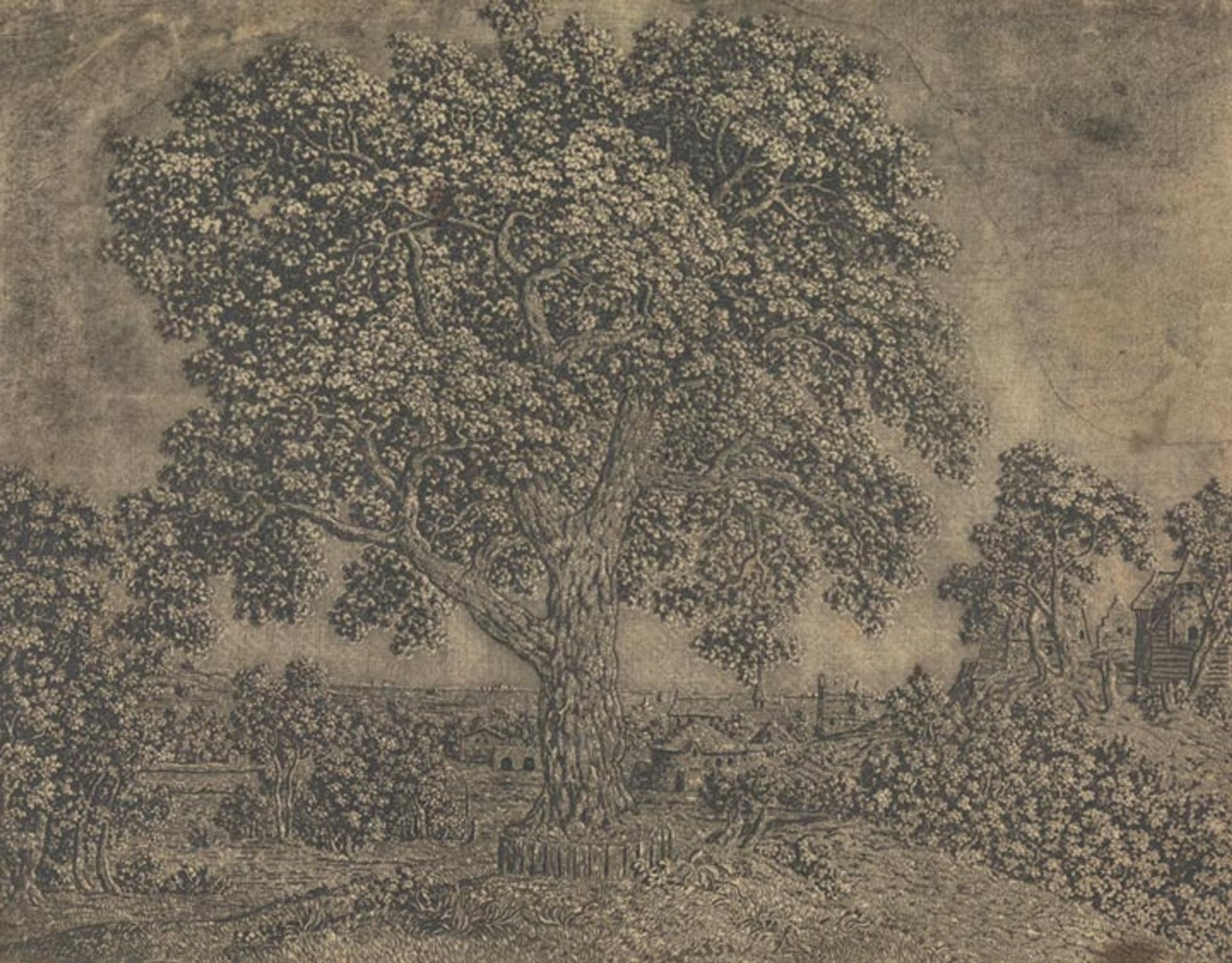
Early 17th Century painter and etcher Hercules Segers (also spelled Seghers) made some ghostly, shimmery prints in addition to his landscape paintings that seem to prefigure the Romantics and their sublimity by a good hundred years. He was also a pioneer of a number of etching techniques, from sugar-bite aquatint to a three-tone advanced plate preparation process that evidently no one else used before or since:
The pronounced diagonal hatching that we see in the detail at left maintains traces of the original layer of hatched lines that Segers applied to his printing plate. At that stage, he also applied a solution of animal fat mixed with oil or pine resin dissolved in turpentine, now known as stopping-out varnish. Segers applied this varnish to the areas where he wanted to create white highlights, evidenced here in the areas of the print that have no lines. The varnish once applied would protect those parts of the copper printing plate from being bitten by the etching acid.
As a long time Photoshop user, I still think a lot about the image histogram that represents the tonal range and variations of a digital image file, which artists use to adjust, mask, preserve, and work in the highlights, shadows, and midtones — it feels like Seger was capturing this idea but with the intricacies of the etching process, long before photography was a concern.
The quote above is from The Met’s writeup of Seger’s process, which also talks about Rembrandt’s admiration for the earlier artist’s work, and links to other examples of his impressions and unique “printed paintings”.
-
Allison Parrish: More than you wanted to know about how Game Boy cartridges work
Dang, this guide by Allison Parrish is a great example of technical documentation: easy to read assuming you know at least a tiny bit about the subject of how software talks to hardware, while still being thorough in its scope and links to more reading (the info might indeed be more than you wanted to know, but hey I appreciated it).
It’s fascinating to me that the games of that era contained so much hardware unique to each release packed into a form factor as tiny as a GB cartridge, while still being reasonably affordable (not to mention the ones that went further with custom on-cartridge peripherals like accelerometers and vibrating rumble packs!). Modern games just shipping on SD-type memory cards seems so simple by comparison.
Go learn more than you wanted to know (and then maybe fire up a round of Tetris)…