
Links and write-ups about beautiful things from around the web!
-
Hercules Segers’s Three-Tone Etchings
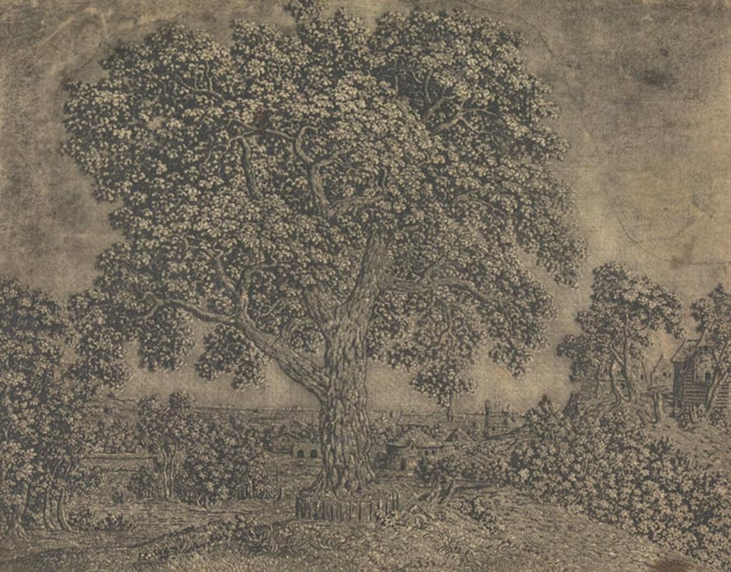
Early 17th Century painter and etcher Hercules Segers (also spelled Seghers) made some ghostly, shimmery prints in addition to his landscape paintings that seem to prefigure the Romantics and their sublimity by a good hundred years. He was also a pioneer of a number of etching techniques, from sugar-bite aquatint to a three-tone advanced plate preparation process that evidently no one else used before or since:
The pronounced diagonal hatching that we see in the detail at left maintains traces of the original layer of hatched lines that Segers applied to his printing plate. At that stage, he also applied a solution of animal fat mixed with oil or pine resin dissolved in turpentine, now known as stopping-out varnish. Segers applied this varnish to the areas where he wanted to create white highlights, evidenced here in the areas of the print that have no lines. The varnish once applied would protect those parts of the copper printing plate from being bitten by the etching acid.
As a long time Photoshop user, I still think a lot about the image histogram that represents the tonal range and variations of a digital image file, which artists use to adjust, mask, preserve, and work in the highlights, shadows, and midtones — it feels like Seger was capturing this idea but with the intricacies of the etching process, long before photography was a concern.
The quote above is from The Met’s writeup of Seger’s process, which also talks about Rembrandt’s admiration for the earlier artist’s work, and links to other examples of his impressions and unique “printed paintings”.
-
Allison Parrish: More than you wanted to know about how Game Boy cartridges work
Dang, this guide by Allison Parrish is a great example of technical documentation: easy to read assuming you know at least a tiny bit about the subject of how software talks to hardware, while still being thorough in its scope and links to more reading (the info might indeed be more than you wanted to know, but hey I appreciated it).
It’s fascinating to me that the games of that era contained so much hardware unique to each release packed into a form factor as tiny as a GB cartridge, while still being reasonably affordable (not to mention the ones that went further with custom on-cartridge peripherals like accelerometers and vibrating rumble packs!). Modern games just shipping on SD-type memory cards seems so simple by comparison.
Go learn more than you wanted to know (and then maybe fire up a round of Tetris)…
-
The Pudding: Dicing an Onion the Mathematically Optimal Way
I can’t really speak to whether their findings will help anyone chop onions better (I feel attacked that they discourage the horizontal slicing technique, my preferred way of getting tiny dices before my eyes start watering up), but look at this web design! A custom onion web font, onion handles for the toggle switch UI elements, scrollbars that look onion-y if you have translucent scrollbars — they committed to the bit and nailed it.
-
New Book of Daniel Johnston’s Art
There’s a new book out that collects some of Daniel Johnston’s voluminous doodling, and it sounds great. The New York Times published this nice writeup (with photos by UT Austin photography professor Eli Durst) of this new collection, I’m Afraid of What I Might Draw, with an interview of Daniel’s brother/guardian Dick Johnston:
In conversation, both Foster and Dick eventually discuss the same drawing, which now lives inside the safe at Electric Lady. Standing in a field of stumps as a half-dozen bats swoop in overhead, Johnston points toward a single sprout and grins. “There is still hope!” he says.
“Isn’t life a disaster and a train wreck? And here I am, and I climb out of it,” Dick said. “You don’t always know what your inner self is, but it reveals itself in your choices. Dan would hang onto that hope.”
-
ARETE — Visual History of the Latin Alphabet
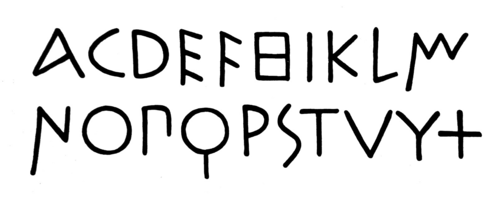
This interactive visualization of the history of the Latin alphabet from a team at the Urban Complexity Lab at the University of Applied Sciences Potsdam (wow, they have some other really interesting looking work on their Projects page!) is like catnip to typography fans. It traces a family tree from early Roman monumental writing up to modern slab serifs — a good reminder that this alphabet design has been pretty constant (aside from the additional development of uncials and lowercase scripts in the 800s) for the better part of 2500 years.
Our main concern was to show the diversity and variance of the Latin alphabet over the centuries. It is often suggested that the Roman Capitalis evolved to Antiqua scripts to today’s Grotesk in a linear way. However, we believe that this is only one possible view among many. Like any cultural development, the history of type and script is, at its core, a network. Over the centuries, designers have learned from others, referred to existing designs, and developed variants. There were times of greater standardization and then again times of great variance. The Arete project wants to show and clarify this diversity and these different design lines.
Also I like that the above earliest example they have looks like it could almost be an “Adam Norwood” wordmark if I just took out a few extraneous letters…
-
One Finger on the Map
From the New York Times review of Mike Mignola’s new comics collection Bowling with Corpses & Other Strange Tales from Lands Unknown, this paragraph celebrating the relationship between text, illustration, and fantasy mapmaking resonated with me:
The book is a good reminder that the history of imaginative literature is also the history of illustrated literature, and not just for children. Gustave Doré is as useful a guide to Milton’s “Paradise Lost” as he is to Charles Perrault’s fairy tales; Botticelli’s drawings and maps of hell give depth and gravity to the “Inferno” as reliably as Virgil gives directions to Dante. Every lover of high fantasy keeps one finger on the flyleaf where the map is printed.
See also: the NY Times “overlooked” obituary for Karen Wynn Fonstad, whose maps of Middle-Earth and the D&D worlds of Dragonlance (Krynn) and Forgotten Realms were some of my most thumbed-through books of my early teenage years. Until this article I hadn’t really thought about the depth to which her geographical form of illustration felt as substantive as the worldbuilding of the original source material she was drawing from.
-
Victor Hugo: Symbolist Painter
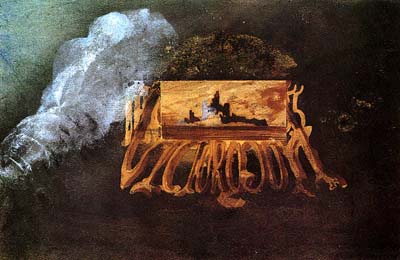
I’ve never read any of his novels (I know I should!), but I only recently learned that Victor Hugo was also an artist and painter. I can only find a couple dozen low-res images online, but the impression I get is that he was ahead of the Symbolist painting movement by a couple of decades, and was working on these around the time his fellow French writer Baudelaire was cranking out Les Fleurs du mal. In any case they’re surprisingly weird and impressionistic, and seem to employ printmaking techniques that also make me think of early photographic experiments (see for example his Silhouette Fantastique or the wonderfully creepy Lace & Ghosts).
The painting above seems to be named Calling Card and reminds me of an 1855-era Wayne White typography painting (it looks like the ornate lettering spells out VICTOR OGUH, with “Hugo” reflected backwards?)
I wish there were better scans of these available!
-
Texas Libraries are Engines of Optimism
A nice piece from writer Elizabeth McCracken (The Giant’s House; Thunderstruck & Other Stories; and most recently The Hero of this Book) on the great services and values our public libraries provide here in Austin and across Texas.
A library’s community shapes its mission. “We serve who comes through our doors,” says Danny Walker, the manager for the Terrazas Branch downtown. “Eighty percent of the people, at least, who come here are those experiencing homelessness or some type of challenge in their lives.” […] That is another resource that public libraries offer: respect for people who deserve respect but don’t always get it. […] The public library is the most democratic of public services. Nobody will ask you what you’re doing there. By being there, you belong.
-
Happy 30th to Mosaic Netscape
A couple of weeks belated, but happy 30th birthday to the release of Netscape’s 0.9 public preview, which in many ways signaled the birth of the popular Web (yes, the WWW had already existed for a few years, and Mosaic was the first browser that brought along images, but the non-commercial free availability of Netscape catapulted their browser onto so many desktops so quickly in 1994).
Also this post reminds me that I first learned HTML as a teen in 1994… 👴
-
Erin Kissane on the Ghost in the Machine
I’m currently reading Christopher Alexander’s (et al.) A Pattern Language, so this essay from Erin Kissane was timely — she turns her attention to how these ideas of patterns affecting the spaces we build and live in apply to our online homes as well, and the ways that these spaces haunt us (and we haunt them):
Maybe for you, it didn’t start on Twitter. Maybe was forums or the blogosphere or Reddit. Maybe it was Facebook with terrible people from high school or TikTok with people who hate you for liking a thing, or not liking it enough. But we built the machines around our weird amygdalas and then we went inside them and now the machine is no longer confined to a stack of software + policy + vibes; we carry it in ourselves. We haunt each new place we enter. We can feel this happening in our bodies, which is why touch grass is so accidentally real.
We shape our structures and afterward our structures shape us, but the we of the first clause and the us of the second are not the same.
The secret heart of every panopticon is not the all-seeing-eye, but the confessional.
A great read, and the side anecdote about engineer Vic Tandy‘s linking of 19hz infrasound to ghostly sensations is a rabbit hole worth pursuing!