There’s a new book out that collects some of Daniel Johnston’s voluminous doodling, and it sounds great. The New York Times published this nice writeup (with photos by UT Austin photography professor Eli Durst) of this new collection, I’m Afraid of What I Might Draw, with an interview of Daniel’s brother/guardian Dick Johnston:
In conversation, both Foster and Dick eventually discuss the same drawing, which now lives inside the safe at Electric Lady. Standing in a field of stumps as a half-dozen bats swoop in overhead, Johnston points toward a single sprout and grins. “There is still hope!” he says.
“Isn’t life a disaster and a train wreck? And here I am, and I climb out of it,” Dick said. “You don’t always know what your inner self is, but it reveals itself in your choices. Dan would hang onto that hope.”
From the New York Times review of Mike Mignola’s new comics collection Bowling with Corpses & Other Strange Tales from Lands Unknown, this paragraph celebrating the relationship between text, illustration, and fantasy mapmaking resonated with me:
The book is a good reminder that the history of imaginative literature is also the history of illustrated literature, and not just for children. Gustave Doré is as useful a guide to Milton’s “Paradise Lost” as he is to Charles Perrault’s fairy tales; Botticelli’s drawings and maps of hell give depth and gravity to the “Inferno” as reliably as Virgil gives directions to Dante. Every lover of high fantasy keeps one finger on the flyleaf where the map is printed.
See also: the NY Times “overlooked” obituary for Karen Wynn Fonstad, whose maps of Middle-Earth and the D&D worlds of Dragonlance (Krynn) and Forgotten Realms were some of my most thumbed-through books of my early teenage years. Until this article I hadn’t really thought about the depth to which her geographical form of illustration felt as substantive as the worldbuilding of the original source material she was drawing from.
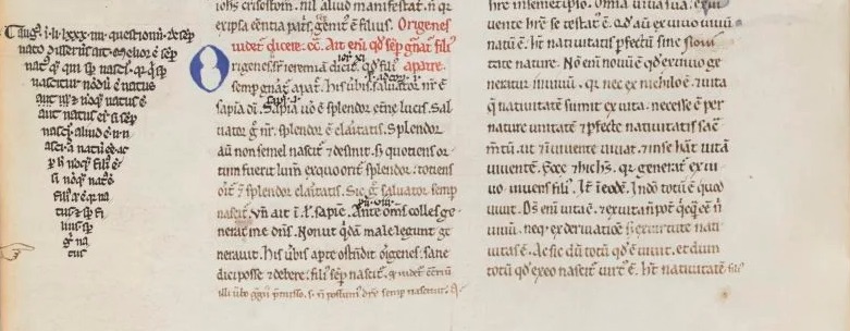
It’s interesting to know that the introduction of scholarly reading — needing to reference many different texts quickly for relevant snippets to quote from — led to changes in how text was laid out, with new features like section headings and passage markers (and those nifty typographic manicules) being added initially by readers as quick reference aides:
Amongst the medieval literate elite, there were two major methods of reading: monastic and scholastic, each divided into three ‘levels’. Monastic reading consisted of lectio / meditatio / contemplatio – that is: reading / meditation / contemplation. This method was primarily concerned with memorisation and enlightenment through repetition and deep reading (contemplation). To read this way was to know by memory and intimately understand a very few books in their entirety. […] Scholastic reading appears in the 13th century and proliferates in universities, growing in popularity throughout the late Middle Ages. It comprised of legere / disputare / praedicare, or: reading / discussing / presenting. The emphasis here was on a person’s capacity to read widely and to be able to pull choice quotes from important works to use in intellectual debates (disputatio) or lectures.
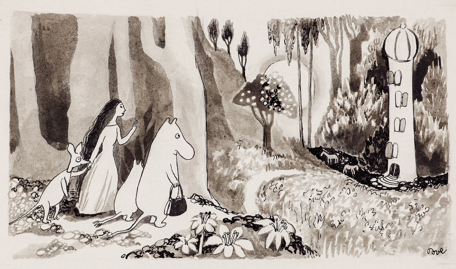
Our family is currently devouring Tove Jansson‘s Moomin books and cartoons, which are resonating with all of the things we’re seeing happening in the world around us lately — timely, then, to come across this article from Aeon on how Jansson’s and Astrid Lundgren’s Pippi books were part of a Nordic postwar antidote to fascism and authoritarianism.
I knew about Jansson working with her mother as a cartoonist for the leftist magazine Garm, but the details about her relationship with her sculptor father makes it much more clear what’s up with the often-distant Moominpappa in the Moomin books:
This message of inclusion is all the more remarkable when we remember that, during the war years, Jansson’s family was every bit as divided as many are today. Her father, Viktor ‘Faffan’ Jansson, was an enthusiastic supporter of Nazi Germany, enraging his daughter with political views that she described as ‘hair-raising’, including open antisemitism. Meanwhile, Tove and her mother, Signe ‘Ham’ Hammersten-Jansson, were earning money drawing illustrations for an anti-Nazi, Left-wing magazine.
The strain this put on the family is transformed into Moominpappa’s absence. He has ‘[taken] off with the Hattifatteners’, ‘who are forever wandering restlessly from place to place in their aimless quest for nobody knows what’. Moominpappa later quietly omits his infatuation with this strange, mindless crowd when he writes the story of his life, which was the approach taken by many Finnish supporters of Nazi Germany. When Moominpappa’s memoirs are complete, there is nothing in them at all about his wayward years with the Hattifatteners, much to Snufkin’s puzzlement.
Dang, these books are good. Fun stories for our six-year-old, and good reminders about how to be a family for ourselves and the community. Looks like we’ll need to start in on the Pippi books sometime soon.
Jordan Mechner’s game development diaries from when he made the original Prince of Persia are a good read, and now available in what looks like a nicely illustrated hardback edition — he was a teenager when he released his first commercial game and roughly 20 when developing the even bigger hit Prince of Persia, and his diaries illuminate both the remarkable technical accomplishments he was able to pull off on the limited 1980s hardware but also the mind and outlook of a teenager diving into an increasingly commercial world.
I recently finished Jan Tschichold’s Treasury of Alphabets and Lettering (1952), an incredible gallery of historical typographic examples alongside acerbic and insightful commentary by Tschichold, and this passage about storefront signs has popped into my head whenever driving by any given strip mall:
In selecting a letter for a given task, beauty is not the only factor. The letter must also be appropriate to its purpose and surroundings. Most important, a distinction must be made between lettering that is to serve for a long period of time and lettering which is to serve only briefly. Frequently, we see lettering in architecture which, due to its flighty and cursive character, is suitable only for temporary and cheap signs. Many store front inscriptions, often executed in metal or neon lights, belong to the category of imitation brush lettering which is alien to their purpose. These are not only generally hard to read, but also often lack the spontaneous, fresh form which only a master can give them after long practice. They are lame, warped, and miserable. That which one is unprepared to do but insists on doing becomes trashy. And this trash despoils our cities today at every turn. Such pap-like brush lettering on our store fronts is out of place and poorly done. Store front lettering is an architecture, since it is a part of the building. It is destined for a long duration, often for decades, and should, therefore, always be correct, noble and beautiful. It is a waste of money to cast such pseudo brush lettering in expensive metal; it must be replaced in a few years as it becomes obsolete and visually offensive to everybody.
This kind of lettering is either the result of the client’s “design” or conceived by incompetents who should choose another profession.
[…]
Store and building signs are necessary, but they need not result in the evil they have become.
In 2003 Paul Ford wrote a rather nice endorsement for colophons:
Rogers’ book terminates with a tremendous 3-page colophon, which wonders aloud if it is not perhaps “the longest colophon on record.” I take this personally, as a challenge for some day in the future, a challenge to create a colophon that transcends all colophons, a colophon that not only mentions the fonts of choice, but describes the sensuous lilt of certain descenders, offering prayers for good linespacing and a hymn to the golden ratio—a colophon that compares the kerned nestling of the “a” against the “W” in “Water” to the cuddling Madonna and child, and describes not only the paper that holds the ink but explains how the exact proportions of the lowercase “q” were debated so avidly that there was a stabbing in the foundry.
It is time for a colophon that explains how thousands of arbitrary hieroglyphs, the product of cognitive processes and some writer’s yearnings, when arranged on the page, form a community of relationships, a living colony redolent in turn of monk’s robes, boiling lead, and the chemical funk of the Linotronic spitting out its tongue of film. Time for a colophon that explains how a page of a book is a tangent off the great expanding unified sphere of language, with monkey grunts at its core and Web sites in its mantle. A colophon that explains how the linear strings of characters which make up prose or poetry can be broken into lines and arranged into sensuous comforts that salve the most polar loneliness. A colophon so overwritten as to make David Foster Wallace look like Raymond Carver, and by its very overwrittenness, absolutely transcendent, as dense as osmium and so obsidian-opaque in its beauty as to deny any reader whose soul is not purified a glance into its mysteries—a colophon which cannot be seen by the uninitiated, but is instead delivered to the pure of page by angels with san-serif wings at the moment of death, providing them with the sacred knowledge necessary to ascend to typographic heaven, where the true letterforms of which our own are only shadows are made manifest and the books are written using the infinite alphabet of the language of God.
There is a mixture of sadness and joy in the Peanuts characters. Their all-too-human disappointments and minor triumphs are reflected in Guaraldi’s music. It is a child’s reality.
Dave Brubeck, as quoted by Charles Solomon in a recent interview with Chronicle Books about his newly-released The Art and Making of Peanuts Animation, a book that I need to pick up.
Let us think the unthinkable, let us do the undoable, let us prepare to grapple with the ineffable itself, and see if we may not eff it after all.
From Douglas Adams’s Dirk Gently’s Holistic Detective Agency, which I’m reading again for the first time since the eighth grade. It’s weird reading it now, knowing that it was originally written as part of a Dr. Who series!
This may be the most important proposition revealed by history: “At the time, no one knew what was coming.”
From the first page of Haruki Murakami’s 1Q84 (translated by Jay Rubin). His earlier books that I’ve read have been wonderful dream factories, but I’ve seen this one scoring some negative reviews. I don’t know what’s coming over the next 925 pages, but I have hope that it’ll be good.