Tag: design

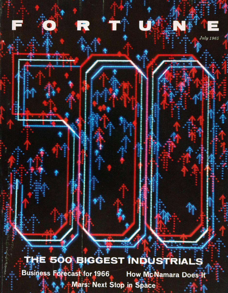
  • Computer-Generated Fortune 500 cover (1965!)

    In the current era of concerns about generative AI / LLMs substituting for creative work, this anecdote about the first magazine cover to be generated by a computer (a DEC PDP-1 in this case, which apart from other hacker lore is also remembered as the hardware for the first known video game, Spacewar!) way back in 1965 reminds me that it’s still a pretty old concern that designers will transition to become prompt engineers:

    “In the course of events, Fortune’s art director, Walter Allner, might have frowned on filling the column at left with an array of abbreviations and figures, for Allner is no man to waste space on uninspired graphics. But these figures are his special brain children. They are the instructions that told a PDP-1 computer how to generate the design on this month’s cover. This program was ‘written’ to Allner’s specifications and punched into an eight-channel paper tape by Sanford Libman and John Price, whose interest in art and electronics developed at M.I.T.

    Generating the design on an oscilloscope and photographing required about three hours of computer time and occupied Price, Allner, and Libman until four one morning. Multiple exposure through two filters added color to the electron tube’s glow. […] 

    Allner confesses to certain misgivings about teaching the PDP-1 computer too much about Fortune cover design, but adds, philosophically: ‘If the computer puts art directors out of work, I’ll at least have had some on-the-job training as a design-machine programer [sic].’

    It’s not mentioned in this article, and it doesn’t look like the choices of color filters and offsets were intentional, but I have to think that this Fortune cover would look pretty amazing through a pair of 1950s-style red/blue anaglyph 3D glasses

  • Fantastic Arcade games acquired by the Strong National Museum of Play

    I’ve been a long time lurker to local Austin, Texas indie game showcase Fantastic Arcade and its offshoots Juegos Rancheros and Games Y’all, and it’s exciting to know that some of their very special (and unusual) custom arcade cabinets are finding a good home in a national museum. The ones being donated are titles made by some amazing and unexpected combinations of well-known game designers, so go check them out if you have the chance.

    It’s also nice to learn that there’s an entire museum dedicated to play! Guess I need to visit Rochester, NY sometime soon.

  • The Pudding: Dicing an Onion the Mathematically Optimal Way

    I can’t really speak to whether their findings will help anyone chop onions better (I feel attacked that they discourage the horizontal slicing technique, my preferred way of getting tiny dices before my eyes start watering up), but look at this web design! A custom onion web font, onion handles for the toggle switch UI elements, scrollbars that look onion-y if you have translucent scrollbars — they committed to the bit and nailed it.

    Go check out their onion math opinions 🧅

  • A Brief History of the Numeric Keypad

    Graphic showing two common layouts for numeric input: a horizontal 5-by-2 design next to the common grid-like calculator layout with 7-8-9 at the top

    If you’ve ever wondered why the numeric keys on a calculator resemble those on a phone (in the U.S. anyhow), but inexplicably backwards with the 7-8-9 at the top, or if you just like looking at old mechanical cash registers and other button-based devices, here’s an excellent read for you! Time to go dust off my own Burroughs Class 3

  • Abstraction and the Meticulous Design of Play in Animal Crossing: New Horizons

    A design document showing various angles and designs of an electric fan from Animal Crossing New Horizons, juxtaposed with a player character from the game

    Even when run through Google Translate, this in-depth article from Famitsu on the design of Animal Crossing: New Horizons is a clear and interesting dive into the meticulous design thinking that goes into Nintendo’s flagship games.

    For me, the most interesting details are about how much they considered the need for abstraction to make the game successful — so much of the game is modeled on reality but very carefully distilled into primitive shapes and textures (despite the capabilities of newer hardware) for aesthetic purposes but also to help the player inject their own memories and feelings into the experience:

    In this way, the degree of symbolization is selected according to the role in the game. However, reducing the amount of information by symbolization can be considered as discarding the amount of information. Regarding this, Mr. Takahashi said, “I think there are many artists who hesitate to reduce the amount of information in images on high-resolution screens. So why can we confidently throw away information?” I don’t think that the amount of information in the picture will decrease and the response will be lost, but I think that it creates an “imaginary gap”. ”

    By having an imaginary gap, the user tries to fill the gap by recalling information from his or her memory. And by projecting one’s thoughts on it, it will lead to creating goals and motives for play.

    The article also explores the ways that the game has very intentionally placed “play triggers” pretty much everywhere except for the sky (where you even have balloons to shoot down from time to time), as well as an emphasis on leading the player to desire communication while playing. There’s a lot going on below the surface of Animal Crossing!

    PS: for the fans of the series, there are quite a few shots of development versions of the game — always interesting to see how the designs progressed from earlier prototypes.

  • Storefront Signs

    I recently finished Jan Tschichold’s Treasury of Alphabets and Lettering (1952), an incredible gallery of historical typographic examples alongside acerbic and insightful commentary by Tschichold, and this passage about storefront signs has popped into my head whenever driving by any given strip mall:

    In selecting a letter for a given task, beauty is not the only factor. The letter must also be appropriate to its purpose and surroundings. Most important, a distinction must be made between lettering that is to serve for a long period of time and lettering which is to serve only briefly. Frequently, we see lettering in architecture which, due to its flighty and cursive character, is suitable only for temporary and cheap signs. Many store front inscriptions, often executed in metal or neon lights, belong to the category of imitation brush lettering which is alien to their purpose. These are not only generally hard to read, but also often lack the spontaneous, fresh form which only a master can give them after long practice. They are lame, warped, and miserable. That which one is unprepared to do but insists on doing becomes trashy. And this trash despoils our cities today at every turn. Such pap-like brush lettering on our store fronts is out of place and poorly done. Store front lettering is an architecture, since it is a part of the building. It is destined for a long duration, often for decades, and should, therefore, always be correct, noble and beautiful. It is a waste of money to cast such pseudo brush lettering in expensive metal; it must be replaced in a few years as it becomes obsolete and visually offensive to everybody.

    This kind of lettering is either the result of the client’s “design” or conceived by incompetents who should choose another profession.

    […]

    Store and building signs are necessary, but they need not result in the evil they have become.

  • Adrian Frutiger Typography and Material

    Type-design is not exclusively a matter of aesthetics but, to a large extent, of understanding the technical conditions in which the letter-forms are built up; and a typeface is successful when it is properly at the service of a strict conformity with the material and with progressive techniques. Adrian Frutiger, Type Sign Symbol p. 20
  • Frutiger on Typography Design

    Every script contains the spirit of its age.

    Adrian Frutiger, Type Sign Symbol (p. 16), on how typography is fundamentally tied to the physical media from which a society creates its writing.
  • On Typographic Novelty

    The good type designer knows that, for a new font to be successful, it has to be so good that only very few recognize its novelty. Stanley Morison, First Principles of Typography (as quoted in Adrian Frutiger’s Type Sign Symbol, p. 7)
  • Seven rules for perfect Japanese typography

    From the files of things I don’t know much about: best practices for Japanese web typography, a nice short primer. Web fonts are problematic enough in the West, and we don’t even have the character set troubles introduced by having multiple alphabets, the huge glyph set and calligraphic history of kanji, the need to be interspersed with Latin characters and ruby characters…