I can’t really speak to whether their findings will help anyone chop onions better (I feel attacked that they discourage the horizontal slicing technique, my preferred way of getting tiny dices before my eyes start watering up), but look at this web design! A custom onion web font, onion handles for the toggle switch UI elements, scrollbars that look onion-y if you have translucent scrollbars — they committed to the bit and nailed it.
Tag: web design
-
The Pudding: Dicing an Onion the Mathematically Optimal Way
-
Sara Soueidan on creating WCAG 2.2-compliant :focus indicators
Good :focus indicators for keyboard and other assistive technology users is a must, and so often overlooked (including by me). The new WCAG 2.1 and 2.2 standards are more strict about how your UI needs to reveal the current tab focus, with the newer spec going beyond what browsers implement in their default user agent stylesheets — thankfully Sara Soueidan has written this excellent guide that breaks down the details!
-
OKLCH in CSS: why we moved from RGB and HSL
Color nerdery ahead: I’ve been a fan of the CIELAB color space ever since I discovered Lab mode in Photoshop 20-ish years ago — it’s so awesome and useful to be able to manipulate color channels separate from luminosity! — and so I’m thrilled that web design is heading that direction as well with the new OKLCH color space in CSS Color 4.
This article from Evil Martians about why they’ve made the switch to OKLCH is a great read on the ins and outs of the new color space and why you should consider using it over the more familiar ancient standards. The TL;DR: unlike hexadecimal or RGBa values, Lab/LCH is much easier to read and adjust directly in CSS as well: want to make a color more saturated? Just adjust the middle value, chroma! Oh, and contrast is preserved between different colors so long as the Luminosity remains the same, which makes conforming to the WCAG-compliant color contrast accessibility guidelines that much easier.
I also learned from this in-depth article that Adobe Photoshop has adopted the OKLab space as a “perceptual” option when generating color gradients. Look at how ugly that “classic” gradient is in their screenshot! Gradients in Photoshop have always been messed up, so this is a pretty huge change that they’ve made.
-
The Realities And Myths Of Contrast And Color
From Andrew Somers, a great primer on how color vision works and how illuminated display technology maps perception to luminance contrast, color gamut, etc. Especially useful is his writeup of not only WCAG 2’s limitations for determining proper contrast for meeting accessibility needs but also the upcoming standards like APAC (Accessible Perceptual Contrast Algorithm) that will pave the way for more useful and relevant a11y standards.
-
Old CSS New CSS
A fantastic post / trip down memory lane on the insanity that was developing for the web (the post touches on HTML and JS, not just the CSS of the title) from the late 90s through today.
-
Seven rules for perfect Japanese typography
From the files of things I don’t know much about: best practices for Japanese web typography, a nice short primer. Web fonts are problematic enough in the West, and we don’t even have the character set troubles introduced by having multiple alphabets, the huge glyph set and calligraphic history of kanji, the need to be interspersed with Latin characters and ruby characters…
-
Methods for Controlling Spacing in Web Typography | CSS-Tricks
A decent roundup of ways that you can fine-tune your word/character-level typography on the web — I don’t 100% agree with all of his suggested specific fixes, but knowing how one can make these adjustments in the first place is the important part. I might also add mention of the CSS overflow-wrap: break-word rule which has come up twice as something I needed in the last couple of projects I worked on (okay, that’s not really a spacing technique so much as a fix for overly-long words, but thought it worth mentioning alongside font tweaks)
-
Antiphonal Geometry — Harmony and proportion in responsive web design
One thing of note is that none of them express the golden ratio, that so-called best of proportions. 5:8 comes quite close but, as far as I’m aware, no web device matches the golden section in its screen aspect ratio. I’m not sure why that is, but I like to think that it’s because the golden ratio is for the weak.
…
The musical interval ratios also provide an opportunity, not only to create connectedness between the parts of a layout, but to bind the content to a device. Just as a textblock and page resonate together, so too can web content and the screen on which it is displayed.Owen Gregory (@fullcreammilk) on musical intervals, device aspect ratios, and how we should be seeking these harmonies when designing for the web as a responsive medium. A good read. And I like the jab at the golden ratio.
See also: Cennydd Bowles’s The Music of Interaction Design talk.
-
Earliest Web Browsers

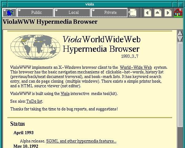
Ars Technica has up a history article on the early web browsers, a rare glimpse into the largely-forgotten software that beat NCSA Mosaic to the punch but didn’t quite make it into pop culture consciousness (seen above is ViolaWWW, notable for early stabs at browsing history, bookmarks, styles, and even embedded scripting — probably also the first web browser I remember using on my Slackware copy of X Windows circa 1994! </old>).
For all of the developments in web technology since 1991, it’s remarkable to see how many UI features and browsing concepts emerged almost immediately and are still with us today.
