Tag: technology

  • I am an em dash deviant

    In The New York Times, With the Em Dash, A.I. Embraces a Fading Tradition, Nisuh Abebe writes on this summer’s Internet chatter around ChatGPT’s apparent predilection for a perceived overuse of typographical dashes:

    As this observation traveled the internet, a weird consensus congealed: that humans do not use dashes. Posters on tech forums called them a “GPT-ism,” a robotic artifact that “does not match modern day communication.” Someone on an OpenAI forum complained that the dashes made it harder to use ChatGPT for customer service without customers catching on. All sorts of people seemed mystifyingly confident that no flesh-and-bone human had any use for this punctuation, and that any deviant who did would henceforth be mistaken for a computer.

    Those deviants were appalled, obviously. I am one; I am, even worse, a former proofreader who could speak at length and with passion about the uses of the narrower en dash. I understand very well that this dash-happy lifestyle is maybe atypical, but I had not expected to see its whole existence questioned.

    Ugh, I too use dashes and parenthetical statements way too much, even in my emails at work, mostly because that’s how my brain works. Makes me feel like I need to start dropping those entirely, lest I sound like a robot (remember when robot talk was expected to be choppy like Does not compute! or Danger! Danger! — I guess chatbots are our new flowery, overly typographical hipsters…)

    See also this excellent essay from last year by Bruce Sterling about other language oddities that can help suss out an LLM’s output: Preliminary Notes on the Delvish Dialect

  • Hercules Segers’s Three-Tone Etchings

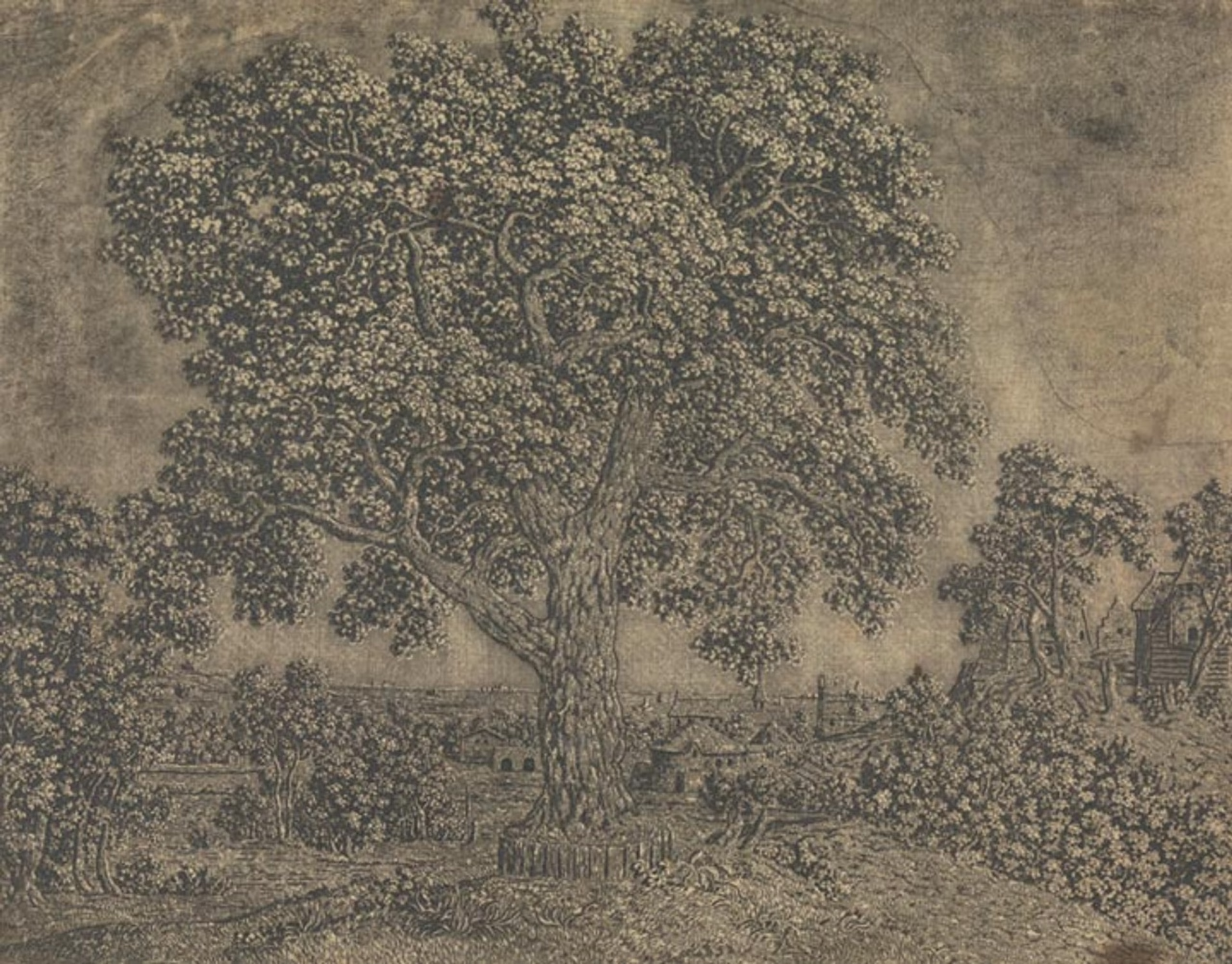
    A ghostly tree seen in a monochrome 17th Century etching, strong contrast between light and dark elements

    Early 17th Century painter and etcher Hercules Segers (also spelled Seghers) made some ghostly, shimmery prints in addition to his landscape paintings that seem to prefigure the Romantics and their sublimity by a good hundred years. He was also a pioneer of a number of etching techniques, from sugar-bite aquatint to a three-tone advanced plate preparation process that evidently no one else used before or since:

    The pronounced diagonal hatching that we see in the detail at left maintains traces of the original layer of hatched lines that Segers applied to his printing plate. At that stage, he also applied a solution of animal fat mixed with oil or pine resin dissolved in turpentine, now known as stopping-out varnish. Segers applied this varnish to the areas where he wanted to create white highlights, evidenced here in the areas of the print that have no lines. The varnish once applied would protect those parts of the copper printing plate from being bitten by the etching acid.

    As a long time Photoshop user, I still think a lot about the image histogram that represents the tonal range and variations of a digital image file, which artists use to adjust, mask, preserve, and work in the highlights, shadows, and midtones — it feels like Seger was capturing this idea but with the intricacies of the etching process, long before photography was a concern.

    The quote above is from The Met’s writeup of Seger’s process, which also talks about Rembrandt’s admiration for the earlier artist’s work, and links to other examples of his impressions and unique “printed paintings”.

  • Dave Karpf: On Generative AI and Satisficing

    In contrast to the flood of hyperbolic pieces about ChatGPT and other LLM-based AI (“It will revolutionize productivity!” / “It will destroy all creative fields!”), I appreciate Dave Karpf’s pointing out that these things are really best thought of as cliche generators, and that in some contexts it’s OK for the results to satisfice:

    The AI isn’t going to give you the optimal Disney World itinerary; It’s going to give you basically the same trip that everyone takes. It isn’t going to recommend the ideal recipe for your tastes; it’s just going to suggest something that works.

    And that sounds great, because both of those tasks are obnoxious time-sinks. (Yes, please, recommend a basic meal that my kids might eat! Offer me the same bog-standard Disney vacation that everyone else eventually settles on!)

  • ClipDrop: AI for Image Relighting

    This is a compelling use of AI for photographic manipulation (in my mind more practical than many of the other AI image generation examples that are flooding the art websites these days): basically the software can analyze a photograph, use AI to generate a pretty accurate depth map of the subject of the photo, and then use that for dynamic relighting (allowing you to add different artificial lights, color gels, etc.). You can try the web-based demo on your own photos! Neat.

    Demo of ClipDrop relighting an existing photo: the adjusted photo has much more colorful artificial lights applied in a realistic manner Demo of how the ClipDrop software compares to OmniData: ClipDrop's depth map is much more accurate

  • Paul Ford gifts us a new modern lexicon for time

    “Eileen, pace yourself. It’s only Scrumspan. We’ve got three lightmodes to go before good-binge.”

  • Anil Dash on A New Web Renaissance

    Lots that I agree with in this post, including this short paragraph that speaks to both the web3 of 2022, but definitely reminds me of what excited me in the early days of learning about the WWW:

    People should have ownership and control of their data online. Users should be able to connect to services and then move between them freely without having to ask permission from any big tech companies. Creators should be fairly compensated for their work. Communities and movements should easily be able to form groups and collaborate together to achieve their goals.

  • Finger.farm

    Modern basic implementation and hosting of the venerable RFC 742 Finger Protocol — share your contact info and plans like it’s the 1970s!

  • Harvesting Metal from Plants

    From the NY Times, one of the more interesting science reports I’ve read lately: there exist a number of species of plants that thrive in metal-rich environments, soaking up the heavy elements that can then be harvested and used for industrial purposes (traditional farming has a lot of downsides, but perhaps not as many as mining operations?).

    Slicing open one of these trees or running the leaves of its bush cousin through a peanut press produces a sap that oozes a neon blue-green. This “juice” is actually one-quarter nickel, far more concentrated than the ore feeding the world’s nickel smelters.

    This quote is evocative of the “speculative fiction” sound this makes:

    The language of literature on phytomining, or agromining, hints of a future when plant and machine live together: bio-ore, metal farm, metal crops. “Smelting plants” sounds about as incongruous as carving oxygen.

  • Social Media’s Dial-Up Ancestor: The Bulletin Board System

    A love letter from the IEEE Spectrum about the 1980s BBS phenomenon with an emphasis on how BBSes and the FidoNet message system spurred the creation of local social networks between users, the local part mostly being lost on our current global social media platforms.

    An add-on for FidoNet called Echomail written by a developer in Dallas, Texas took simple conversational forums like this across the nation — for a fictionalized account of this history, see the 2nd season of Halt and Catch Fire (OK, that show is riffing more on the Lucasfilm Games-develoed Quantum Link Club Caribe, but it’s of the right era and zeitgeist)

  • Ibm Punched Card Typography

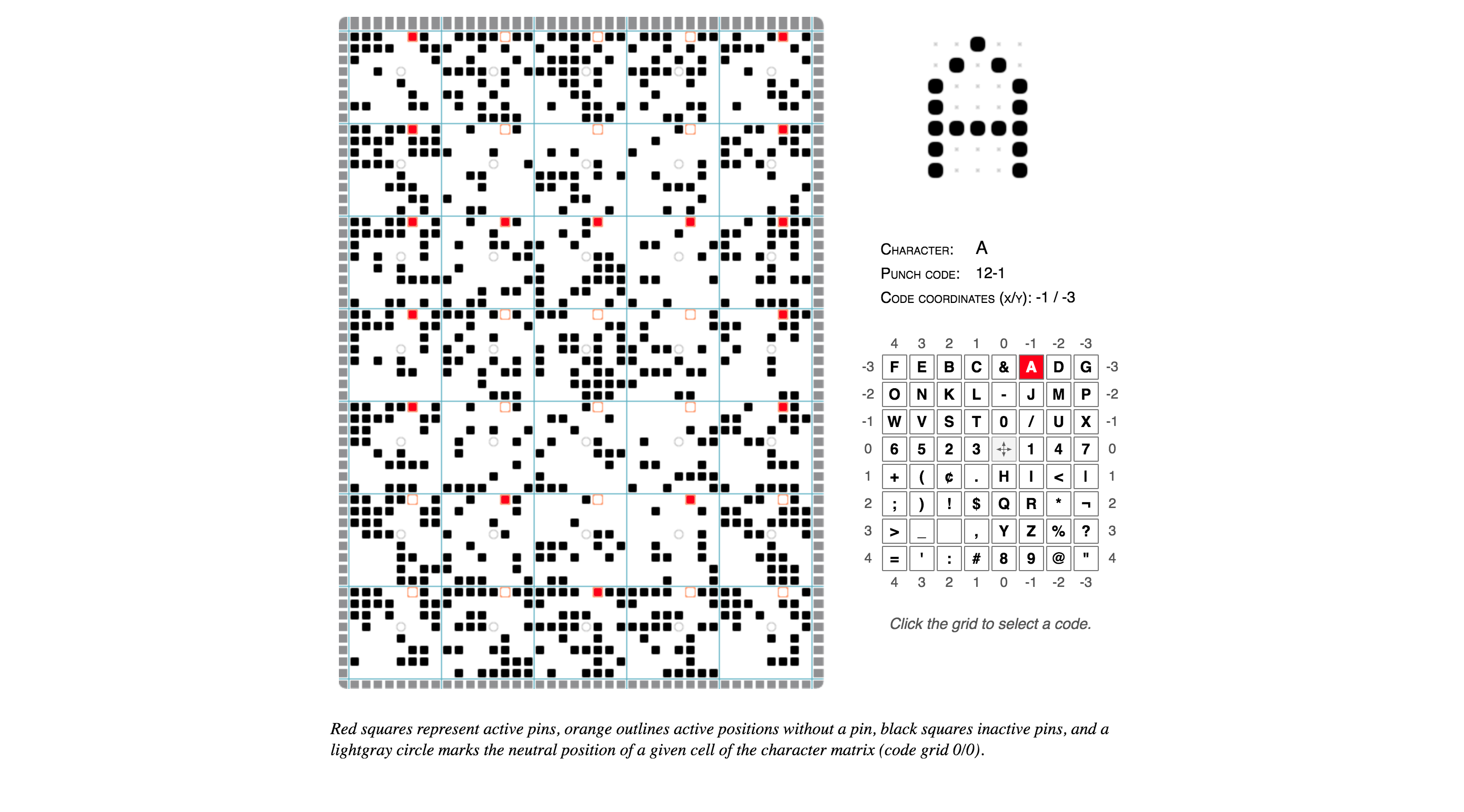
    Norbert Landsteiner wrote up a post about something that’s retro-technology-typography-nerdy beyond even my usual limits and understanding: a thorough explication and an interactive demo of how the late-1940s IBM 026 key punch (the typewriter keyboard/workstation machine that operators would use to poke the holes in the computer program punchcards of that era) was able to also print tiny human-readable letters and words at the top of the cards for easy reference.

    Basically IBM encoded the alphabet and other special characters onto a clever postage stamp-sized print head that would run along the top of the punchcard, with wires to each “dot” enabling the printing of each encoded character in turn, effectively an early dot-matrix printer. (it’s not easy to see, but if you squint at the image you’ll see that the red dots form the “A” character, upside-down — you’ll see it more easily if you play with the demo and choose other characters)

    IBM Punched Card Typography.