
From the files of things I don’t know much about: best practices for Japanese web typography, a nice short primer. Web fonts are problematic enough in the West, and we don’t even have the character set troubles introduced by having multiple alphabets, the huge glyph set and calligraphic history of kanji, the need to be interspersed with Latin characters and ruby characters…
Tag: design
-
Seven rules for perfect Japanese typography
-
The Only Unit of Time That Matters Is Heartbeats
The only unit of time that matters is heartbeats. Paul Ford, in an excellent keynote speech given to the graduating MFA students at the School for the Visual Arts, on our slippery understanding of time and how we make use of the seasons (days, hours, heartbeats, nanoseconds) allotted to us and the users of our work as designers.
-
Why Would You Design Something if It Didnt
Why would you design something, if it didn’t improve the human condition? From the NY Times obit for Niels Diffrient, industrial designer and ergonomics pioneer (among other things, he designed the Polaroid SX-70 Land camera and worked with Henry Dreyfuss and Eero Saarinen on furniture and devices like the Bell Systems princess telephone)
-
Antiphonal Geometry — Harmony and proportion in responsive web design
One thing of note is that none of them express the golden ratio, that so-called best of proportions. 5:8 comes quite close but, as far as I’m aware, no web device matches the golden section in its screen aspect ratio. I’m not sure why that is, but I like to think that it’s because the golden ratio is for the weak.
…
The musical interval ratios also provide an opportunity, not only to create connectedness between the parts of a layout, but to bind the content to a device. Just as a textblock and page resonate together, so too can web content and the screen on which it is displayed.Owen Gregory (@fullcreammilk) on musical intervals, device aspect ratios, and how we should be seeking these harmonies when designing for the web as a responsive medium. A good read. And I like the jab at the golden ratio.
See also: Cennydd Bowles’s The Music of Interaction Design talk.
-
Brian Moriarty Listen
Game designer Brian Moriarty delivered quite a talk at the 1997 Game Developers Conference, touching on everything from interaction design, emergent play, community-created art, creativity, self expression, and even an unexpected but interesting tangent about 101 Dalmatians. In hindsight, many of subjects he talks about would become evident over the next decade, from the Sims to Etsy to Minecraft to social networking. From Listen! The Potential of Shared Hallucinations:
Before we can learn, before we can grow, we have to be prepared to listen.
What does it mean, to listen?
The word is commonly understood to mean “attentive hearing.”
It has its etymological origin in the archaic verb, list.
“List!” they used to say. “Ssh! List! The wild boar is outside!”
But the verb “list” also means to tilt something to one side.
When a sea vessel leans to starboard or port, it is said to be listing.
So how did the word “list” turn into the verb “listen?”
Because when we try to hear something, we sometimes cock our heads in the direction of the sound.
So to listen means more than to hear attentively.
The word also implies a change of inclination.
A new slant.
To listen is to put ourselves into a receptive attitude.
A position to be re-aligned.
Also worth reading (the talk is also available for watching as a video in the GDC Vault) if you fondly remember the days of Hypercard, MUDs, and when text adventures reigned supreme on AOL, or if you like crazy 1990s Photoshop anaglyphs…
-
Ice Cube on Having a Plan
What I learned from architectural drafting is that everything has to have a plan to work. You just can’t wing it. I can’t get all the materials I need for a house and just start building.
Whether it’s a career, family, life — you have to plan it out.
Ice Cube, rapper and former architectural draftsman (“You don’t want to live in nothing I draw”), shares some advice in a NY Times Q&A as a followup to his recent Eames House appreciation video. -
Fun with Kerning

Fun with kerning! I don’t 100% agree with all of their solutions (they do let you share your version in protest, at least!), but it’s a entertaining five-minute distraction if you’re a designer or type-friend, and the interface is slick.
(Via pretty much every design blog and Twitter user this week…)
-
Captain Picards Utah Teacup
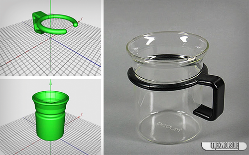
As the Make post says, this 3D-printable model of Captain Picard’s teacup would be a good benchmark for the nascent fabrication technology (the image on the right is a photo of the original Star Trek prop, which was just an off-the-shelf Bodum teacup). That it could be seen as a sly progression from the famous Utah teapot I think makes it an especially worthy benchmark!
Obligatory: “Tea! Earl Grey. Hot.”
-
RIP Alex Steinweiss, Creator of Album Covers
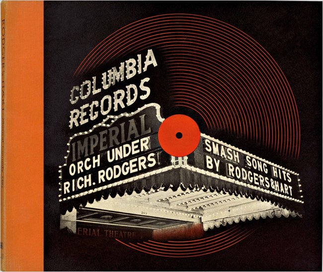
I’ve wondered where the idea of music albums as discrete packaged works of art came from, and now I know. From the New York Times: Alex Steinweiss, Originator of Artistic Album Covers, Dies at 94
“The way records were sold was ridiculous,” Mr. Steinweiss said in a 1990 interview. “The covers were brown, tan or green paper. They were not attractive, and lacked sales appeal.” Despite concern about the added costs, he was given the approval to come up with original cover designs.
His first cover, for a collection of Rodgers and Hart songs performed by an orchestra, showed a high-contrast photo of a theater marquee with the title in lights. The new packaging concept was a success: Newsweek reported that sales of Bruno Walter’s recording of Beethoven’s “Eroica” symphony increased ninefold when the album cover was illustrated.
Mr. Steinweiss also created a distinctive handwriting script that he used on many of his album covers, which came to be known as the Steinweiss Scrawl (recently resurrected as the font Steinweiss Script by designer Michael Doret).
Mr. Steinweiss said he was destined to be a commercial artist. In high school he marveled at his classmates who “could take a brush, dip it in some paint and make letters,” he recalled. “So I said to myself, if some day I could become a good sign painter, that would be terrific!“
More good information about his career and innovations (including diagrams of his LP packaging) are available on this page about his work for the Remington record label.
-
Poka-yoke
Poka-yoke (ポカヨケ) is a Japanese term that means “fail-safing” or “mistake-proofing”. A poka-yoke is any mechanism in a lean manufacturing process that helps an equipment operator avoid (yokeru) mistakes (poka). Its purpose is to eliminate product defects by preventing, correcting, or drawing attention to human errors as they occur.
Not just handy for manufacturing processes, this idea applies very easily to any kind of designed object. How can we make what we design not only easy to use, but as difficult as possible to mis-use? (It’s worth noting that this principle was originally described as baka-yoke, i.e. idiot-proof, unfairly placing the blame on the user instead of the design)