L’Artisan Electronique, an openFrameworks-powered “virtual pottery wheel”. Users can deform the cylinder geometry by waving their hand between the lasers and then print a physical copy of their piece using an attached RepRap machine.
(Via Make)
L’Artisan Electronique, an openFrameworks-powered “virtual pottery wheel”. Users can deform the cylinder geometry by waving their hand between the lasers and then print a physical copy of their piece using an attached RepRap machine.
(Via Make)
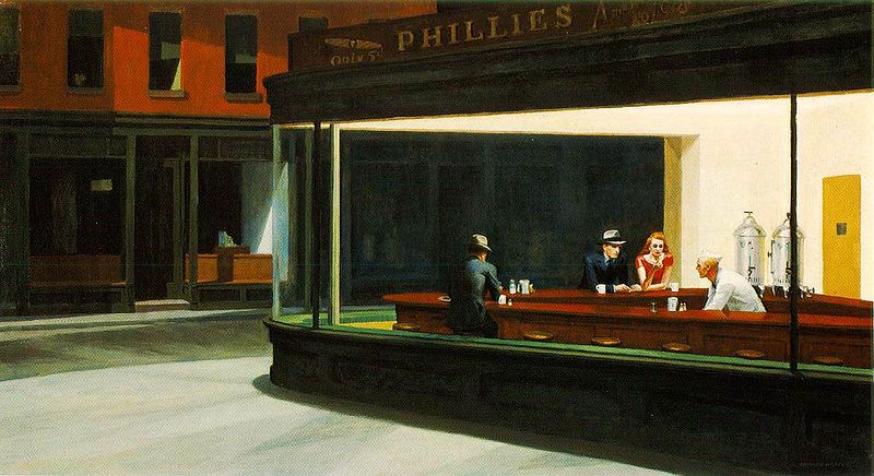
From an Op-Ed in Monday’s New York Times about a frustrated search for the existence of the “real” Nighthawks diner painted by Hopper:
Over the past years, I’ve watched bakeries, luncheonettes, cobbler shops and much more come tumbling down at an alarming rate, making space for condos and office towers. Now the discovery that the “Nighthawks” diner never existed, except as a collage inside Hopper’s imagination, feels like yet another terrible demolition, though no bricks have fallen.
It seems the longer you live in New York, the more you love a city that has vanished. For those of us well versed in the art of loving what is lost, it’s an easy leap to missing something that was never really there.
To me, it’s quite the opposite: Hopper was delivering to us an entire city’s electric nightlife collapsed into one tidy, incredibly lonely painting, and that is far more interesting than any image of a specific, real diner. Why mourn the non-existence of a restaurant when the sadness and predation that Hopper reflects in us still exists in every large city, at no risk of demolition?
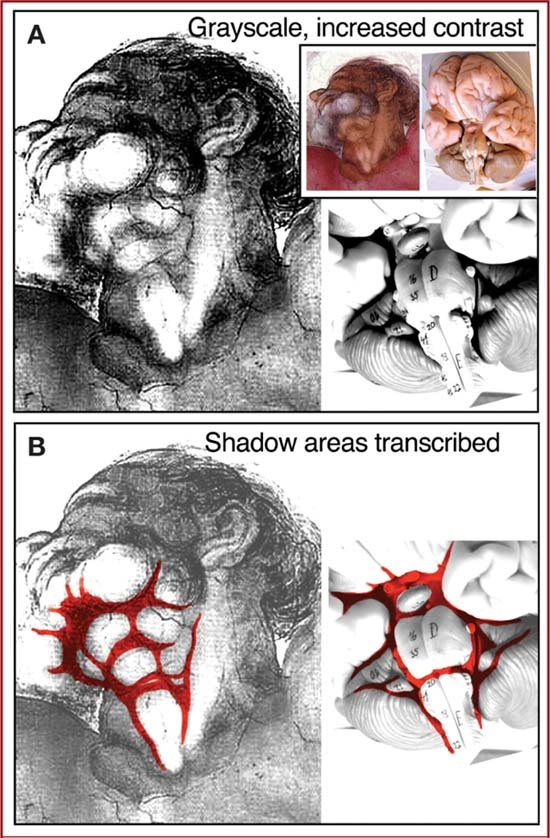
From Concealed Neuroanatomy in Michelangelo’s Separation of Light From Darkness in the Sistine Chapel in the May, 2010, issue of Neurosurgery:
In the winter of 1511, Michelangelo entered the final stages of the Sistine Chapel project and painted 4 frescoes along the longitudinal apex of the vault, which completed a series of 9 central panels depicting scenes from the Book of Genesis. It is reported that Michelangelo concealed an image of the brain in the first of these last 4 panels, namely, the Creation of Adam. Here we present evidence that he concealed another neuronanatomic structure in the final panel of this series, the Separation of Light From Darkness, specifically a ventral view of the brainstem.
Could be pareidolia, but given Michelangelo’s breakthroughs in anatomical rendering and that God is depicted here with a rather non-standard bearded neck, who knows?
(Via NYTimes.com)
Digital Graffiti Wall + Stencils from Alex Beim on Vimeo.
Tangible Interaction’s Tangible Graffiti Wall. Rear projection drawing screens with IR “spraycan” interface. The cherry on top is the ability to use virtual stencils while painting – clever.
(Via Make)
And as she lost consciousness of outer things, and her name and her personality and her appearance, and whether Mr. Carmichael was there or not, her mind kept throwing up from its depths, scenes, and names, and sayings, and memories and ideas, like a fountain spurting over that glaring, hideously difficult white space, while she modelled it with greens and blues. On daydreaming as a means to get past the terror of the blank canvas. From Virginia Woolf’s To The Lighthouse.
Whenever humans design and make a useful thing they invariably expend a good deal of unnecessary and easily avoidable work on it which contributes nothing to its usefulness. Look, for instance, at the ceiling. It is flat. It would have been easier not to have made it flat. Its being flat does not make you any warmer or the room about you any quieter, nor yet does it make the house any cheaper; far from it. Since there is a snobbism in these things flattening a ceiling is called workmanship, or mere craftsmanship; while painting gods on it or putting knobs on it is called art or design. But all these activities: ‘workmanship,’ ‘design for appearance,’ ‘decoration,’ ‘ornament,’ ‘applied art,’ ‘embellishment,’ or what you will are part of the same pattern of behavior which all men at all times and places have followed: doing useless work on useful things. If we did not behave after this pattern our life would indeed by poor, nasty and brutish. Furniture designer and theorist David Pye, from The Nature of Aesthetics and Design. Quoted in Julie Lasky’s excellent post on Design Observer, Superbeauty.
Animator Patrick Smith offers advice over on Scribble Junkies about drawing hands, an area of life drawing I still struggle with. He rails against both Preston Blair and Burne Hogarth’s popular treatises, and I’d have to agree with him there (I think the Hogarth “dynamic” books stunted my artistic abilities and understanding of anatomy by a few years, personally…).
One of the responses in the comments section rings true: “The drawings of hands you admire were probably drawn by people who looked at hands, not drawings of drawings of hands.”
If you’re the sort of lab that’s engineering a method of printing ceramic materials using rapid prototyping machines, I suppose it’d make sense that you’d already have made some real-life polygonal Utah teapots! I never thought about it before, but for the 3D graphics humor value I really, really want one of these now. You can read about the Utanalog project and see finished photos (and a video explaining the whole thing) over on the Unfold blog.
The New York Times has up a nice review of the new Charles Addams exhibit at the Museum of the City of New York:
The city street is dark and deserted. The buildings are empty. There are no witnesses. A lone man carrying a briefcase, after a long day at the office perhaps, approaches a subway staircase. Out of the subterranean gloom, a giant human hand protrudes, its index finger beckoning the office worker, inviting him into the depths. His eyes are wide with astonishment, his face showing the hint of a grin, as if the bizarre, illicit invitation were not entirely unwelcome. […]
Above is my personal favorite Addams cartoon, perhaps one of my favorite cartoons of all time. His drawings are often cited as finding their humor and inspiration in the macabre — I think their lasting appeal comes more from his ability to find joy in laughing at and rejecting the bleakness of modern life.
Storyboard artist and animation historian Mark Kennedy on keeping a sketchbook:
I’ve seen artists on the Internet question the necessity for this, saying that you can’t really learn anything about drawing by carrying a sketchbook, and that the drawings you do in a sketchbook are always dashed off, careless and sloppy. […]
The real reason I carry a sketchbook is so that I can record and remember details that I observe. Drawing from real life is the best way to teach yourself how people look, act and move in a naturalistic way (and help you remember it later). Life drawing and studying the work of other artists and animators are great learning experiences, but those things aren’t the same as studying real life. A great life drawing is an amazing feat and you can learn a lot about drawing and anatomy by going to life drawing. But very few life drawings give you a lot of information about the model’s personality and what kind of human being they are. You’re never going to create an original story or character based on a life drawing model you saw.