
Links and write-ups about beautiful things from around the web!
-
iPad Light Paintings
This film explores playful uses for the increasingly ubiquitous ‘glowing rectangles’ that inhabit the world.
We use photographic and animation techniques that were developed to draw moving 3-dimensional typography and objects with an iPad. In dark environments, we play movies on the surface of the iPad that extrude 3-d light forms as they move through the exposure. Multiple exposures with slightly different movies make up the stop-frame animation.
We’ve collected some of the best images from the project and made a book of them you can buy: http://bit.ly/mfmbook
Read more at the Dentsu London blog:
http://www.dentsulondon.com/blog/2010/09/14/light-painting/
and at the BERG blog:
http://berglondon.com/blog/2010/09/14/magic-ipad-light-painting/From Dentsu London, Making Future Magic:
We use photographic and animation techniques that were developed to draw moving 3-dimensional typography and objects with an iPad. In dark environments, we play movies on the surface of the iPad that extrude 3-d light forms as they move through the exposure. Multiple exposures with slightly different movies make up the stop-frame animation.
Take that, Picasso.
-
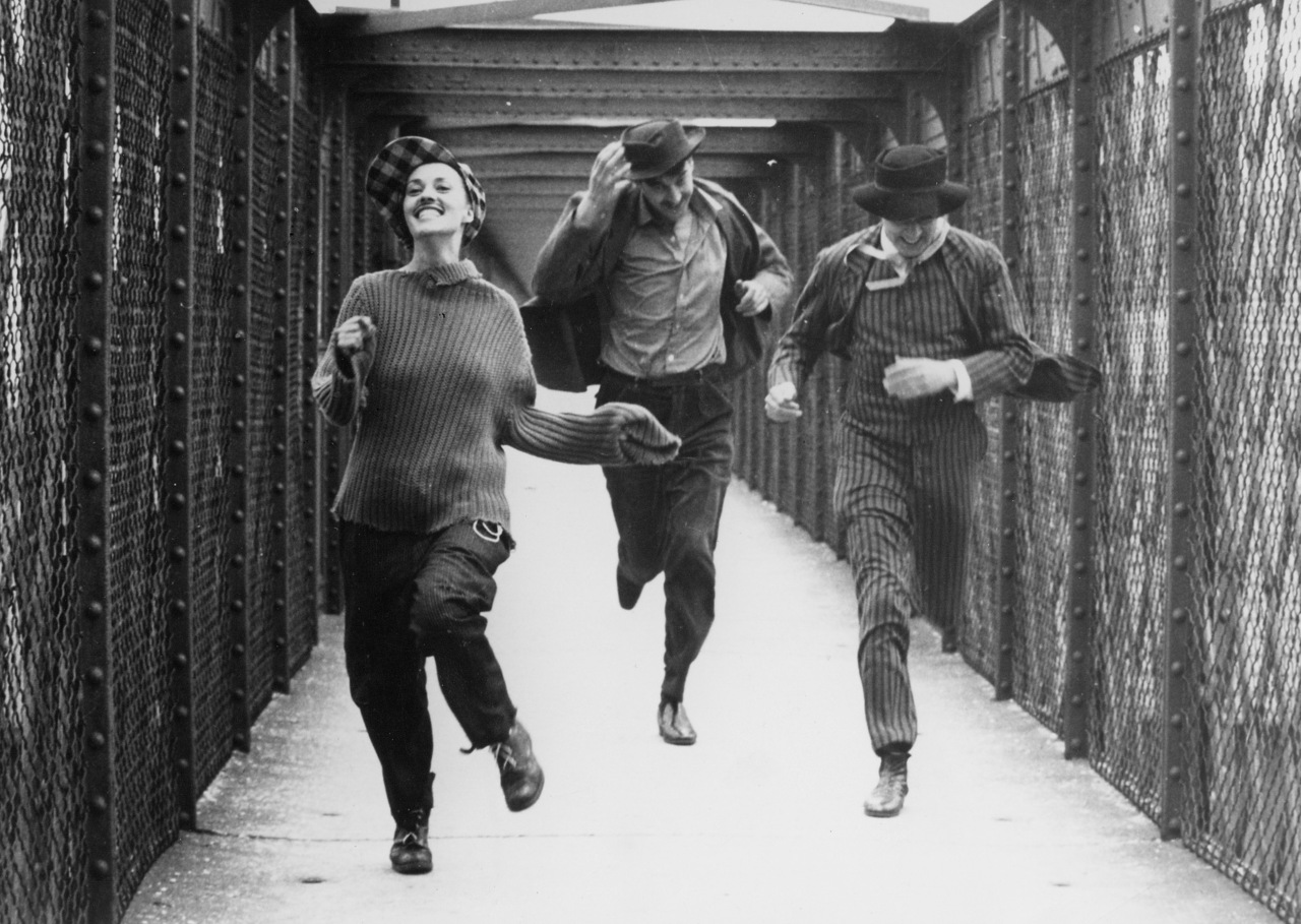
Jules and Jim
Jim: “Either it’s raining, or I’m dreaming.”
Catherine: “Maybe it’s both.”
From François Truffaut’s Jules and Jim, another turbulent French New Wave film to cross off of my list. Sort of charming and depressing at the same time, outlining the difficulties of juggling art, friendship and love in a turbulent era (its reportedly a near-biographical account of a love triangle between Marcel Duchamp, Henri-Pierre Roché, and Beatrice Wood). Very innovative cinematography and editing work for 1962. If nothing else, be sure to check out the famous tracking shot where the trio is riding bikes together downhill, evidently shot from the vantage of another bicycle, a scene made possible by the revolution in light-weight camera manufacturing.
P.S. for the Jean-Pierre Jeunet fans: this is the movie that Amelie’s watching in the theater, and I’m pretty sure that there are a lot of movies with voiceover narrators that took inspiration from this film…
-
Kurosawas Dreams
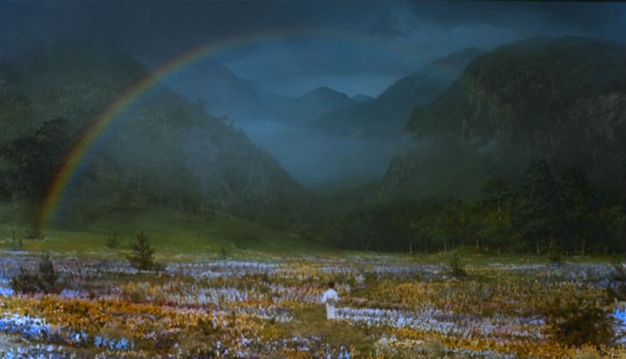
Akira Kurosawa’s Dreams (夢,Yume): a mostly quiet, artful film with eight short vignettes (five dreams and three nightmares) reflecting the remembered dreams of the director throughout his lifetime. Despite the segments being separate, discontinuous stories, I enjoyed their shared abstract sense of looking for something, a great dream motif. Unfortunately the quality of the pieces vary, but the ones that are good border on the sublime. In some ways they remind me of animated versions of Jeff Wall’s artifically-constructed photographs (but maybe I’m just conflating this film’s first nightmare with Wall’s Dead Troops Talk).
Like many of his other later movies, Kurosawa had difficulty getting this film financed by the Japanese studios, but a script sent to Steven Spielberg helped secure money from Warner Bros. Interestingly, the visual effects in the movie (including a walking-through-an-oil-painting sequence later echoed in What Dreams May Come) were supervised by Ken Ralston of Industrial Light and Magic (of Star Wars and Back to the Future fame), and there’s a cameo by Martin Scorsese as Vincent van Gogh, so despite the traditional Japanese cultural elements, there’s definitely a Western tinge to this one.
Other good movies about dreams and dreaming:
- 8½ (film and memory as dream)
- Brazil (dreams as heroic escapism)
- Waking Life (once you get past the philosophizing, it clicks)
- The Science of Sleep (not my favorite Gondry film, but fun)
- Hatsu Yume (Bill Viola’s video art piece, worth mentioning even if it’s not strictly a ‘movie’)
- Paprika (vividly crazy dream visuals from an anime master)
- I assume that Inception and Vanilla Sky / Abre los ojos should be in this list, but I haven’t seen them yet…
Any others I should know about?
-
Comics in the Courtroom
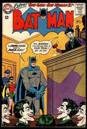
From the New York Times, a notice on an exhibition entitled “The Courtroom and Comics” at the Yale Law Library:
The medium serves as a guide to what was going on in society at the time, he said: “Comics are very much a reflection of pop culture.” The law has long been a part of that, whether it’s Perry Mason grilling a witness or Denny Crane blustering.
In the exhibition, many of the images have the power to delight, especially for those who collected comics in their youth. If your day job happens to be anything like mine — I’m the national legal correspondent for this newspaper — you will certainly notice that the comic book creators’ knowledge of law had a few gaps. For starters, the little girl in that Superman cover would have been seated in the witness chair, if in fact taking sworn testimony from a minor in open court was allowed in the Metropolis jurisdiction, and Superman would have been elsewhere in the courtroom. But you probably won’t mind that the creators sacrificed a bit of reality for drama, which is also why, you know, the main character can fly.
Mike Widener, the rare book librarian mentioned in the article, formerly oversaw the Law in Popular Culture collection at our own Tarlton Law Library here in Austin, which houses a great array of movies and books with lawyerly angles.
(Via the NY Times)
-
With Charcoal as an Elixir, South Koreans Revitalize by Roasting in Kilns
In the relative cool of midnight, Seo Seok-gu’s workers break the seals on the kilns and, using long steel hooks, drag out what remains of the oak logs that were inserted a week before and have by now turned into smoldering charcoal. The temperatures inside the clay domes reach up to 1,400 degrees Celsius. […]
Later that day, Mr. Seo’s ovens are packed with something new: people, who huddle inside where the temperature still hovers around 200 degrees Celsius (nearly 400 Fahrenheit), so hot that synthetic clothes are banned because they can melt. For two days the kilns provide heat baths for visitors. Then, another cycle of charcoal production begins. […]
For a while, said Seo Jong-won, 37, Mr. Seo’s son and the manager of the complex, “we were making more money from people sitting in our kilns than from selling charcoal.”
If the numbers are to be believed, that’s nearly double the air temperature of a Scandinavian-style sauna! I’ll make no further jokes about the sweltering Texas summer heat.
(On a side note, I like the Romanized word for Korean-style spas: Jjimjilbang)
-
The Anti-Spoiler
Hate reading content on the web that reveals the endings to the movies and shows you haven’t watched yet?
Enter graduate student Sheng Guo of Yangzhong, China, a Ph.D. student in the computer science department at Virginia Tech’s College of Engineering and his advisor, Naren Ramakrishnan, a professor of computer science. The men have developed a data mining algorithm that uses linguistic cues to spot and flag spoilers before you read them, thus saving much frustration for those who enjoy being surprised. Guo recently presented his findings at the 23rd International Conference on Computational Linguistics held in Beijing.
Here’s a direct link to their research and findings: “Finding the Storyteller: Automatic Spoiler Tagging using Linguistic Cues” (PDF)
-
Saint Expeditus of the GTD
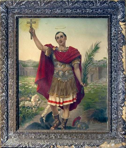
A photo in the recent Big Picture post about the men trapped in the Chilean mine features a small impromptu shrine to San Expedito, a saint I hadn’t heard of before (I’m not Catholic or even especially religious so I’m ignorant about a lot of these things). In English he’s known as Saint Expeditus, and the name’s a pretty big giveaway: with one foot he’s crushing a crow cawing the word ‘cras’ (the ancient Roman’s onomatopoeia for a crow call, but more importantly it’s also the Latin word for tomorrow — wordplay!) and he bears aloft a cross with the inscription ‘hodie’ (today). So basically he’s the patron saint of Getting Things Done.
Other things I like about this guy: his very existence and origin story is a bit sketchy, maybe even attributable to human language error, he’s big in the realm of Haitian Vodou and African-American hoodoo (while looking this stuff up, I came across more than one source from New Orleans instructing that you should leave him offerings of Sara Lee pound cake! weirdly specific!), and according to a 2004 Wired article, he’s the patron saint of nerds and hackers.
-
ESO VLT Laser Optics
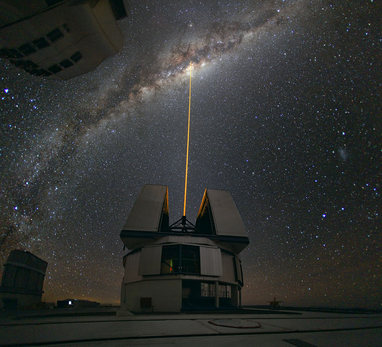
The ESO’s Very Large Telescope (I love that name, nicely to-the-point) shoots a sodium-exciting laser towards the center of the Milky Way to create an artificial “star” of light in the sky, helping calibrate its adaptive optics system. Sort of like white balancing your camera, but much, much cooler looking.
Photo credit: ESO/Y. Beletsky
-
OBAMA GML PLAYA
https://vimeo.com/14575301
A novel way to view Graffiti Markup Language tags: Obama GML Playa.
And speaking of the Graffiti Research Lab, if you happen to be in Houston next week, you can see the local chapter demonstrating their laser tagging as part of the MEDIA ARCHEOLOGY event at the Menil.
-
Objects of Play
From an insightful entry on the Toy Story trilogy on Bat, Bean, Beam:
Of course the toys aren’t really toys, they are allegorical figurines that we are supposed to read human meanings into, but I want to try to be literal for a moment. There is one irrefutable truth that we learn through the films about the toys’ psychology, one trait that all of them except a pair of scarred deviants – Stinky Pete and Lotso – have in common: what they like best is to be played with by children. But it so happens that at those times they are limp and inanimate; as is the case whenever they are in the presence of people, their spark abandons them, their eyes become vacant – a point that is further underscored in Toy Story 3 by the otherwise extraordinary capacity for expression of those eyes. So what the toys derive the most pleasure from is also what flicks their off switch, reverting them to the base status of mass produced consumer objects: every Sheriff Woody, every Buzz Lightyear totally identical to any other, therefore totally interchangeable, Andy’s marker-pen branding notwithstanding.
That is curious, from a philosophical point of view. More unhappy/unheimlich psychoanalysis of the Toy Story fiction over at Frieze Magazine.