Tag: typography

  • Dna Sans Nanoscale Typeface

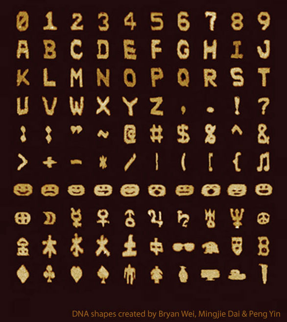
    DNA Sans, a typeface / character set of self-assembled DNA strands that have been shaped into pixel-like blocks. I know where I’m stashing my next steganographically-hidden secret message! (Or maybe this could be used as graffiti for the Fantastic Voyage crew?)

    (Via Naturearticle is here for those with journal access)

  • Fake Unicode Consortium

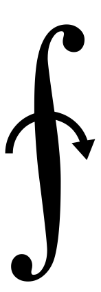
    I’m getting far too many chuckles out of this page for the Fake Unicode Consortium, which pairs up obscure Unicode glyphs with better names. Depicted here:

    Unicode character U+2231: ‘NOW FLIP SNAKE TO COOK OTHER SIDE’
    http://www.fileformat.info/info/unicode/char/2231/index.htm

    (Via O’Reilly Radar)

  • The Secret Font of Monkey Island

    A fan-made port of the pixel font built into the adventure game classics The Secret of Monkey Island and Monkey Island 2: LeChuck’s Revenge. As a bonus, a separate version is available that is properly kerned and hinted. (double bonus: opening the .ttf file in Font Book reveals that the demonstration string for the font reads “You fight like a dairy farmer!”)

    A post combining Lucasfilm Games and typography? Immediate reblog!

  • Sesame Seed Braile Burgers

    To advertise their new accessibility-friendly menus, the South African arm of the Wimpy fast food chain delivers burgers to blind users with a special twist: the sesame seeds on the bun spell out a message in braille! While it might be viewed as a marketing gimmick, it’s nice to see a fast food place making efforts to be inclusive, and the recipients in the video certainly seem amused. (a narrated version of the video is also available for the visually impaired)

    PS: what’s up with both the Popeye’s and Wimpy fast food chains completely ignoring their namesake cartoon characters in their branding?

    PPS: evidently the Wimpy UK mascot, a weird little guy in a Beefeater outfit, got his own platforming game back in the early 1980s! Thanks, Wikipedia rabbit hole.

  • Fun with Kerning

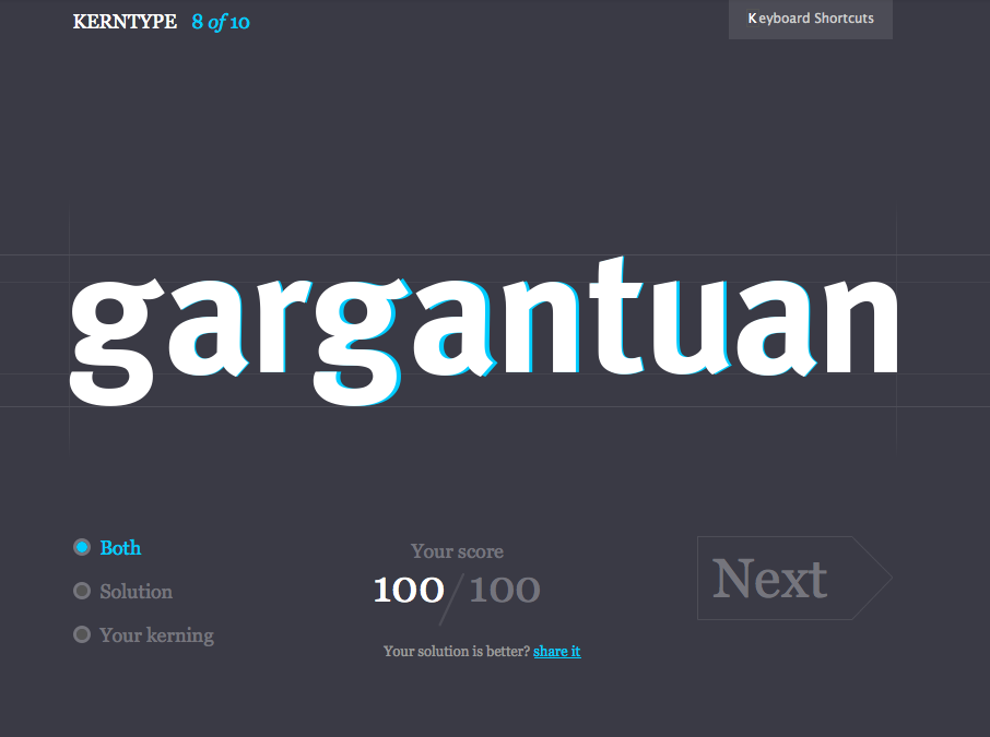
    Fun with kerning! I don’t 100% agree with all of their solutions (they do let you share your version in protest, at least!), but it’s a entertaining five-minute distraction if you’re a designer or type-friend, and the interface is slick.

    (Via pretty much every design blog and Twitter user this week…)

  • RIP Alex Steinweiss, Creator of Album Covers

    I’ve wondered where the idea of music albums as discrete packaged works of art came from, and now I know. From the New York Times: Alex Steinweiss, Originator of Artistic Album Covers, Dies at 94

    “The way records were sold was ridiculous,” Mr. Steinweiss said in a 1990 interview. “The covers were brown, tan or green paper. They were not attractive, and lacked sales appeal.” Despite concern about the added costs, he was given the approval to come up with original cover designs.

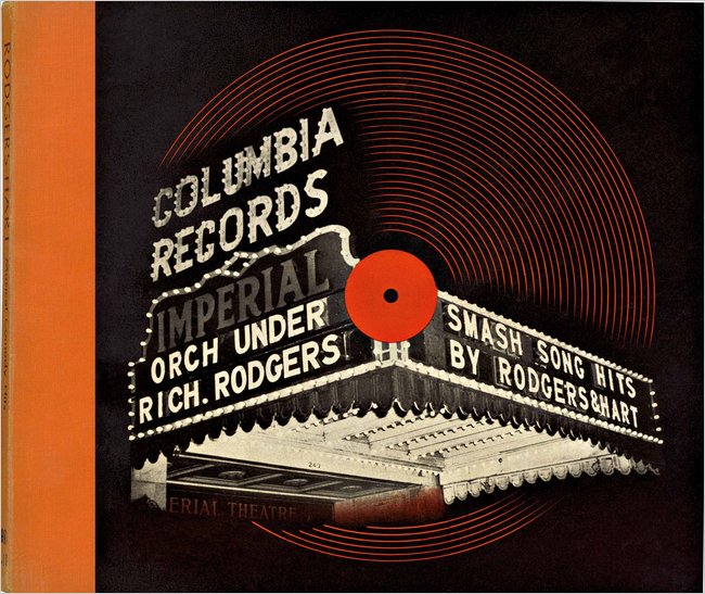
    His first cover, for a collection of Rodgers and Hart songs performed by an orchestra, showed a high-contrast photo of a theater marquee with the title in lights. The new packaging concept was a success: Newsweek reported that sales of Bruno Walter’s recording of Beethoven’s “Eroica” symphony increased ninefold when the album cover was illustrated.

    Mr. Steinweiss also created a distinctive handwriting script that he used on many of his album covers, which came to be known as the Steinweiss Scrawl (recently resurrected as the font Steinweiss Script by designer Michael Doret).

    Mr. Steinweiss said he was destined to be a commercial artist. In high school he marveled at his classmates who “could take a brush, dip it in some paint and make letters,” he recalled. “So I said to myself, if some day I could become a good sign painter, that would be terrific!“

    More good information about his career and innovations (including diagrams of his LP packaging) are available on this page about his work for the Remington record label.

  • FaceOSC Font-Face Typography

    FaceOSC

    +
    RoboFab’s Glyph Math
    http://www.robofab.org
    +
    Vanilla
    http://code.typesupply.com
    +
    Ideal Sans
    http://www.typography.com/fonts/font_overview.php?productLineID=100042

    The ofxFaceTracker openFrameworks add-on + typgraphy = interestingly literal idea of exploring typefaces…

    (Via Hoefler & Frere-Jones)

  • iPad Light Paintings

    This film explores playful uses for the increasingly ubiquitous ‘glowing rectangles’ that inhabit the world.

    We use photographic and animation techniques that were developed to draw moving 3-dimensional typography and objects with an iPad. In dark environments, we play movies on the surface of the iPad that extrude 3-d light forms as they move through the exposure. Multiple exposures with slightly different movies make up the stop-frame animation.

    We’ve collected some of the best images from the project and made a book of them you can buy: http://bit.ly/mfmbook

    Read more at the Dentsu London blog:
    http://www.dentsulondon.com/blog/2010/09/14/light-painting/
    and at the BERG blog:
    http://berglondon.com/blog/2010/09/14/magic-ipad-light-painting/

    From Dentsu London, Making Future Magic:

    We use photographic and animation techniques that were developed to draw moving 3-dimensional typography and objects with an iPad. In dark environments, we play movies on the surface of the iPad that extrude 3-d light forms as they move through the exposure. Multiple exposures with slightly different movies make up the stop-frame animation.

    Take that, Picasso.

  • Lumitype

    From the New York Times obituary for Louis Moyroud, co-inventor of the phototypesetting Lumitype machine that revolutionized the newspaper industry in the 1950s:

    Then, in the early 1940s, Mr. Moyroud and Mr. Higonnet — electronics engineers and colleagues at a subsidiary of ITT (formerly International Telephone & Telegraph) in Lyon, France — visited a nearby printing plant and witnessed the Linotype [the older Victorian-era printing process that was still in use] operation.

    “My dad always said they thought it was insane,” Patrick Moyroud (pronounced MOY-rood) said. “They saw the possibility of making the process electronic, replacing the metal with photography. So they started cobbling together typewriters, electronic relays, a photographic disc.”

    The result, called a photo-composing machine — and in later variations the Lumitype and the Photon — used a strobe light and a series of lenses to project characters from a spinning disc onto photographic paper, which was pasted onto pages, then photoengraved on plates for printing.

    If you’ve ever seen the older lead-alloy-fueled “hot metal” Linotype process you’d agree: it was crazy.

    (Photo of the Lumitype/Photon wheel by Flickr user Jeronzinho)

  • Japanese Bromide Baseball Card Prints

    Besuboru Bromides, John Gall’s beautiful collection of Japanese baseball card bromide prints (ブロマイド). The full set can be found on his Flickr account, along with a billion other great graphic arts images. I think I need to trawl through his whole photoset now, and pick up his book Sayonara Home Run!

    (Via Monoscope)