Tag: letters

  • Max Planck Society: Glyph

    Getting burned out on playing Wordle? Want something that’s more about the letters individually? Want to play around with taxonomies of multicultural letterforms for the sake of science? (who wouldn’t??)

    Glyph is a newly-launched game that will help researchers better understand how crowdsourced individuals around the word perceive the shapes, texture, and patterns of letters from 45 different written languages. The video below explains how it works:

  • Why Are Letters Shaped the Way They Are?

    Over on Vice, an interesting write-up on a growing movement in the field of linguistics: that the sounds of words or letterforms themselves can have direct relationships to their referent:

    The Color Game did more than show how languages form over time, it violated a long-standing rule in linguistics: the rule of arbitrariness. In the subject of semiotics, or the use of signs and symbols to convey meaning, most students are taught about the theories of linguist Ferdinand de Saussure. He wrote that the letters and words in many writing and language systems have no relationship to what they refer to. The word “cat” doesn’t have anything particularly cat-like about it. The reason that “cat” means cat is because English speakers have decided so—it’s a social convention, not anything ingrained in the letters c-a-t. […] But the idea that words, or other signs, do actually relate to what they’re describing has been gaining ground. This is called iconicity: when a spoken or written word, or a gestured sign, is iconic in some way to what it’s referring to.

    Aside from familiar English onomatopoeia like bang, chirp, etc., see the takete/maluma effect or bouba/kiki effect, as examples of words that “sound” like something. From the Vice article:

    This effect extends beyond made up words. In 2021, researchers wrote about how words in English like ball, globe, balloon and hoop have more round vowels and sounds, compared to angular or spiky objects, such as spike, fork, cactus and shrapnel.

    Now I’m also thinking of:

  • Storefront Signs

    I recently finished Jan Tschichold’s Treasury of Alphabets and Lettering (1952), an incredible gallery of historical typographic examples alongside acerbic and insightful commentary by Tschichold, and this passage about storefront signs has popped into my head whenever driving by any given strip mall:

    In selecting a letter for a given task, beauty is not the only factor. The letter must also be appropriate to its purpose and surroundings. Most important, a distinction must be made between lettering that is to serve for a long period of time and lettering which is to serve only briefly. Frequently, we see lettering in architecture which, due to its flighty and cursive character, is suitable only for temporary and cheap signs. Many store front inscriptions, often executed in metal or neon lights, belong to the category of imitation brush lettering which is alien to their purpose. These are not only generally hard to read, but also often lack the spontaneous, fresh form which only a master can give them after long practice. They are lame, warped, and miserable. That which one is unprepared to do but insists on doing becomes trashy. And this trash despoils our cities today at every turn. Such pap-like brush lettering on our store fronts is out of place and poorly done. Store front lettering is an architecture, since it is a part of the building. It is destined for a long duration, often for decades, and should, therefore, always be correct, noble and beautiful. It is a waste of money to cast such pseudo brush lettering in expensive metal; it must be replaced in a few years as it becomes obsolete and visually offensive to everybody.

    This kind of lettering is either the result of the client’s “design” or conceived by incompetents who should choose another profession.

    […]

    Store and building signs are necessary, but they need not result in the evil they have become.

  • Seven rules for perfect Japanese typography

    From the files of things I don’t know much about: best practices for Japanese web typography, a nice short primer. Web fonts are problematic enough in the West, and we don’t even have the character set troubles introduced by having multiple alphabets, the huge glyph set and calligraphic history of kanji, the need to be interspersed with Latin characters and ruby characters… 

  • Ibm Punched Card Typography

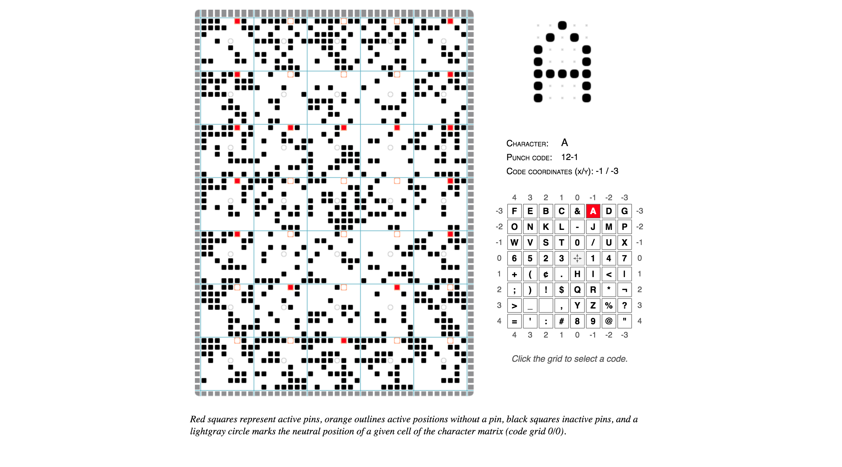
    Norbert Landsteiner wrote up a post about something that’s retro-technology-typography-nerdy beyond even my usual limits and understanding: a thorough explication and an interactive demo of how the late-1940s IBM 026 key punch (the typewriter keyboard/workstation machine that operators would use to poke the holes in the computer program punchcards of that era) was able to also print tiny human-readable letters and words at the top of the cards for easy reference.

    Basically IBM encoded the alphabet and other special characters onto a clever postage stamp-sized print head that would run along the top of the punchcard, with wires to each “dot” enabling the printing of each encoded character in turn, effectively an early dot-matrix printer. (it’s not easy to see, but if you squint at the image you’ll see that the red dots form the “A” character, upside-down — you’ll see it more easily if you play with the demo and choose other characters)

    IBM Punched Card Typography.

  • opentype.js

    This is pretty cool: an OpenType parser written in JavaScript, enabling direct manipulation of a font’s letterforms and other typographical controls right in the browser (or node.js). I don’t think it would be used in production, but with type foundries cranking out OpenType variable fonts, it might be a fun playground / experimentation tool.

  • Like Ezra Said (Ftrain.com)

    In 2003 Paul Ford wrote a rather nice endorsement for colophons:

    Rogers’ book terminates with a tremendous 3-page colophon, which wonders aloud if it is not perhaps “the longest colophon on record.” I take this personally, as a challenge for some day in the future, a challenge to create a colophon that transcends all colophons, a colophon that not only mentions the fonts of choice, but describes the sensuous lilt of certain descenders, offering prayers for good linespacing and a hymn to the golden ratio—a colophon that compares the kerned nestling of the “a” against the “W” in “Water” to the cuddling Madonna and child, and describes not only the paper that holds the ink but explains how the exact proportions of the lowercase “q” were debated so avidly that there was a stabbing in the foundry.

    It is time for a colophon that explains how thousands of arbitrary hieroglyphs, the product of cognitive processes and some writer’s yearnings, when arranged on the page, form a community of relationships, a living colony redolent in turn of monk’s robes, boiling lead, and the chemical funk of the Linotronic spitting out its tongue of film. Time for a colophon that explains how a page of a book is a tangent off the great expanding unified sphere of language, with monkey grunts at its core and Web sites in its mantle. A colophon that explains how the linear strings of characters which make up prose or poetry can be broken into lines and arranged into sensuous comforts that salve the most polar loneliness. A colophon so overwritten as to make David Foster Wallace look like Raymond Carver, and by its very overwrittenness, absolutely transcendent, as dense as osmium and so obsidian-opaque in its beauty as to deny any reader whose soul is not purified a glance into its mysteries—a colophon which cannot be seen by the uninitiated, but is instead delivered to the pure of page by angels with san-serif wings at the moment of death, providing them with the sacred knowledge necessary to ascend to typographic heaven, where the true letterforms of which our own are only shadows are made manifest and the books are written using the infinite alphabet of the language of God.

    (Via Robin Rendle’s excellent Adventures in Typography newsletter)

  • How I Came to Love the En Space

    Not only is every letter an object, but every space between every letter is also an object. Every space between words, every space between lines—every bit of white space is an object. When typesetting, a printer has to think about negative space as something tangible.

    A nice essay from The Atlantic on the development of the humble metal (or wood) block known as the en, the invisible assistant of legibility in classic printed text.

  • Dna Sans Nanoscale Typeface

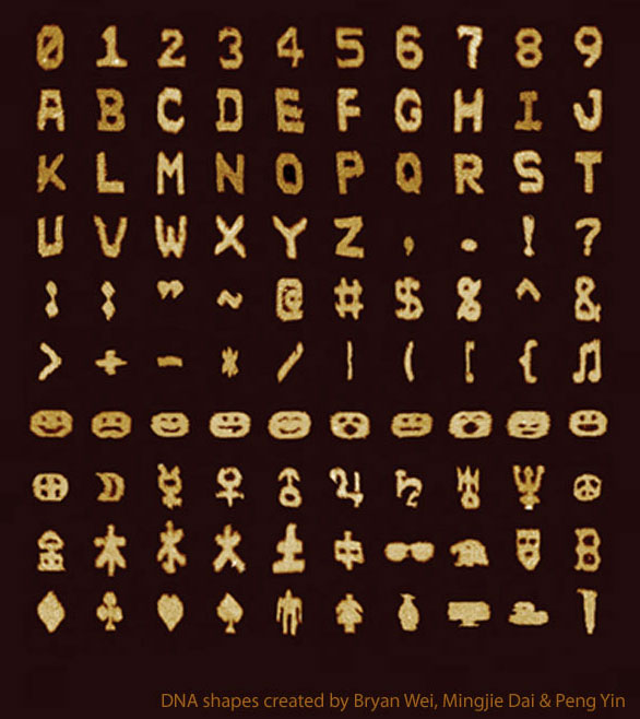
    DNA Sans, a typeface / character set of self-assembled DNA strands that have been shaped into pixel-like blocks. I know where I’m stashing my next steganographically-hidden secret message! (Or maybe this could be used as graffiti for the Fantastic Voyage crew?)

    (Via Naturearticle is here for those with journal access)

  • Neil Degrasse Tyson Gets Hate Mail from Kids About

    Neil Degrasse Tyson gets hate mail from kids about Pluto. The shift in tone from letter to letter is great, as kids begin to accept that “thats science”.

    (Via Coudal Partners)