Links and write-ups about beautiful things from around the web!
-
Abstraction and the Meticulous Design of Play in Animal Crossing: New Horizons

Even when run through Google Translate, this in-depth article from Famitsu on the design of Animal Crossing: New Horizons is a clear and interesting dive into the meticulous design thinking that goes into Nintendo’s flagship games.
For me, the most interesting details are about how much they considered the need for abstraction to make the game successful — so much of the game is modeled on reality but very carefully distilled into primitive shapes and textures (despite the capabilities of newer hardware) for aesthetic purposes but also to help the player inject their own memories and feelings into the experience:
In this way, the degree of symbolization is selected according to the role in the game. However, reducing the amount of information by symbolization can be considered as discarding the amount of information. Regarding this, Mr. Takahashi said, “I think there are many artists who hesitate to reduce the amount of information in images on high-resolution screens. So why can we confidently throw away information?” I don’t think that the amount of information in the picture will decrease and the response will be lost, but I think that it creates an “imaginary gap”. ”
By having an imaginary gap, the user tries to fill the gap by recalling information from his or her memory. And by projecting one’s thoughts on it, it will lead to creating goals and motives for play.
The article also explores the ways that the game has very intentionally placed “play triggers” pretty much everywhere except for the sky (where you even have balloons to shoot down from time to time), as well as an emphasis on leading the player to desire communication while playing. There’s a lot going on below the surface of Animal Crossing!
PS: for the fans of the series, there are quite a few shots of development versions of the game — always interesting to see how the designs progressed from earlier prototypes.
-
Monkey Island 2 — Talkie Prototype!
I love when people dig up new dirt on my favorite things from 30-ish years ago, in this case a playable prototype of a never-developed “talkie” version of LucasArt’s The Secret of Monkey Island 2: LeChuck’s Revenge. The folks at the venerable MixNMojo site have a good writeup, including a detailed archeology on the differences and new sound resources discovered, along with information and images of LucasArt’s internal debugging tool called Windex (which ran on a second monitor in Hercules monochrome graphics mode!). Neat.
-
Hokusai’s Sudden Gust
The New York Times has posted a lovely analysis of my favorite woodblock print by Hokusai, “Ejiri in Suruga Province” (circa 1830, from his “Thirty-Six Views of Mt. Fuji” series), in which a sudden blast of wind is the invisible subject of the piece. Nature and landscape and social class and quotidian humor, all meeting together in a pivotal moment of art history where Dutch imports influenced the Edo-era artists whose own innovative works quickly influenced the French.
-
On Animalese, Localization, and Video Game “Beep Speech”
I’ve long wanted a name for the dot-dot-dot-dot sound effects that have stood in for speech in video games since the early NES days — here described as “beep speech” which works for me! This video is a great roundup on how those beeps function, how they’ve been used over the years (up through Simlish and the even more recent Animal Crossing hybrid speech, which is actual vocalization skewed into psuedo-gibberish), and how they’ve been tweaked when games are translated and localized for different cultures’ languages.
-
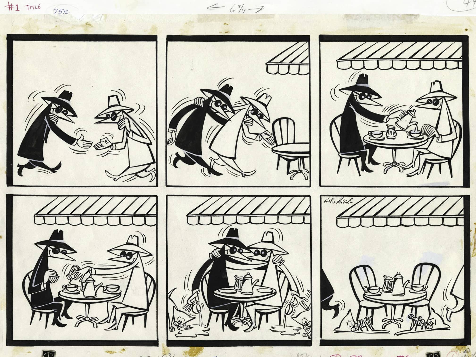
Antonio Prohías, Cuban émigré creator of Spy vs. Spy

Image credit: Heritage Auctions By the time I was reading MAD Magazine as a kid, Antonio Prohías had already finished his run of the iconic Spy vs. Spy feature that ran every month, passing it along to a new artist in 1987 after illustrating 241 strips. I only recently learned that Prohías was already an established political cartoonist and satirist in Cuba by the time he immigrated to the U.S. in 1961, himself an accused spy after fleeing Castro’s clampdown on the free press:
In 1946, Prohías was given the Juan Gualberto Gómez award, recognizing him as the foremost cartoonist in Cuba. By the late 1940s, Prohías had begun working at El Mundo, the most important newspaper in Cuba at the time. In January 1959, Prohías was the president of the Cuban Cartoonists Association; after Fidel Castro seized power, he personally honored the cartoonist for his anti-Batista political cartoons. But Prohías soon soured on Castro’s actions of muzzling the press. When he drew cartoons to this effect, he was accused of working for the CIA by Fidel Castro’s government. Consequently, he resigned from the newspaper in February 1959.
With his professional career in limbo, Prohías left Cuba for New York on May 1, 1960, working in a garment factory by day and building a cartoon portfolio for Mad by night. Ten weeks later, he walked into Mad’s offices unannounced. He spoke no English, but his daughter Marta acted as an interpreter for him. Before he’d left, he had an $800 check and had sold his first three Spy vs. Spy cartoons to Mad. […] During an interview with the Miami Herald in 1983, Prohías gloated, “The sweetest revenge has been to turn Fidel’s accusation of me as a spy into a moneymaking venture.”
The rest of the magazine’s humor hasn’t entirely aged as well, but I’m still sad to think about a world without MAD.
-
Rotoscoping via Machine Learning

A recent computer vision paper titled Learning to Cartoonize Using White-box Cartoon Representations trains machine learning software to automatically “cartoonize” photographs — a normally human-done process known as rotoscoping (at least when applied to moving images). The results are strikingly similar to the work produced for the (excellent) Amazon show Undone or the earlier animated Richard Linklater / Bob Sabiston classic Waking Life.
It’s interesting that their training data was “collected from Shinkai Makoto, Miyazaki Hayao and Hosoda Mamoru films.” These demo images definitely look akin to the American productions mentioned above, more than I’d expect from the background art of a Studio Ghibli film, say.
The good news for now for human animators: I presume these images each take significant processing power to generate, and would have trouble with consistency between frames even if it could be animated (?).
-
The Letterform Archive: Now Open to All
This great news ought to keep fans of typography and lettering busy: the Letterform Archive, the physical collection of letter arts based in San Francisco, has digitized a significant chunk of their holdings and that searchable database is now free and open to the Internet.
There’s lots to look at, but don’t miss that they have the complete run of Emigre magazine available!
-
8-bit Arcade Fonts
-
Isn’t Everything Amazing
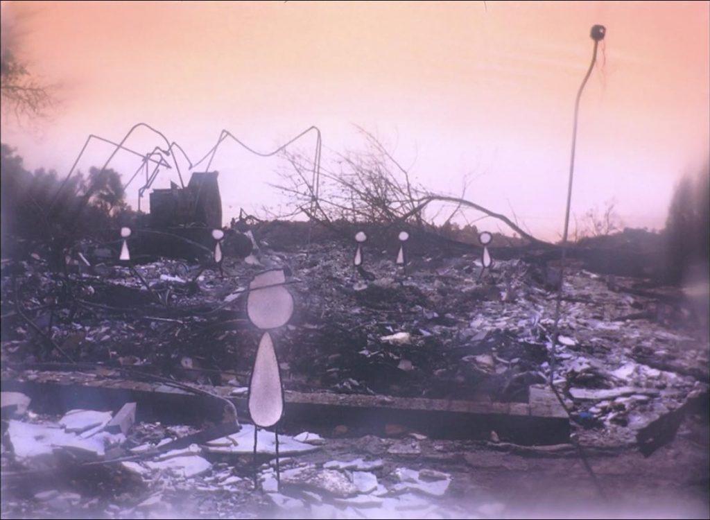
Over on the great Bright Wall/Dark Room online magazine, Ethan Warren writes a timely appreciation of animator Donald Hertzfeldt and in particular his 2012 feature-length film It’s Such a Beautiful Day:
As I write this, a few weeks into an open-ended global self-quarantine that we hope might mitigate the worst effects of what data suggests will be a historic wave of illness and death, it’s easy to feel that the future has been stolen, or at least the luxury of feeling halfway certain what the future might hold on levels both micro and macro. It’s easy, as well, to feel that even the very recent past is suddenly unavailable, at least without the risk of tumbling into nostalgia for a time when we took mundane errands and gatherings for granted. As winter finally gives way to spring, each day offering my three-year-old daughter new flower buds to marvel at through the sliding glass door, I find myself living like a goldfish in a bowl, endlessly tracing the same few movements—bedroom to bathroom to kitchen to living room to kitchen to living room to bathroom to bedroom. I yearn for a return to normalcy while fearing the consequences that return might bring. I watch governments at home and abroad either fumble or sabotage their response to this disaster. For lack of a better option, I batten down the hatches and wait for death to roll through, hoping that by sheer luck myself and those I love might be passed by. And in the meantime, I focus as much of my attention as possible on my daughter’s shrieks of glee as she notes the day’s new purple and yellow buds. You’d think the kid had never seen a flower before.
Good news, you can now stream Hertzfeldt’s It’s Such a Beautiful Day for free via Vimeo:
while we're all locked indoors wondering how bad things will get, "it's such a beautiful day" will be available to stream around the world for free. use the coupon at the following link if you need something new to fall asleep tohttps://t.co/wA0zkChV0w
— don hertzfeldt (@donhertzfeldt) March 19, 2020
See also Vulture’s take: “One of the Saddest Films I’ve Ever Seen Makes Me Feel More Hopeful Than Ever”

-
The Making of Prince of Persia, now in Hardback
Jordan Mechner’s game development diaries from when he made the original Prince of Persia are a good read, and now available in what looks like a nicely illustrated hardback edition — he was a teenager when he released his first commercial game and roughly 20 when developing the even bigger hit Prince of Persia, and his diaries illuminate both the remarkable technical accomplishments he was able to pull off on the limited 1980s hardware but also the mind and outlook of a teenager diving into an increasingly commercial world.

