Good :focus indicators for keyboard and other assistive technology users is a must, and so often overlooked (including by me). The new WCAG 2.1 and 2.2 standards are more strict about how your UI needs to reveal the current tab focus, with the newer spec going beyond what browsers implement in their default user agent stylesheets — thankfully Sara Soueidan has written this excellent guide that breaks down the details!
Tag: ui
-
Sara Soueidan on creating WCAG 2.2-compliant :focus indicators
-
Banaphone Invoked Computing
Banana Phone And Pizza Box Laptop PC – Invoked Computing For Ubiquitous AR
Usually “augmented reality” involves using a camera device to view an overlay of information or digital control on top of a video screen of some kind (say an iPhone or webcam/desktop), but this is kind of the opposite: having a camera+projector system that can map your intents onto everyday objects around the house for “invoked computing”.
Mostly I share this because I like this bananaphone demo:
There is a banana scenario where the person takes a banana out of a fruit bowl and brings it closer to his ear. A high speed camera tracks the banana; a parametric speaker array directs the sound in a narrow beam. The person talks into the banana as if it were a conventional phone.
(Via PhysOrg via ACM TechNews)
-
Earliest Web Browsers

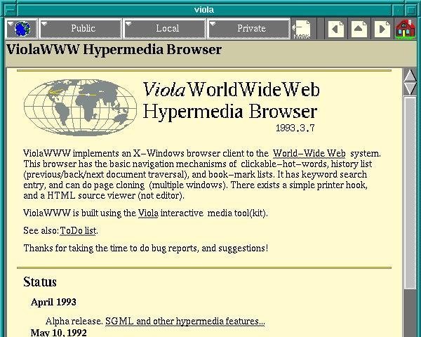
Ars Technica has up a history article on the early web browsers, a rare glimpse into the largely-forgotten software that beat NCSA Mosaic to the punch but didn’t quite make it into pop culture consciousness (seen above is ViolaWWW, notable for early stabs at browsing history, bookmarks, styles, and even embedded scripting — probably also the first web browser I remember using on my Slackware copy of X Windows circa 1994! </old>).
For all of the developments in web technology since 1991, it’s remarkable to see how many UI features and browsing concepts emerged almost immediately and are still with us today.
-
Poka-yoke
Poka-yoke (ポカヨケ) is a Japanese term that means “fail-safing” or “mistake-proofing”. A poka-yoke is any mechanism in a lean manufacturing process that helps an equipment operator avoid (yokeru) mistakes (poka). Its purpose is to eliminate product defects by preventing, correcting, or drawing attention to human errors as they occur.
Not just handy for manufacturing processes, this idea applies very easily to any kind of designed object. How can we make what we design not only easy to use, but as difficult as possible to mis-use? (It’s worth noting that this principle was originally described as baka-yoke, i.e. idiot-proof, unfairly placing the blame on the user instead of the design)
-
User guided audio selection (.mov)
Research video demonstrating an ability to automatically select individual elements of a recorded song (like the vocal track, guitar solo, ringing cellphone, etc) by singing, whistling, or even Beavis & Butthead style grunting in imitation. Not 100% perfect, but it’s very clever. (I wish the video was embeddable…)
Here’s a link to the original paper (PDF) presented to at the 2009 ACM User Interface Software and Technology symposium.
-
UltraEdit UI Horrorshow

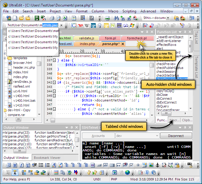
UltraEdit, the Windows text editor I’ve been using for years, has a “bold new interface”, cited in the promo email as “a thing of beauty”. Sigh.

