Tag: printing

  • Ibm Punched Card Typography

    Norbert Landsteiner wrote up a post about something that’s retro-technology-typography-nerdy beyond even my usual limits and understanding: a thorough explication and an interactive demo of how the late-1940s IBM 026 key punch (the typewriter keyboard/workstation machine that operators would use to poke the holes in the computer program punchcards of that era) was able to also print tiny human-readable letters and words at the top of the cards for easy reference.

    Basically IBM encoded the alphabet and other special characters onto a clever postage stamp-sized print head that would run along the top of the punchcard, with wires to each “dot” enabling the printing of each encoded character in turn, effectively an early dot-matrix printer. (it’s not easy to see, but if you squint at the image you’ll see that the red dots form the “A” character, upside-down — you’ll see it more easily if you play with the demo and choose other characters)

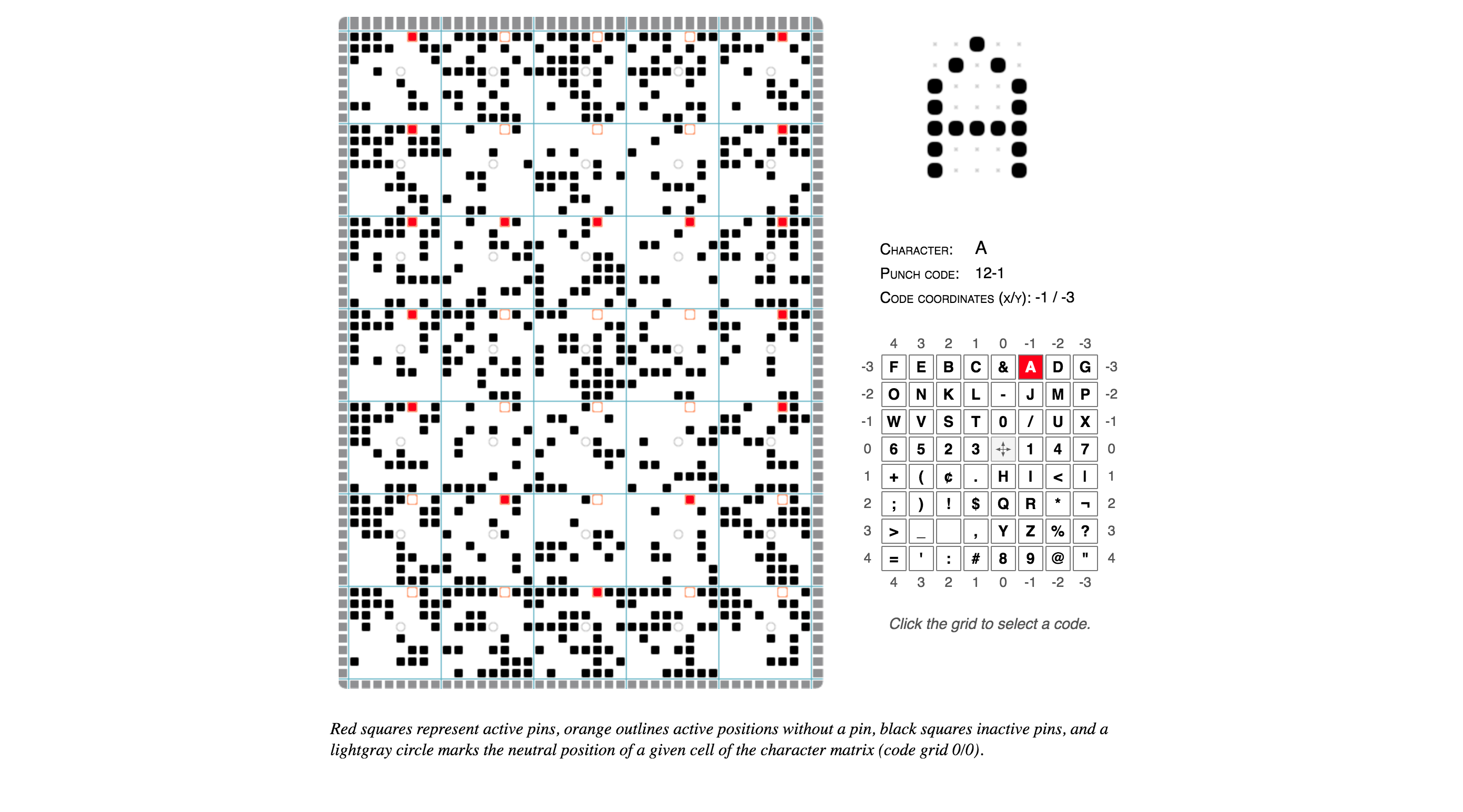
    IBM Punched Card Typography.

  • Like Ezra Said (Ftrain.com)

    In 2003 Paul Ford wrote a rather nice endorsement for colophons:

    Rogers’ book terminates with a tremendous 3-page colophon, which wonders aloud if it is not perhaps “the longest colophon on record.” I take this personally, as a challenge for some day in the future, a challenge to create a colophon that transcends all colophons, a colophon that not only mentions the fonts of choice, but describes the sensuous lilt of certain descenders, offering prayers for good linespacing and a hymn to the golden ratio—a colophon that compares the kerned nestling of the “a” against the “W” in “Water” to the cuddling Madonna and child, and describes not only the paper that holds the ink but explains how the exact proportions of the lowercase “q” were debated so avidly that there was a stabbing in the foundry.

    It is time for a colophon that explains how thousands of arbitrary hieroglyphs, the product of cognitive processes and some writer’s yearnings, when arranged on the page, form a community of relationships, a living colony redolent in turn of monk’s robes, boiling lead, and the chemical funk of the Linotronic spitting out its tongue of film. Time for a colophon that explains how a page of a book is a tangent off the great expanding unified sphere of language, with monkey grunts at its core and Web sites in its mantle. A colophon that explains how the linear strings of characters which make up prose or poetry can be broken into lines and arranged into sensuous comforts that salve the most polar loneliness. A colophon so overwritten as to make David Foster Wallace look like Raymond Carver, and by its very overwrittenness, absolutely transcendent, as dense as osmium and so obsidian-opaque in its beauty as to deny any reader whose soul is not purified a glance into its mysteries—a colophon which cannot be seen by the uninitiated, but is instead delivered to the pure of page by angels with san-serif wings at the moment of death, providing them with the sacred knowledge necessary to ascend to typographic heaven, where the true letterforms of which our own are only shadows are made manifest and the books are written using the infinite alphabet of the language of God.

    (Via Robin Rendle’s excellent Adventures in Typography newsletter)

  • Lumitype

    From the New York Times obituary for Louis Moyroud, co-inventor of the phototypesetting Lumitype machine that revolutionized the newspaper industry in the 1950s:

    Then, in the early 1940s, Mr. Moyroud and Mr. Higonnet — electronics engineers and colleagues at a subsidiary of ITT (formerly International Telephone & Telegraph) in Lyon, France — visited a nearby printing plant and witnessed the Linotype [the older Victorian-era printing process that was still in use] operation.

    “My dad always said they thought it was insane,” Patrick Moyroud (pronounced MOY-rood) said. “They saw the possibility of making the process electronic, replacing the metal with photography. So they started cobbling together typewriters, electronic relays, a photographic disc.”

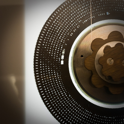
    The result, called a photo-composing machine — and in later variations the Lumitype and the Photon — used a strobe light and a series of lenses to project characters from a spinning disc onto photographic paper, which was pasted onto pages, then photoengraved on plates for printing.

    If you’ve ever seen the older lead-alloy-fueled “hot metal” Linotype process you’d agree: it was crazy.

    (Photo of the Lumitype/Photon wheel by Flickr user Jeronzinho)

  • Cartoon-y 19th Century Fukuoka Woodblock

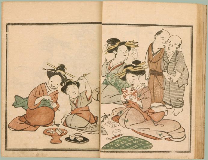
    I love Edo-era art and cartooning. Hard to imagine doing this with a woodblock! Image found on the always-great BibliOdyssey, also available on Flickr.