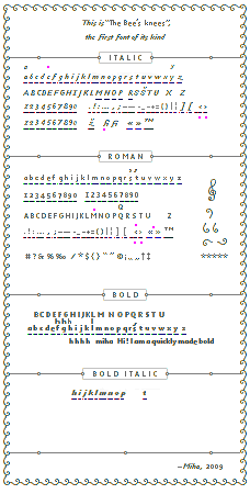
Typophile user Miha is doing some awesome sub-pixel typography experimentation for making tiny text sharper (at least on LCD screens with RGB ordering – sorry CRT holdouts!). It’s this kind of hand-rendering and tailoring that makes this work craft, in the best sense of the word. Drawing out a legible, full alphabet with an x-height of 3 pixels? Impressive.
Miha’s Sub-pixel Typography